Best tradeshow marketing tips and case studies. Call 800-654-6946.

March 2018

Getting the Color Right on Your Tradeshow Graphics

When I first got into the tradeshow world around the turn of the century (!), an issue that kept coming up time and time again was the color of tradeshow graphics.

There are a number of problems that come up with printing graphics with accurate color.
tradeshow graphic color

First, since we printed everything in-house at that point, we needed to make sure that the printer’s output was consistent with what was called for. A graphic designer will usually spec a PMS color (Pantone Matching System), which is a proprietary color space that identifies exact shades. That meant regular testing of the system to make sure that the color matched.

The inks in the printer must be of high quality so that when the computer that is used to process the print calls on the right combination of the various ink tanks.

Next, you have the computer monitor. Many clients would look at something on their monitor and think it looked exactly how they wanted it. Trouble it, monitors differ in their output as well. So, what you see on your monitor in your office may not be what I see on my monitor.

Don’t forget about the substrate you’re printing on. Whether it’s fabric or paper, simply by changing the source of paper from one package to another may bring a subtle difference. It’s the same with carpet dye. One dye lot may be slightly different from another, and if you try to match a new printed piece with an older printed piece, chances are good it won’t exactly match.

Then there’s the human factor. We all see colors differently, and usually the person operating the printers have a good eye for colors.

So how to address this? If you are trying to match a PMS Pantone color exactly, the best thing is to provide a paper-printed color sample that you like. For example, if you have a brochure or other printed piece that is exactly what you want, color-wise, make sure your printing vendor has that. If they have that piece in hand, chances are very high they can make adjustments in their process to create a printed tradeshow graphic that matches your desired color.

But understand that there a lot of variable! The technology has generally made it easier to color-match, but it’s not always guaranteed. Just work with your exhibit house or print shop if color-matching is important.

Speaking of colors, did you hear about the chemist that accidentally discovered a new blue a couple of years ago?

TradeshowGuy Expo West 2018 Exhibit Awards

Welcome to the (perhaps) annual TradeshowGuy Expo West 2018 Exhibit Awards, where I totally (almost) at random, pick out a handful of the 3600+ exhibits at the Natural Products Expo West show and give them a little notoriety here on the TradeshowGuy Blog!

A couple of caveats: I’m not including any current clients of TradeshowGuy Exhibits – they’re already award winners in our book, and we don’t want this fun post to be biased towards, you know, clients! Besides, we’ve already posted photos of those exhibits.

So, let’s get started!

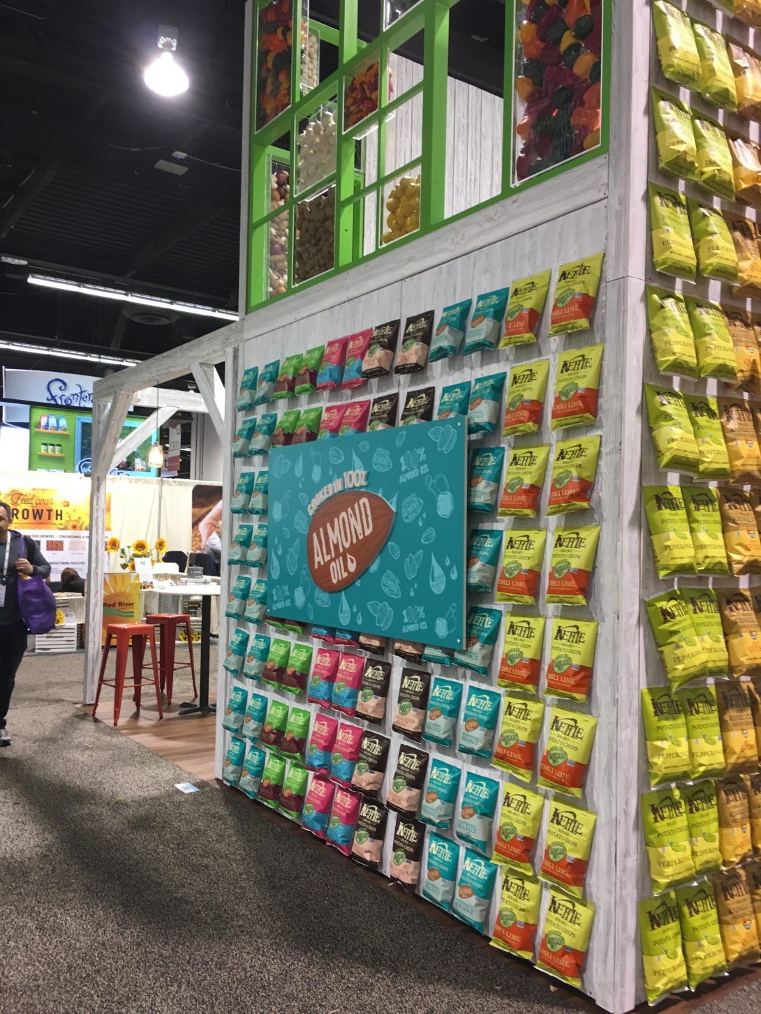
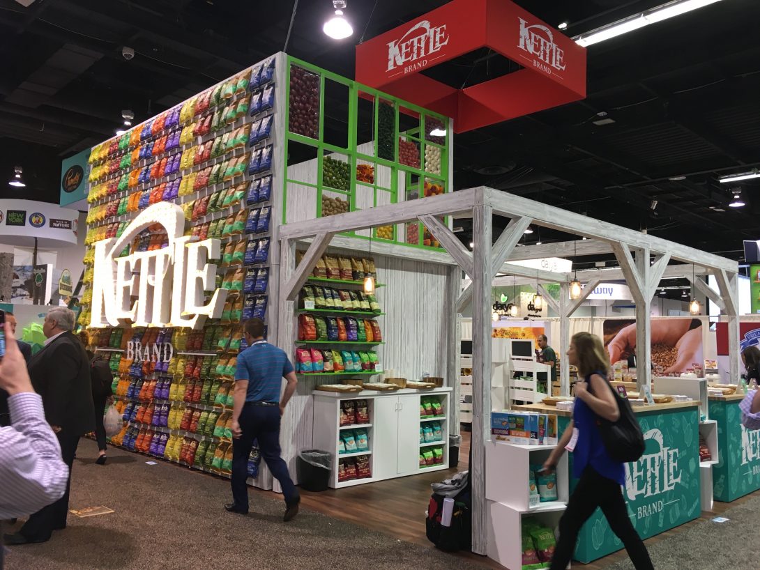
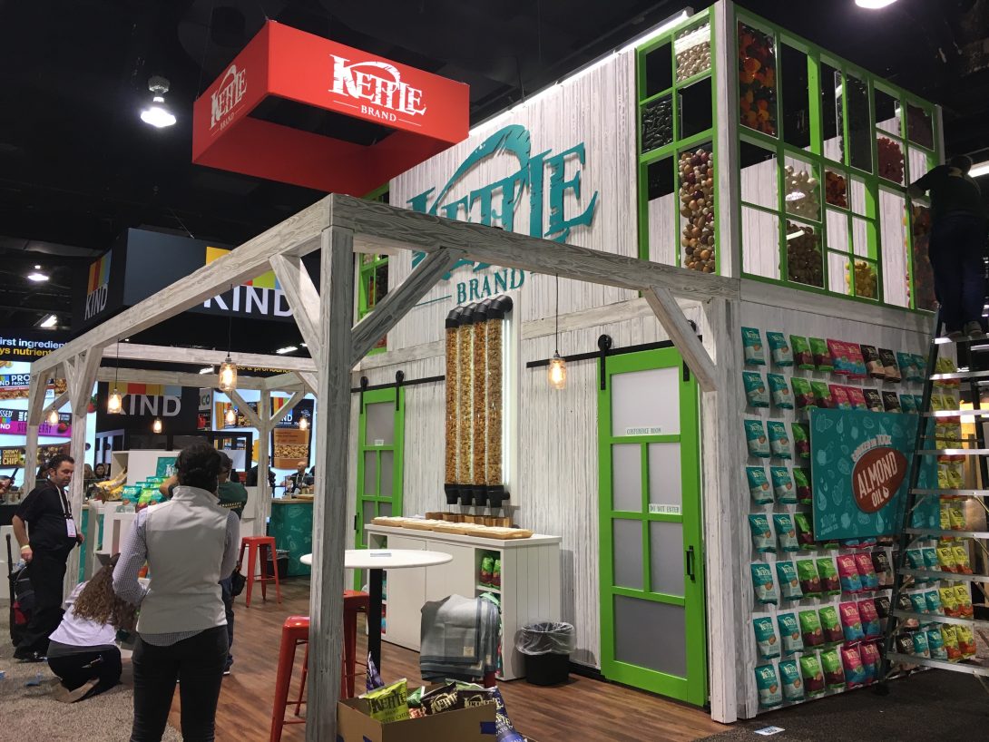
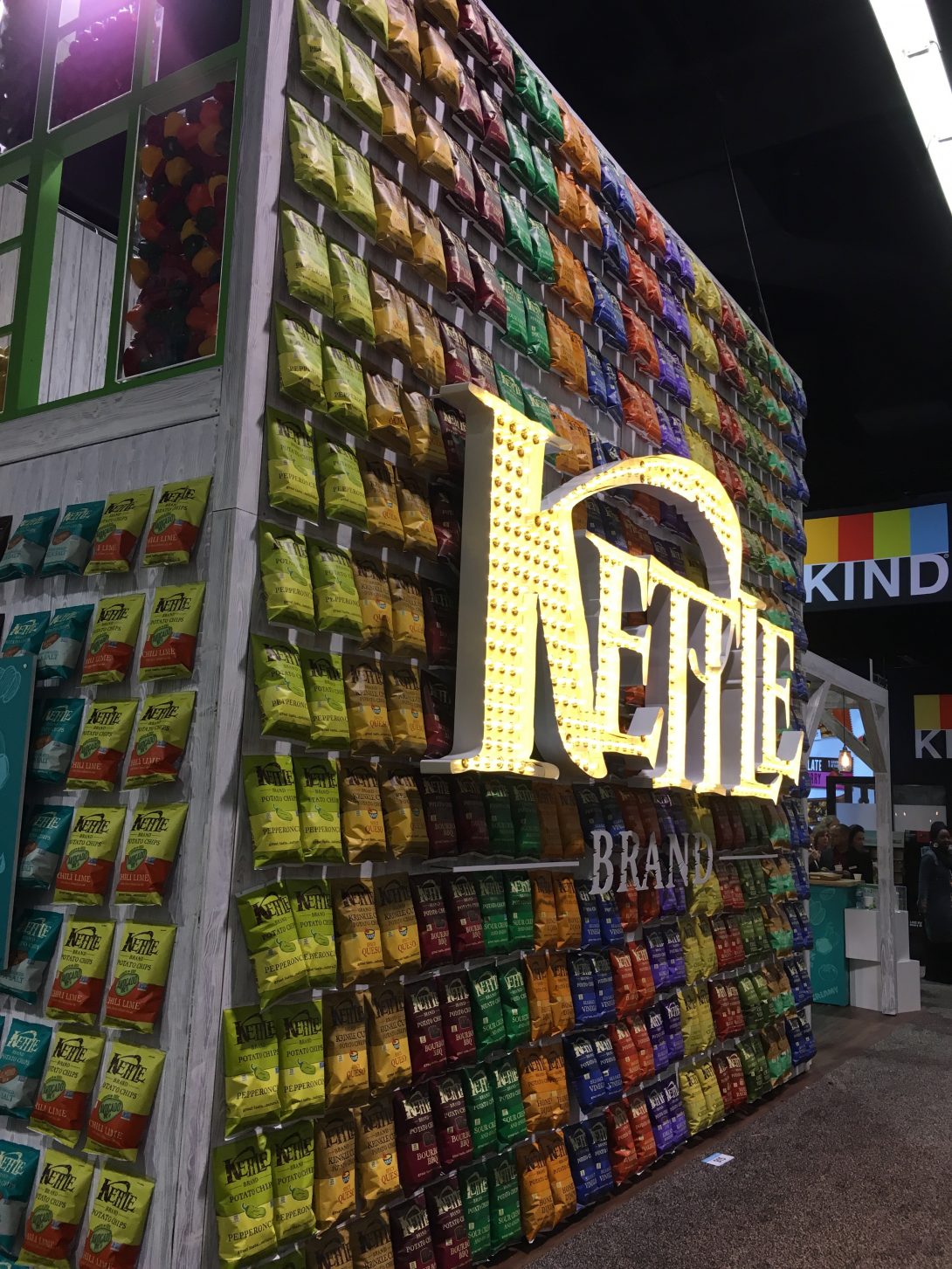
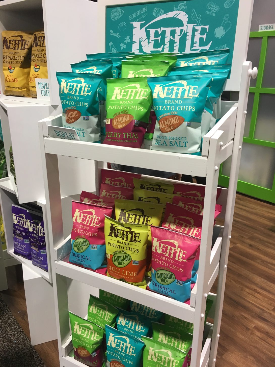
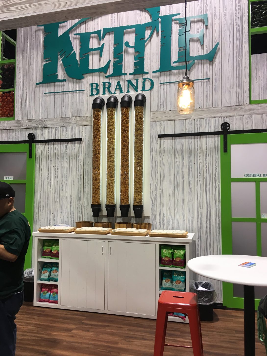
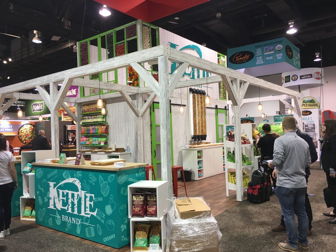
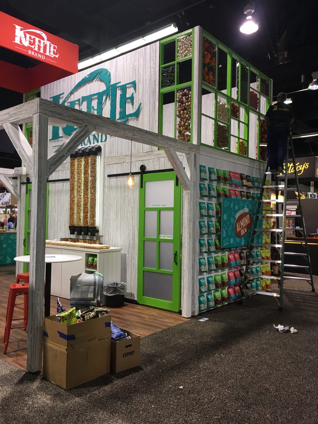
Best Big Brand Makeover: Kettle Foods

Kettle Foods started out as a small nut and chip maker in Salem, Oregon. In the past ten years or so the company has been bought and sold a handful of times and is currently operated as one of the major brands of the Snyder’s-Lance product suite. The island exhibit shows great color and ingenuity in piecing together many elements of the Kettle Brand.

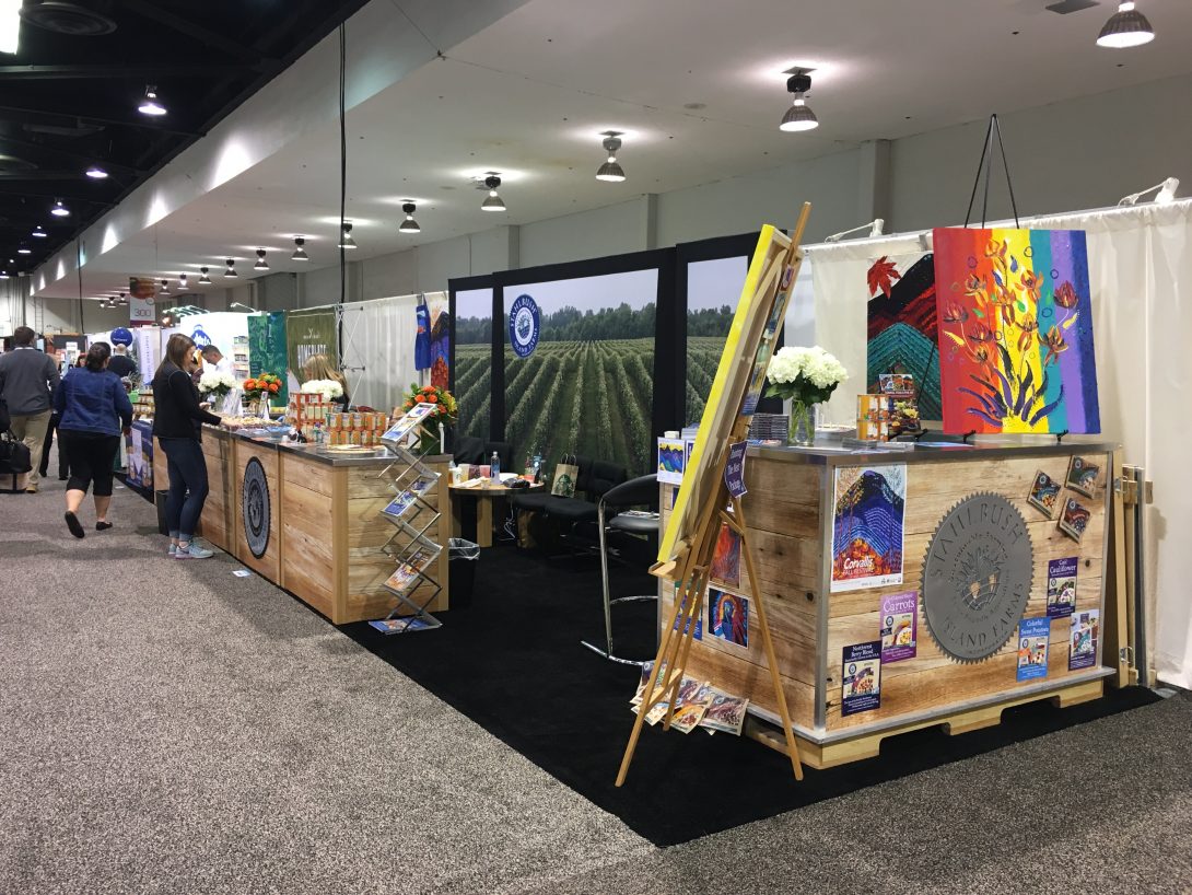
Best Client-Made Exhibit: Stahlbush Farms

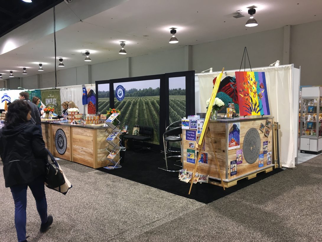
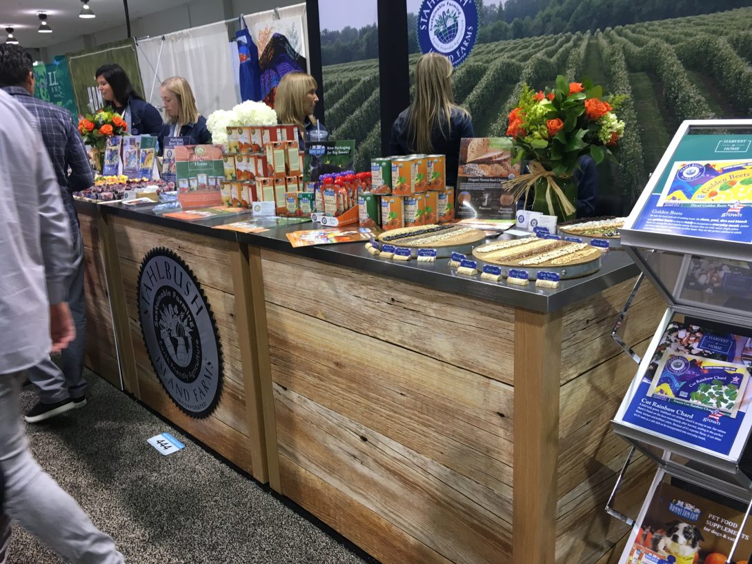
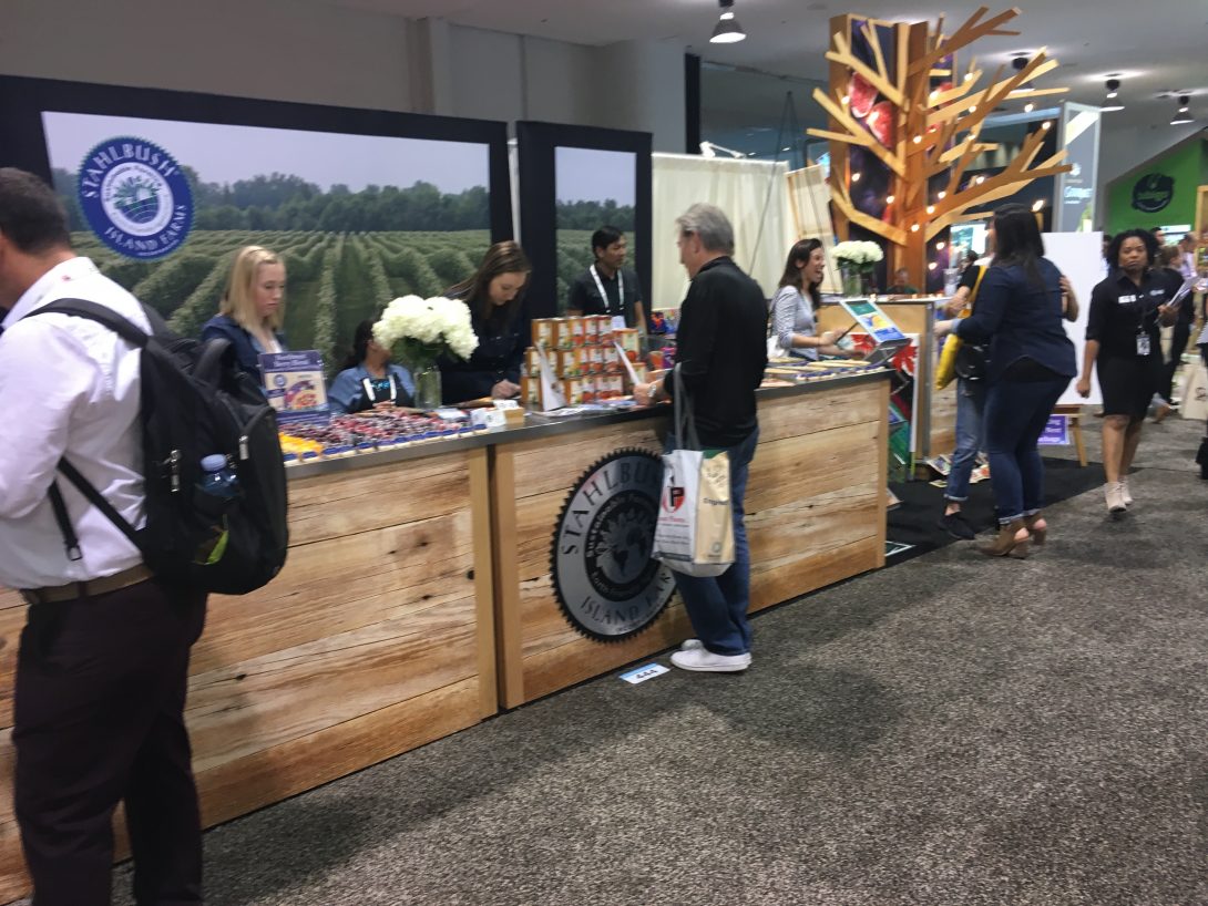
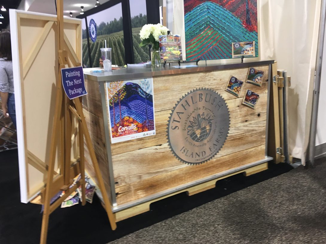
I’ve had the pleasure of knowing and working with the good folks at Stahlbush Farms, near Corvallis, Oregon, for several years. But when it came time to do a new booth, it finally came down to having their own fabrication shop create it. It’s built using crates that double as counters, and everything fits neatly into a couple of crates. Nicely done!

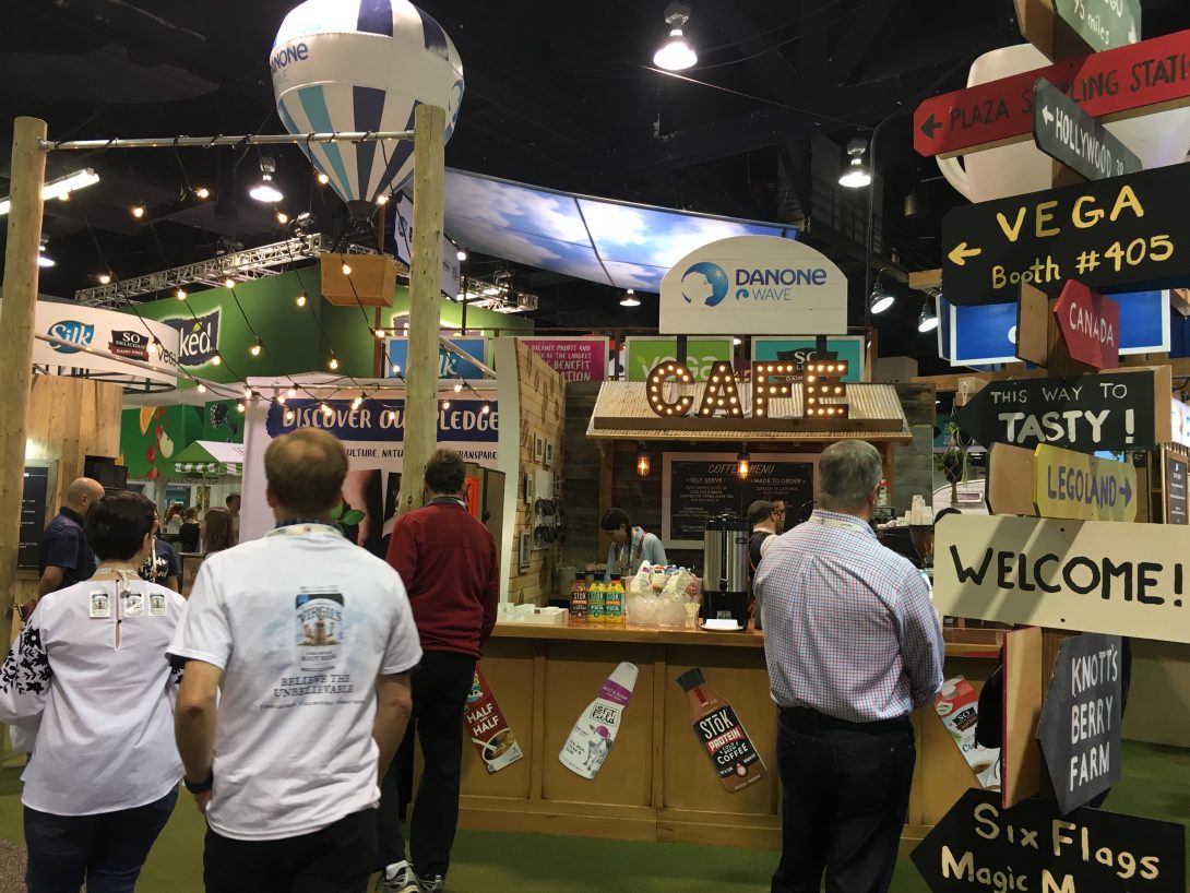
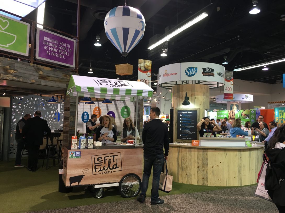
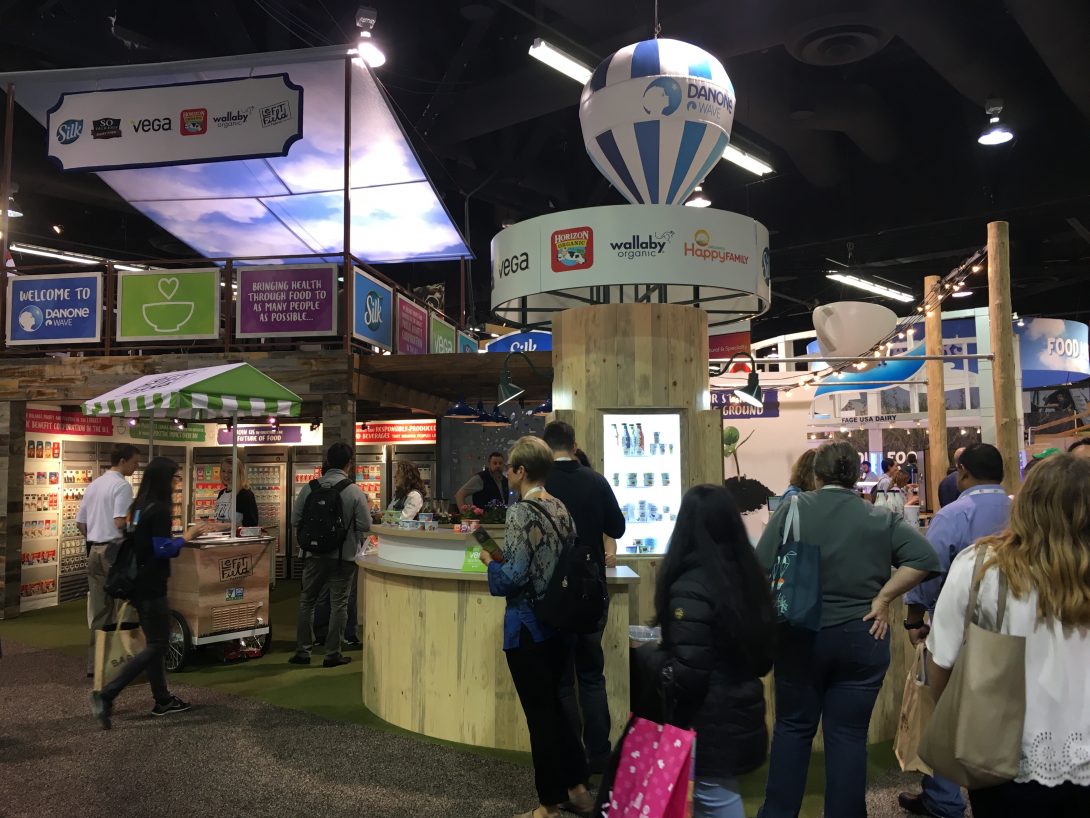
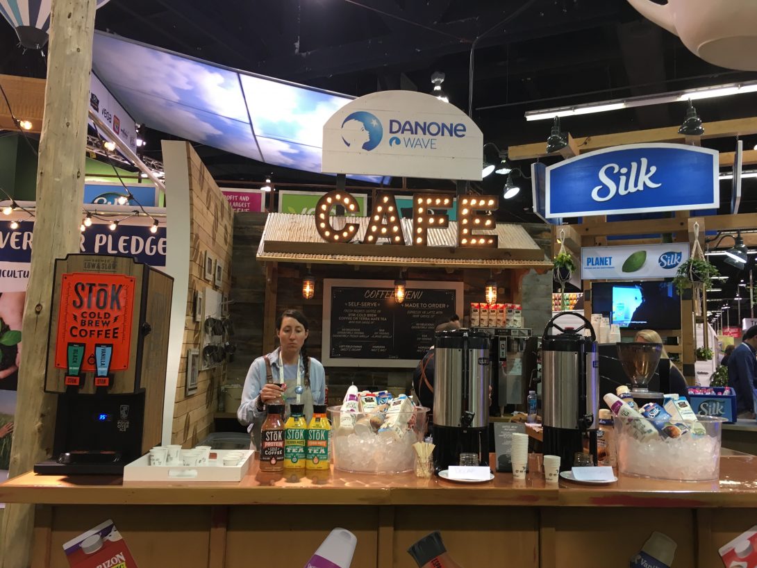
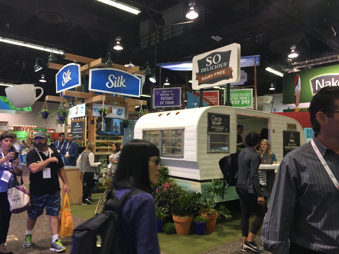
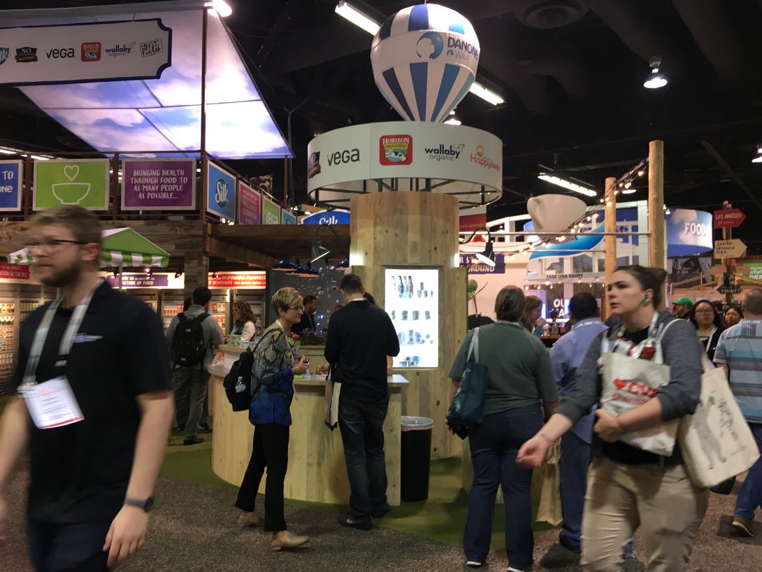
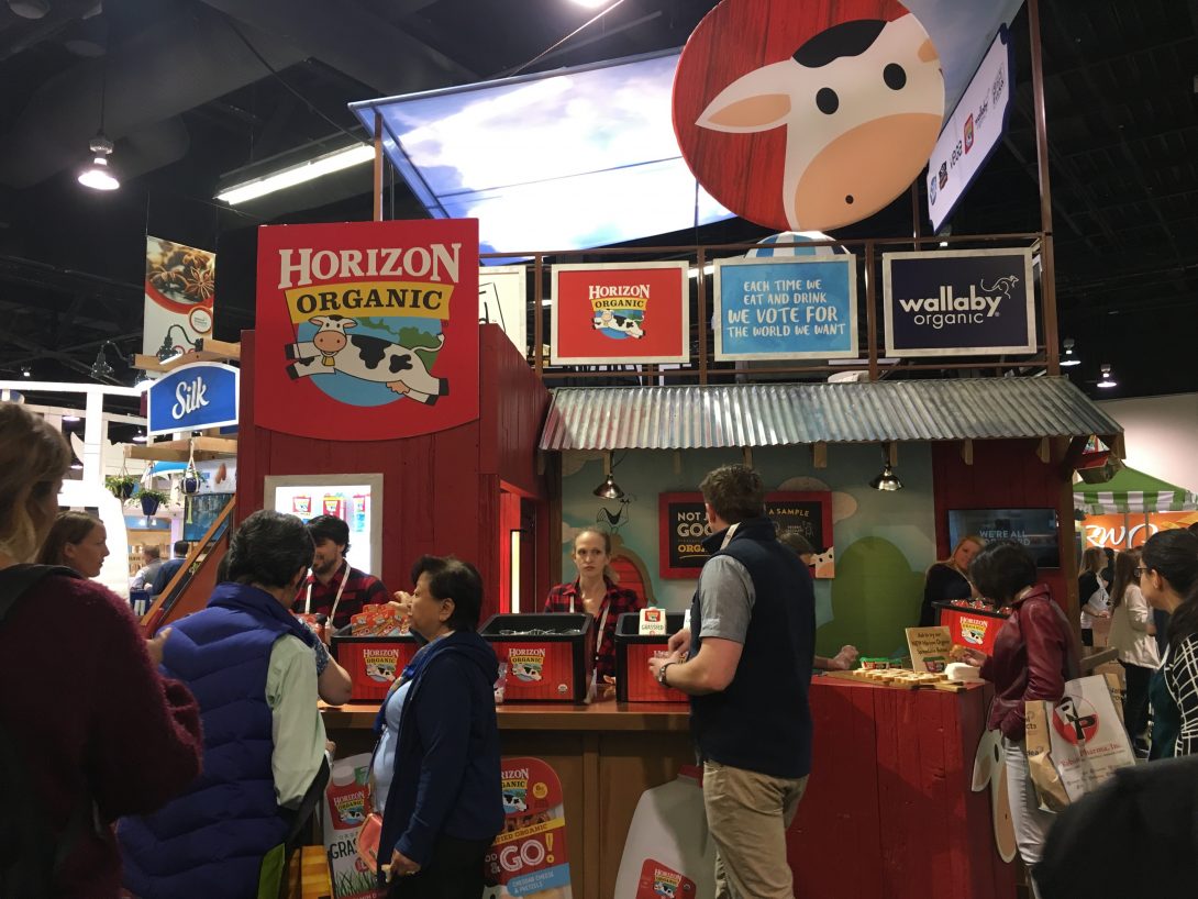
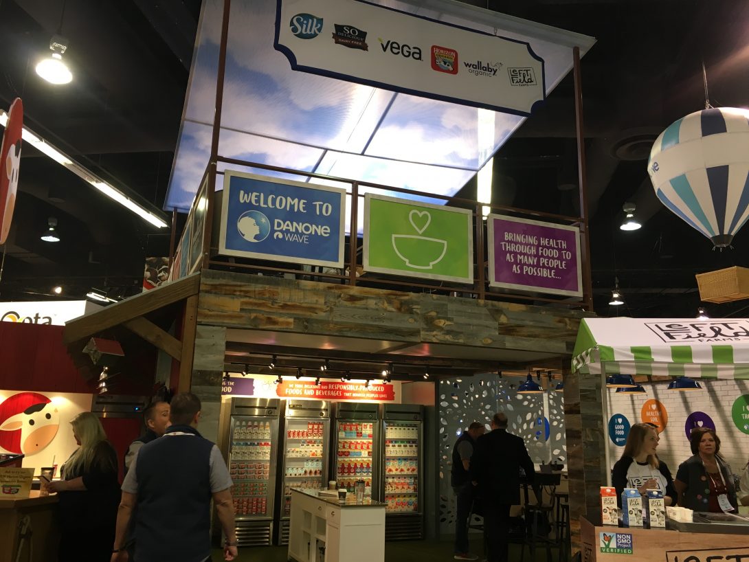
Best Kitchen Sink Exhibit – DanoneWave

I think they used to be White Wave, but now it’s DanoneWave, still offering brands under the Silk, Dannon, Oikos, SoDelicious, Wallaby Organic and many others. I’ve always stopped by their booths over the years and chatted and tasted and this year was no exception. There’s a lot going on here: carts, hot air balloons, colorful images, detailed woodwork, a random vehicle or three – seriously, you can just walk around the thing for fifteen minutes taking it in!

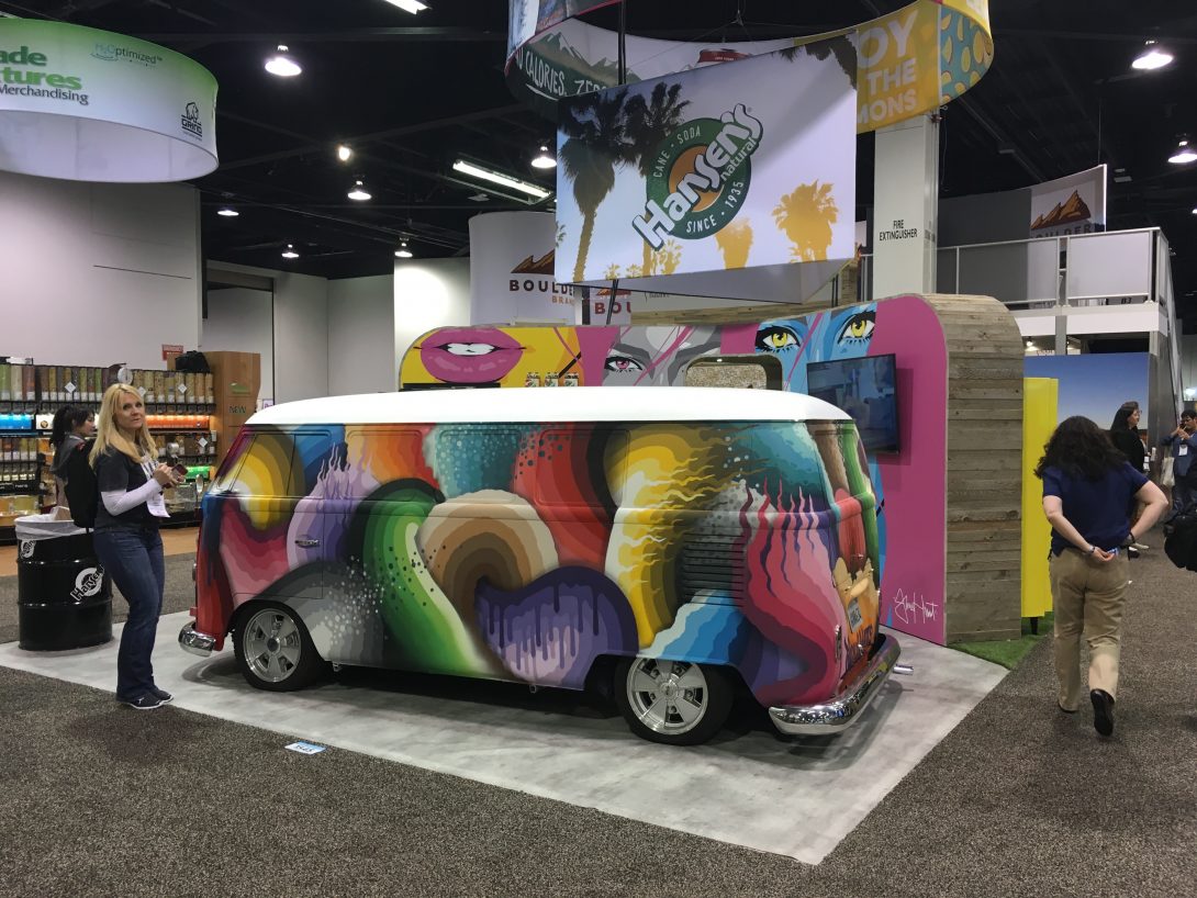
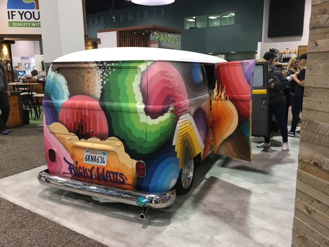
Best Retro Motor Vehicle Use – Hansen’s

A cool psychedelically painted hippie van? Ff course! There are a lot of vehicles that show up in booth spaces at Expo West, but this one catches your eyes like no other.

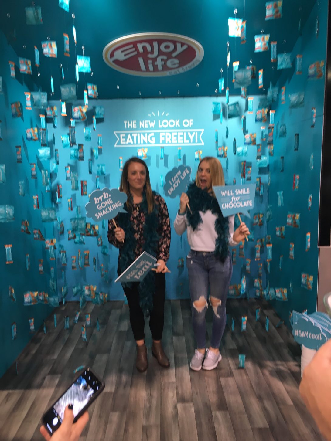
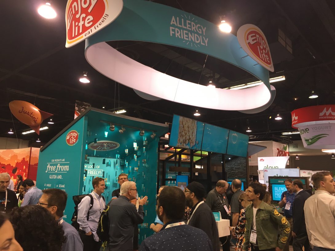
Best Photo Op – Enjoy Life

Enjoy Life has seen their exhibit grow significantly in the last few years, from a small inline to a dominating island. This year they showed of a pseudo-underwater photo alley that invited people to shoot and share. Yes, there were a lot of photo ops throughout the show, but this made the biggest impression.

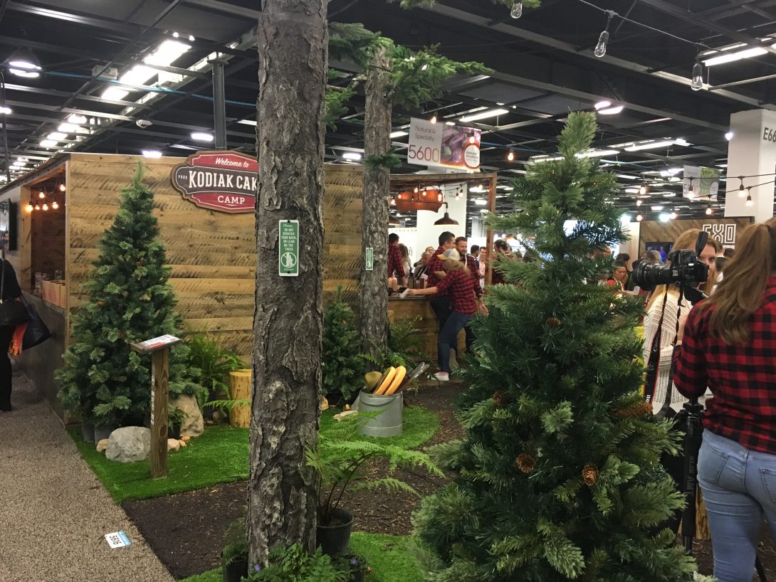
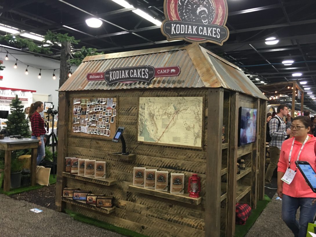
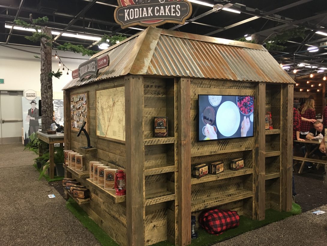
Best Rustic Exhibit – Kodiak Cakes

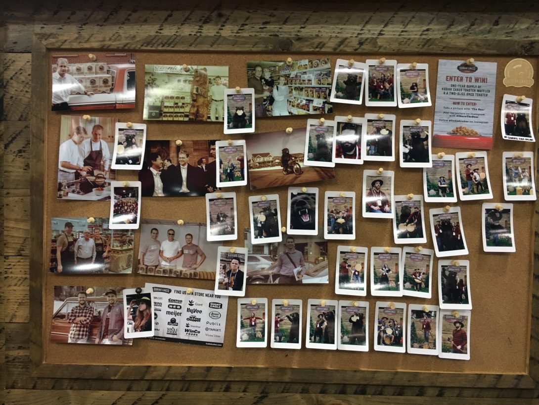
Kodiak Cakes of Park City, Utah, also had a great photo op section of their booth space, but I felt that the rest of the exhibit was more impressive. Beyond the photo op section was a forest, a lookout-like building and a wall of photos of booth visitors. A fun-loving and lively crew, too, passing out samples like crazy.

Best Simple Yet Powerful Statement Exhibit – Kashi

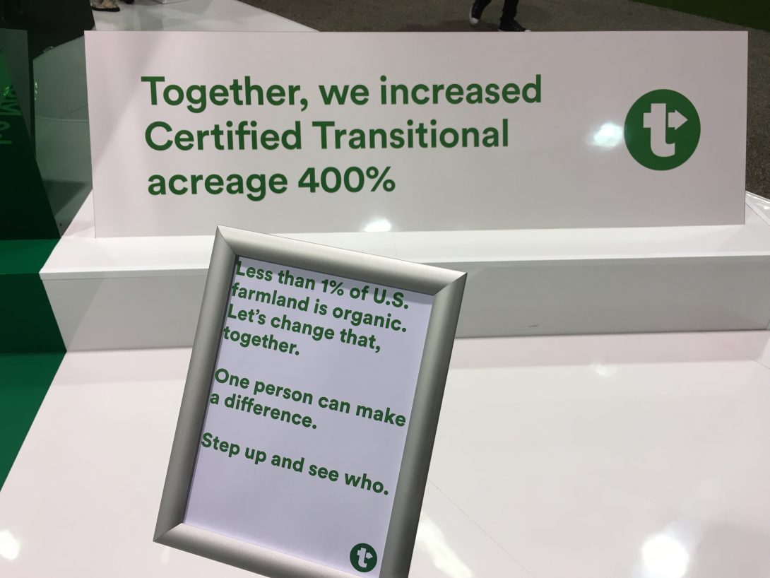
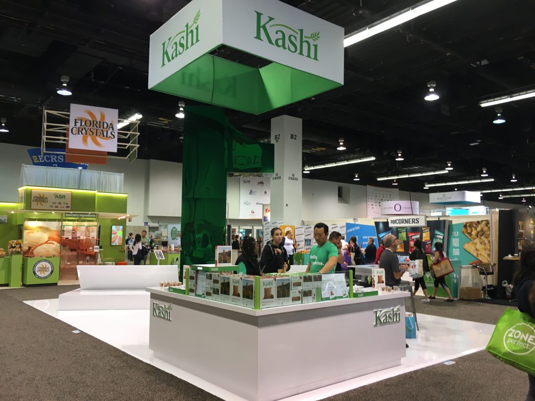
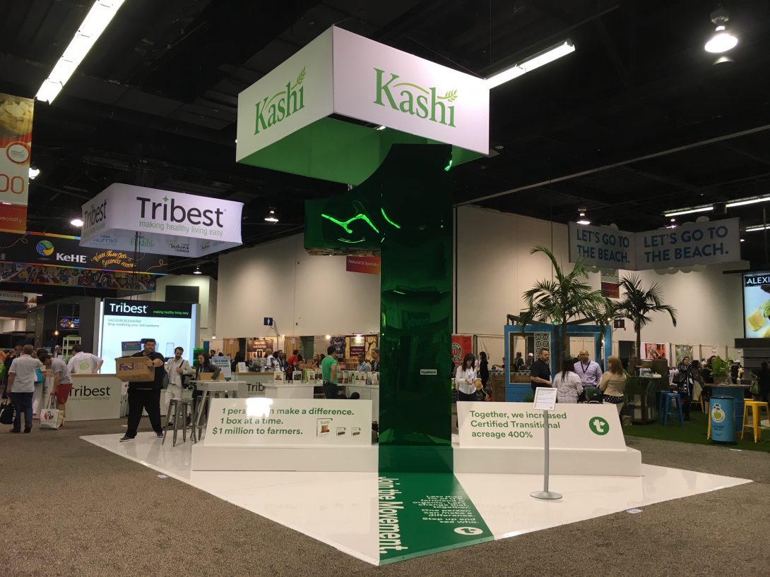
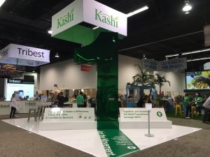
Last year, Kashi caught eyes with a simple statement with no brand ambassadors, no sampling – just a simple statement to support farmers in their transition to organic farming. This year they made a similar statement with a slightly modified exhibit. Powerful stuff.

Best Split Exhibit – Aqua Carpatica

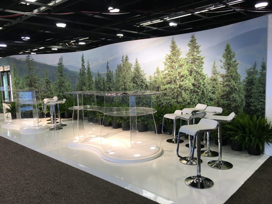
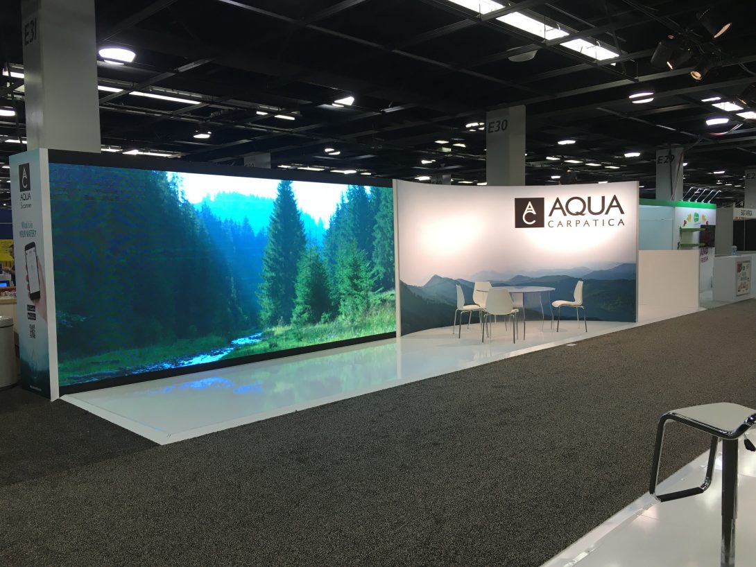
Downstairs in the busy ballroom at Expo West, it’s a little hard to stand out. But Aqua Carpatica of Romania booked two 10×20 spaces across the aisle from each other and dominated the space with a spare, almost ascetic approach to pitch the cleanliness of their water. It was capped by a giant video screen, around 8 x 12 feet, and some tables and chairs – but not much else. Very attention-getting!

Best Tribute to a Fallen Comrade – Clif Bar

I met John Anthony over a decade ago when Kettle Foods was a client, and John worked for them. A fun and engaging guy to talk to, he moved to Clif Bar, Nature’s Path, UNFI and CLIF’s White Road Investments. I was having lunch with an old Kettle Foods friend a few months prior to Expo West and mentioned that I’d run into John at the 2017 show. He said he’d heard that John had died unexpectedly in the fall of 2017. Clif Bar did a nice job in their tribute:

All right – on that note, we’ll wrap up this year’s TradeshowGuy Expo West Exhibit Awards. Hope you enjoyed. Sorry if we missed your booth – but hey, there were over 3,600 exhibitors this year. Maybe next year!

Check last year’s awards here.

TradeshowGuy Monday Morning Coffee, March 26, 2018: Shep Hyken

Shep Hyken is an author, speaker and customer service expert consultant that’s been doing his thing for decades. He was inducted into the National Speakers Association Hall of Fame in 2008, and it’s a pleasure to welcome him to the TradeshowGuy Monday Morning Coffee this week.


This week’s ONE GOOD THING: being a fan of the Portland Trailblazers!

The Ultimate Tradeshow Marketing Playlist

Music moves you, and so should the Ultimate Tradeshow Marketing Playlist. Yes, your list will look different from mine, I have no doubt. But take this list as a starting point in creating an ultimate tradeshow marketing playlist that will keep you moving and motivate you do have an awesome show next time.

And, yes, I’m old school:

“Hot Stuff” by Donna Summer. Your tradeshow booth is going to showing all of the hottest stuff you can muster, because you know that the only way to compete against your competitors is to have even hotter stuff.

“Electric Avenue” by Eddy Grant. Walk down any aisle at any tradeshow and you’ll wish you had sunglasses. Back lit graphics, light boxes, halogen lights, overhead lights. It’s all electric.

“Takin’ Care of Business” by Bachman Turner Overdrive. This was also Elvis’s mantra. Wherever it came from, it means you’re there to do some business, to meet and greet potential clients and customers. To take care of business! Check out Keith Moon introducing the band:

“Ballroom Blitz” by Sweet. Most every show I’ve been at has some action in the ballroom. Probably not the kind of action described in this classic tune, but how many other songs about ballrooms are you going to find? Big hair, big collars, men wearing makeup…what more could you ask from a mid-70s video?
“Make Me Smile” by Chicago. Any transaction in any situation goes better when you can make the other person smile.

“My Poor Brain” by the Foo Fighters. After three days of fielding questions, walking the floor and getting sore feet, setting up and dismantling exhibits, you’ll probably relate to this song.

“On the Road Again” by – take your pick – Canned Heat (my preference) or Willie Nelson. The great traveling songs.

“Come Together” by the Beatles. Couldn’t let the ultimate tradeshow marketing playlist get by without something by the Fab Four. Tradeshows, events and conferences are all about coming together for a common cause.

“Show Biz Kids” by Steely Dan. No, we’re not in the movie-making industry, but tradeshows are a lot about showing off the goods. It’s a Show. It’s Biz. And deep down, we’re Kids.

“Take It Easy” by the Eagles. When you’re stressed for a hundred reasons, and you need to take a break. Just take a deep breath and take it easy.

“Over and Over” by the Dave Clark Five. Once you get in the groove of doing tradeshows, this song will have more meaning for you. Do it over and over again!

“Magic” by any number of artists. We all try to create a little magic in our tradeshow booths. There’s an oldie called “Magic” by Pilot. Olivia Newton-John did a song of the same name. So did The Cars. And then there’s “Magical Mystery Tour” by the Beatles. And so on. All good stuff to inspire you to work your magic!

Let’s finish off this baker’s dozen list with “Jammin’” by Bob Marley and the Wailers. A tradeshow is chaotic, energetic, noisy, wild. And half the time you’re making things up as you go to accommodate the various questions and situations that come your way. So you are JAMMIN’!

https://youtu.be/RAW1wj3Lx0I

What would you add to the list?
The New Tradeshow Exhibit Classic: the LED Fabric Back Wall

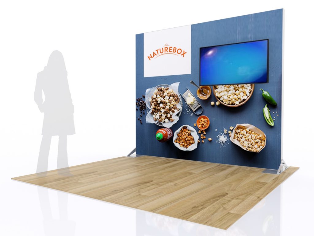
It used to be that the tradeshow exhibit classic was the curved pop-up back wall. It was quick and easy to setup, looked good and did what you wanted it to: gave you a respectable presence at a tradeshow booth in a 10×10 space.

That’s old. Now the new tradeshow exhibit classic booth is the LED fabric back wall, or light box. Dang, they look good. Here’s why.

tradeshow exhibit classic
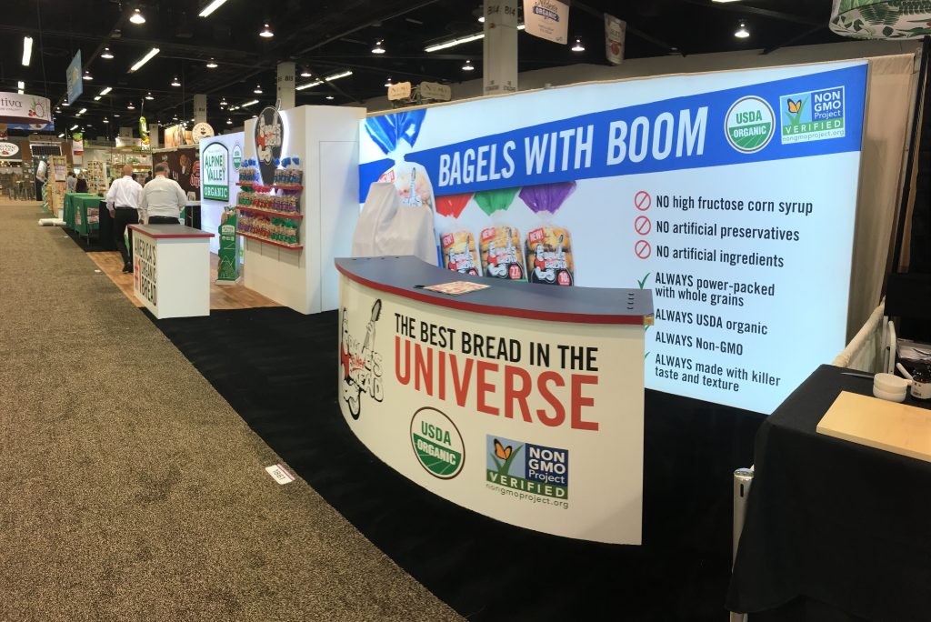
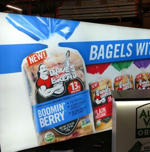
SEG backlit fabric back walls in Dave’s Killer Bread/Alpine Valley 10×40 custom tradeshow exhibit.

First, a fabric back wall is dominated by the SEG – silicone edge graphics – that are gorgeously printed using dye-sublimation. Then a thin silicone stop is sewn around the edge of the graphic, which is installed by inserting the silicone strip into a small channel in the facing edge of the frame. The SEG graphic is the main part of the new tradeshow exhibit classic, and the flexibility that comes with it makes it the new classic.

For starters, the graphic can be printed at any size. The frame can be made at virtually any size that fits in your booth space. The beauty of the flexibility is that you can add counters, closets, shelves, monitors or other items in and around the fabric back wall to create a unique exhibit.

But wait, there’s more!

The SEG graphic can be a free-standing unit, or it can mount to a wall, such as in a corporate conference or entrance, or it can be hung from the ceiling.

Now, let’s add another great feature: LED backlighting. The technology of LED lighting has improved drastically in the past decade, and the cost has plummeted, it seems that hardly anyone ever uses halogen lighting at tradeshows any more. The LED lights are inserted into the aluminum extrusion frame and, with the addition of an opaque white backside “blocker,” the light is spread evenly throughout the graphic.

With the technological advance in fabrics and printing, the printers who are keeping up with the current wave are able to offer extremely high-quality printing (blacks are BLACK, reds are RED!) on high-quality fabric to give you printing that is hard to distinguish from printing on paper.

tradeshow exhibit classic

Depending on your printing vendor, you can create giant fabric graphics up to 16’ high and as wide as you’d like with no seam. Finally, fabric (and the aluminum frame) can be recycled, and it will store and ship in small containers, saving you money all down the line.


Take a look at SEG options here.

TradeshowGuy Monday Morning Coffee: March 19, 2018: Nicky Omohundro

A recap of Natural Products Expo West from an official blogger’s point of view. Nicky Omohundro is a blogger and runs a website called Little Family Adventure, and we spoke about Expo West on this episode of TradeshowGuy Monday Morning Coffee.


This week’s ONE GOOD THING: a spreadsheet of all of the music played during the 4-year run of WKRP in Cincinnati.

Tradeshow Game Day: Are You Playing to Win?

I spent a lot of time as a youth on the baseball diamond and the basketball court. One coach always stressed the importance of GAME DAY. Put on your game face! Be ready for the big game! In other words, bring even more focus and attitude to the game. When you are done practicing, and you’re facing an opponent, it counts. It’s Game Day.

tradeshow ga

You could say the same thing about just about anything. But when it comes to tradeshows, bringing your Game Face and knowing that you’re competing with some very challenging companies means it’s you vs. the rest of the hall. Your competitors are (assumedly) going to bring their game faces. Simple: they want to talk to all the people they can. They want to talk to all the people you want to talk to.

So even though it’s a friendly event, the competition is toe-to-toe, and if you want to come out on top, that means bring your game face as soon as the clock starts.

Booth staffers should know their products and services. They should know how to engage an attendee in a meaningful fashion. If a visitor turns out to be a genuine lead, they should know how to capture all of the pertinent information that is required at that step, and how that information will be sent back to the sales team.

Your exhibit should be clean. Even if it means hiring the show services cleaners to vacuum the booth space every morning and take the trash away. Personal items should be out of site. If at all possible, don’t store things behind your exhibit. Some people will see the clutter and even though they understand the reason for it, it does reflect on their overall impression.

The first thing a visitor sees is your exhibit. The second thing they see is a person standing in the booth space. What they see from that person is critical to how they will respond. If the person is ready and wearing their tradeshow game face, the visitor will engage at a higher rate and be more responsive to the staffer. If the staffer is standing there looking bored, or staring at his phone, or worst of all, eating, the visitor will likely keep on moving. And there goes your lead. Simply because someone in your booth was not ready to be in the game. In a sports situation, if the coach puts someone into the game and they’re not ready, points will be scored against them. Or they’ll fail to respond when they should. It’s an easy way to let your competition beat you.

You don’t want to let the competition beat you because you’re not wearing your game face, do you? If they beat you, it should be fair and square: because they had a product or service that better suited the visitor. But if they beat you because you’re not mentally in the game, that’s an easy way to give up points. And the game.

So yeah, put on your game face at all times in the booth!

Grab our free report “7 Questions You’ll Never Ask Your Exhibit House” – click here!

TradeshowGuy Exhibits at Expo West

Fifteen years ago, my very first client, Kettle Foods, made an appearance at Natural Products Expo West with a custom 20×20 exhibit. Since then, I’ve been back every year, many times with new clients, and updated exhibits with current clients. Kettle Foods, by the way, has been sold at least three times since the old days and the brand is now owned and managed by Snyder’s-Lance.

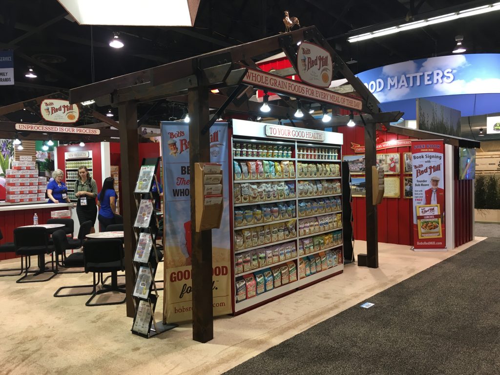
A few years after that, I worked with Bob’s Red Mill to debut a new 20×20 island. Since then, we’ve created a new 30×30 exhibit, which has since increased to a 30×40. The Bob’s Red Mill marketing team is on top of updates every year with new graphics to promote new products.

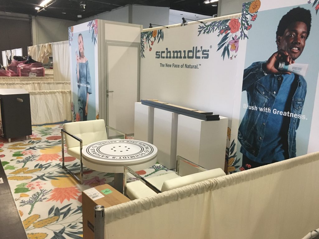
This year we saw expanded and/or upgraded versions of current clients. Schmidt’s Naturals of Portland (recently acquired by Unilever), kept the same size, but added some custom product display units, and washed away the previous gray-ish look and brought forward their new array of stunning colors.

Schmidt's Naturals

Dave’s Killer Bread/Alpine Valley increased the size of their exhibit from 10×30 to 10×40, adding new backlit graphics and a new custom greeting counter with LED-highlights.

Dave's Killer Bread at Expo West

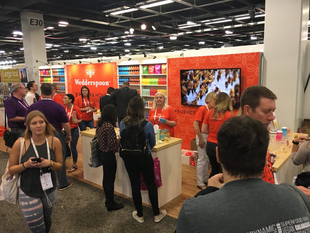
Wedderspoon Manuka Honey increased the size of their exhibit from 10×20 to 10×30, adding in new fabric graphics to their wooden display shelving units. We also fabricated a new hexagon shaped, LED highlighted, charging table (reportedly it was loved by visitors as they sat and talked business). A new 60″ monitor capped it off.

Wedderspoon Manuka Honey at Expo West


Natural Products Expo West: Days Three and Four

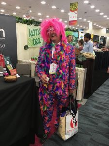
Babies – lots of babies – along with young kids, the occasional dog, lots of mascots/costumes, and a few weirdly dressed people. Typical Expo West!

natural products expo west

Saturday night – Day Three of Expo West – was spent hanging out with Oregon Business folks at their annual soiree at McCormick and Schmicks, and later, producing Monday Morning’s vlog/podcast. Now let me see if I can manage a recap of the final two days of Expo West.

Dozens of people I spoke with agreed that the show was somewhere between amazing and fantastic, or perhaps crazy-busy and overwhelming. Just saw the press release this morning from New Hope which showed that there were over 85,000 attendees, and 3,521 exhibiting companies, including more than 600 first-time exhibitors.

I mentioned in my vlog/podcast that I was impressed by the great detail that exhibit designers go to to capture a brand’s essence. I also got into a conversation with one booth staffer about the wild colors that are everywhere in the show. “Can you imagine what this show would be like without all of those colors?” he asked. Agreed. Bright and bold colors everywhere.

There were also a lot of BIG hanging signs, from 40’x40’ aluminum structures/fabric graphics to wooden panels and what looked like carved wooden signs. Does anybody look up these days at shows?

natural products expo west

There were a lot of clever interactive things going on at booths, offering people an opportunity to walk into the booth space and do something. It’s always a great way to capture attention. I counted at least a dozen “selfie” stations, with some including a circular light where you can take a selfie where you’re fully and evenly lit, and some stations where they’ll take a photo and then email it to you. One of the most fascinating and eye-catching interactives was a Rube Goldberg contraption in the KIND Snacks booth, showing how KIND snacks are made from start to finish.

There were many opportunities to tweet a hashtag with a photo for a chance to win something, so it was good to see the social media tie-in as well. Although, frankly, it almost seems run-of-the-mill, when six or seven years ago social media was all so new!

Another thing I noticed in booth fabrication was the use of see-through printed fabric. Everywhere I turned there was another example. See-through fabric is very useful in creating a barrier, but the see-through aspect gives you a view of what’s beyond it, without intruding on people that might be in a meeting room for example.

This was my sixteenth consecutive time I’ve attended Expo West in support of clients, for years, the halls have been set up in a specific configuration: foods, manufacturing, supplements, new products and more all have had their own areas. That didn’t change this year, but the layout changed – drastically – and it was interesting to see how the whole layout was essentially flopped from one end to the other. Lots of comments from people who weren’t sure how it worked, but from my view it worked just fine. Took a little getting used to.

Sunday – Day Four – started off much slower, in terms of visitors roaming the aisles. I was there at opening of ten o’clock, and the back reaches of the halls were lightly travelled. it didn’t take long for that to pick up. By late morning, it seemed almost as busy as previous days. It did give me a chance to speak to more people without feeling rushed. By 2:30 to 3 o’clock, exhibitors were offering all of their samples to attendees so they wouldn’t have to transport them back to HQ. And of course, some folks were pulling down banner stands and packing up suitcases by 3 o’clock. Ya ain’t s’posed to do that, but it happens anyway. Planes to catch.

natural products expo west

And finally, I know of no other show where, frankly, you never need to eat a meal offsite for ate least three days. Virtually every company is sampling the goods, from sausage, bagels, bread, toast and eggs to energy bars, drinks, coffee, teas, juices and other goodies. It’s easy to consume a couple of thousand calories without even batting an eye. Even if you try to avoid eating much, you’ll end up taking bite-sized samples here and there.

And don’t get me started on the varieties of chocolates.

© Copyright 2016 | Oregon Blue Rock, LLC
Tradeshow Guy Blog by Tim Patterson

Call 800-654-6946 for Prompt Service
Copyrighted.com Registered & Protected <br />
QA4E-AZFW-VWIR-5NYJ