At tradeshows, the game is all about attracting attention. Have you considered a custom-printed floor?
Every client we’ve worked with that has chosen to use a custom graphic on a printed floor has been happy with the result. They like it, it looks good with the rest of the booth, and it gets positive comments from their visitors.
There are a lot of different floor choices, but what I’m talking about here is bringing the area below your feet into the overall graphic design of the exhibit and booth area. When you incorporate a branding element into the floor as part of the overall look, it adds POP and depth. Take a look at these examples:
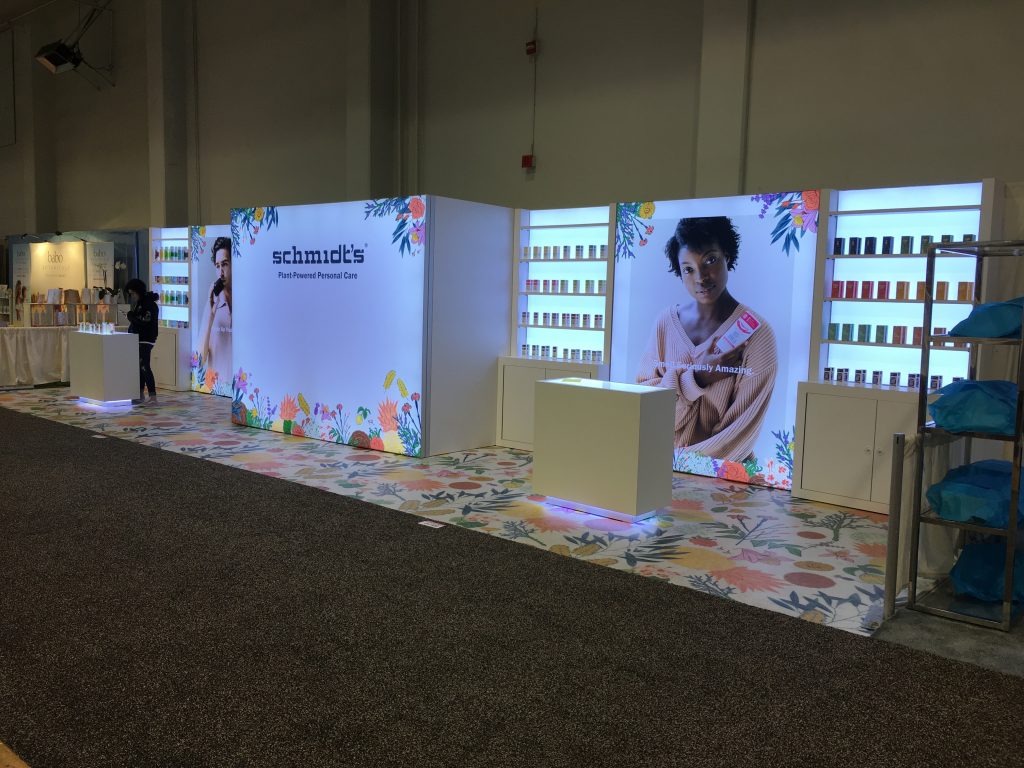
With Schmidt’s Naturals, their iconic flowery design spreads across the 10×40 space. It reinforces their overall brand. And when added to the clean and spare look of the rest of the exhibit elements, the colorful floor stands out.

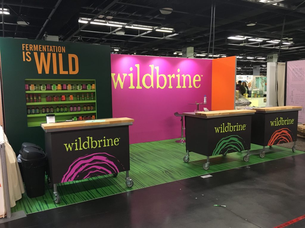
Wildbrine chose a custom-printed floor that also added to the overall color scheme. The striped green and black floor added another dimension to the bright colors throughout the rest of their simple layout.

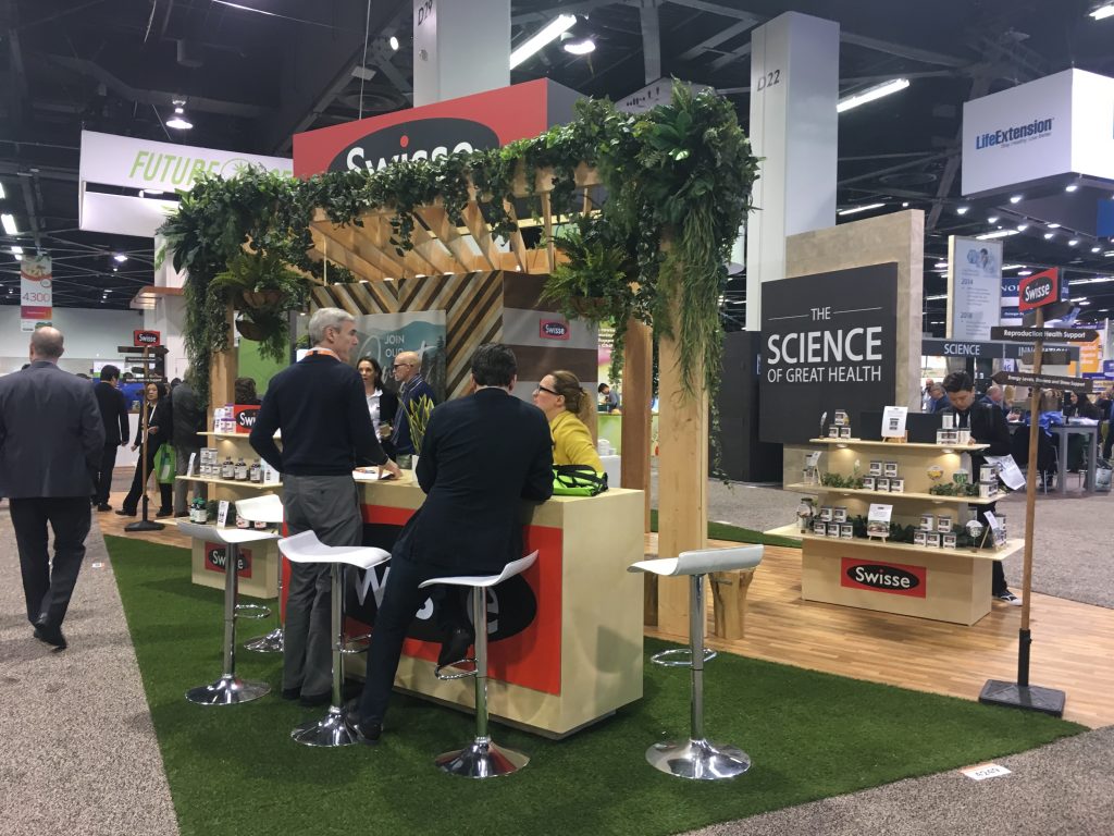
Of course, you can create a custom look without printing a graphic below your feet. Another way is to use typical flooring but present it in unusual cuts or angles:

Dave’s Killer Bread/Alpine Valley’s custom-cut floor shows separation between two brands. 
Another great example of a custom cut 
Colorful tiles stand out! 
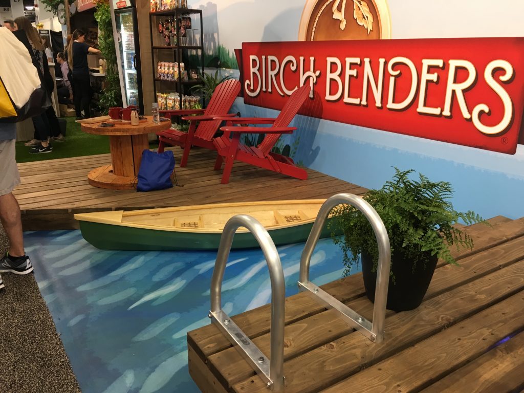
Bring on the deck and a fake pool at Birch Benders
Whatever flooring you choose, there are any number of ways to make it stand out.
Disclosure: Dave’s Killer Bread, Schmidt’s Naturals and Wildbrine are clients of TradeshowGuy Exhibits; the others shown here are not.

