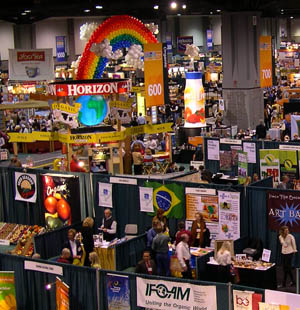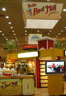
Funny, you don’t think of tradeshow graphics as actually working. Like, doing a job. More like you just hire a designer to put a nice logo up with a spiffy enticing photo and perhaps a photo and call it good.
But if that’s all you do, you’re probably not getting your money’s worth.
Your graphics should be doing a JOB. A BIG job. The biggest in your booth.
First, your graphics should stop people in their tracks. Admittedly, in a crowded chaotic tradeshow floor, it’s asking a lot of those graphics to actually stop people. But if you can get your graphics to at least slow someone down enough to see what your booth is all about, that’s probably enough. After all, most people at a show are there to learn and see what’s new and are actually looking to be engaged in show-stopping stuff.
How to get your graphics to stop someone or slow them down? A wild beautiful photo; a bold, engaging statement; a challenging question.
Next, your graphics should qualify and disqualify show attendees as much as possible. If your graphic is inviting EVERYBODY to your booth chances are a lot of those people are NOT potential clients or customers. But if you ask the right question and show the right photo, illustration or graphic, the visitor can quickly deduce if your product or service works for them. They’re qualified or disqualified before they even enter the booth. Job well done.
Finally, your graphics should appear in a hierarchy of most important to least important. You’ve seen all of those expensive overhead hanging banners? They almost always are of a recognizable logo or brand. The overhead banner helps shout out your name from the rooftops. Literally. It helps people find your booth from halfway across the hall.

So: top of the hierarchy: Your logo. Next: the important tagline or question that engages the mind and helps to qualify or disqualify.
Third: the sub-headline, which supports or complements the main headline. Often this appears as the last item – beyond three you’re getting into the kind of text and verbiage that most people won’t read unless they’re your absolute target market. Does this mean you shouldn’t include it? Of course you should – if you have room and it makes overall sense and is still engaging to your core target.
The fourth and final part of your graphic package in the hierarchy would be any supporting literature. In rare cases it might be a set of graphics with more detailed information, such as bullet points, that add to the overall description.
One additional piece which a lot of companies now add is the video element. Even though the video likely has a soundtrack, in most tradeshow environments the sound will either be ignored or lost in the ambient noise. It doesn’t mean that the soundtrack should be ignored or thought of as a throwaway piece of information, because it can be useful in other situations. It just means that as part of your overall tradeshow graphics package, the video should have strong images and an engaging storyline without having to rely on the soundtrack or narrator.
One final aside: it’s common for people to underestimate the cost of their graphic design and production, and because of that end up cutting corners.
If you really want your graphics to do the job they are capable of doing, be realistic about the budget and give them the impact they deserve.


Are Your Tradeshow Graphics Doing Their Job? « Expopedia ,
[…] Are Your Tradeshow Graphics Doing Their Job? By expopedia Funny, you don’t think of tradeshow graphics as actually working. Like, doing a job. More like you just hire a designer to put a nice logo up with a spiffy enticing photo and perhaps a photo and call it good. But if that’s all you do, you& … Continue reading … […]
Heidi Thorne ,
Another great article, Tim! Appreciate two of the key takeaways:
1) Video needs strong images and shouldn’t rely on the soundtrack. I would follow that up with your video run on a laptop does not qualify as a video feature in your booth. (Can’t tell you how many times I’ve seen that!) If you’re going to do video, go large or go home as they say.
2) Don’t cut corners on graphic design. I think with the advent of personal desktop publishing, we’re seeing this happen more and more. No, folks, clip art from your office productivity software is not the same as graphic design. Hire the pros so that you have scalable art that can be upsized and resized to meet your various graphic needs within your booth area. As well, a graphics pro can marry your show graphics to all of your other marketing elements to build a consistent, powerful image.
Tim Patterson ,
Heidi, I would add one more comment to your 2nd point: a typical graphic designer is usually trained in smaller items: brochures, letterhead, small newspaper or magazine ads, etc. Most do NOT design for large-scale digital output for a tradeshow presentation. There are issues involving resolution and preparation for printing that may not be addressed by the smaller projects. When looking to hire a new tradeshow graphic designer, make sure you ask about their experience in designing large-scale graphics.
Heidi Thorne ,
Totally agree! The evidence of people hiring “small stuff” designers to do “big stuff” like billboards, tradeshow graphics, etc. is littered all over America’s highways. I better end my comments here since that’s one of my favorite and continuing rants.
Werbegeschenke ,
I can’t say I totally agree that a designer who is used to designing brochures can’t turn his hand (or mac) to larger trade show imagery. Also, in terms of quality, most designers I know are resolution “freaks”, I do agree with you though Tim, ask first about experience and see if you can get images of past work they’ve done (most designers will keep pics of the trade shows they’ve designed if they have managed to get to the show themselves!) Great blog!