Just returned from Expo West in Anaheim where I had a number of tradeshow booth clients, including Bob’s Red Mill, gDiapers, Aisle7 and Hyland’s. One of my goals at this particular show was to do informal assessments of a couple of dozen booths, including booths that I picked at random, and those of companies that responded to my 2-minute video I posted about ten days before the show.
Since I have a handful of client booths at the show, I am disqualifying them from winning any awards (although I think they all were top-noth projects)!
Before getting to the awards, a few comments: first, these are for fun only. Nobody actually wins anything substantial except a mention in this blog. Second, while I spotted a number of booths that would qualify for awards such as ‘Most Cluttered,’ ‘Most Confusing’ and ‘Shouldn’t Even Be Here Because Mom Didn’t Approve it’ the point is not to speak ill of booths that should be improved. Hey, I can’t help everybody, right?
So, without furthre adieu, let’s begin:
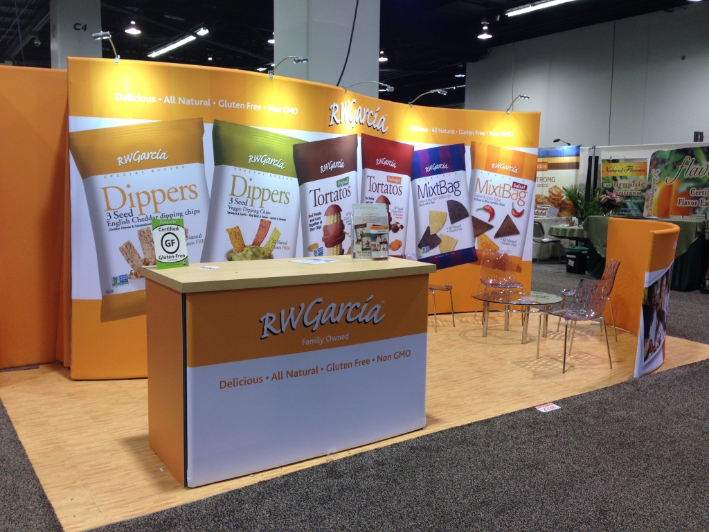
Cleanest Look & Most Pristine Representation of a Brand: R .W. Garcia. Not a custom booth, but an aluminum frame-and-fabric construction, nonetheless this captured my attention with its attention to detail. The graphical heirarchy was clean: company name at the top with secondary bullet points describing the company’s products. The back wall graphic was dominated by images of chip bags, so there was no doubt about the company’s products.
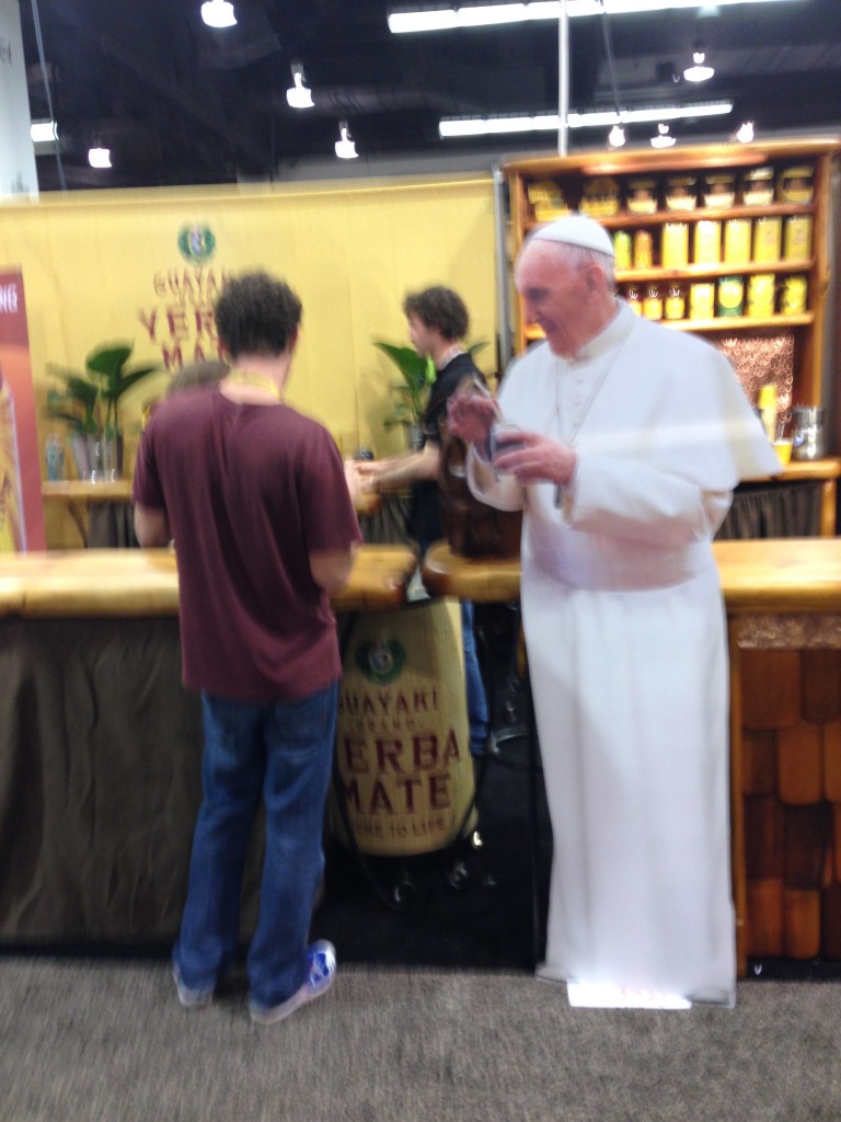
Most Iconic Use of an Icon: Guayaki Brand Yerba Mate. Okay, I only caught one photo of this, but the use of a life-size cutout of the Pope drinking tea stopped me in my tracks and made me want to have Yerba Mate with His Holiness.
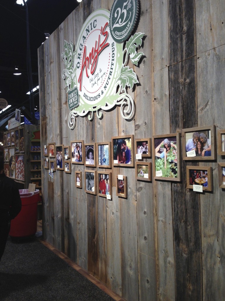
Best Story on a Booth: Amy’s Kitchen debuted their new booth in 2013, and this 30×30 island clearly captures the company’s natural image, including a back wall section with photos and captions detailing the company’s history.
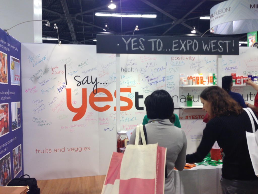
Best Interactive Booth: While there were several booths that invited attendees to write notes on a board, YesTo asked people to write what they would say YES to.
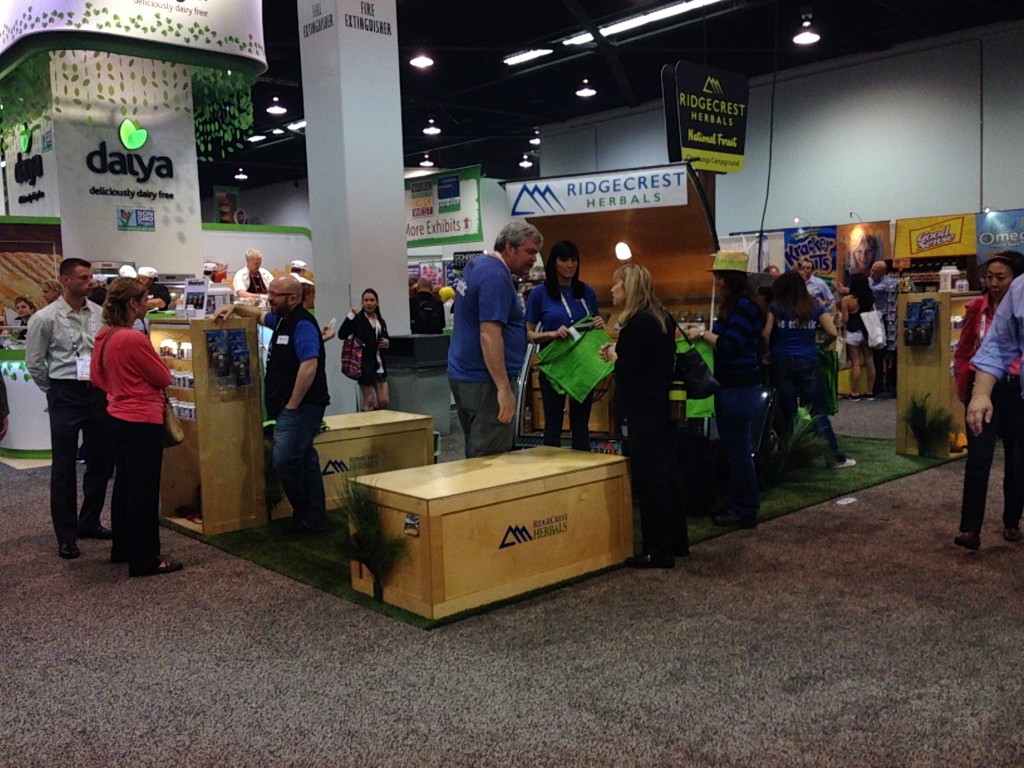
Best Use of Shipping Crates: Several booths use shipping crates as part of their booth to save on time and shipping expense. Ridgecrest Herbals showed how its done with branded shipping crates that doubled as counters, benches and product display.
Best Dancing Mascot: SweetLeaf, with their Sweet Drops Sweetener doing his/her shaking to a live guitarist.
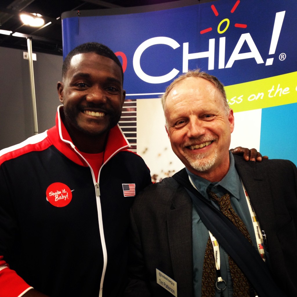
Best Use of an Olympic Stud: Drink Chia! How can you top an impromptu aisle race featuring Olympic athlete Justin Gatlin? (check out his race here)
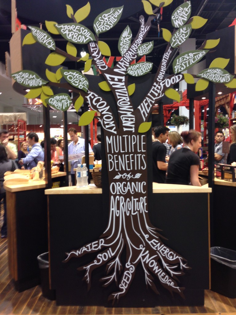
Most Elaborate Use of Booth: Clif Bar. The 40×40 island that Clif Bar used to represent their brand included not one, but two enclosed client meeting rooms, two sample stations, messaging that showed their love of fun and helping Mother Earth and the creative use of repurposing old wood for something new. And more. Hanging plants in wooden boxes. Bicycle gears. Old window frames. The steep usage of the word ‘organic.’ With all of this disparate yet congruent elements, this booth came close to a Terry Gilliam dream (go ahead, look him up. I’ll wait.).
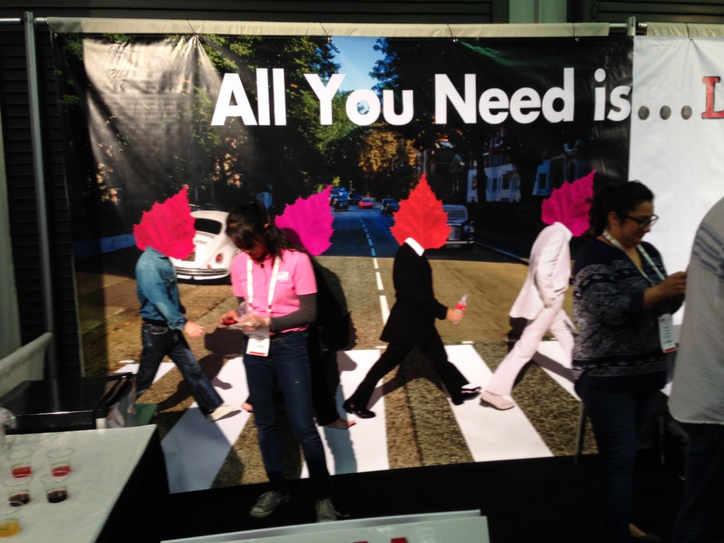
And finally, Best MashUp of a Beatles Album Cover: Love Birch. With their wacky replacement of John, Paul, George and Ringo’s heads with leaves, Love Birch took the iconic Abbey Road album cover and turned it on its head, and in the process stopped people in their tracks.
This is the 13th consecutive year that I’ve attended Expo West, and it still seems fresh and fun, bigger and bolder and more overwhelming every year.
A few final observations: while there was a lot of use of social media this year, it didn’t seem to be anything out of the norm for most companies. Several companies invited attendees to ‘like’ them on Facebook, or tweet out a photo for a prize, but not as many as you might think would.
I was also on the lookout for QR Codes, and was a bit surprised to find only one on display. I had tasked myself with testing each and every QR Code I ran across to see if it worked. This one didn’t. The invitation next to the code was to ‘like’ us on Facebook, yet when I scanned the code, I was taken to a home page of a website – not optimized for a smartphone – and there was no indication of how to get to Facebook from there.
With QR Codes seemingly fading from popularity at least at this year’s show, perhaps that’s a good thing since it seems that so many QR Codes fail at least one part of the test: tell people what they get when they scan, make sure its optimized for a smartphone, and then test it all to make sure it works.

