This is number 5 in a series. Check the previous articles here:
Let’s tackle the BIGGEST part of your tradeshow strategy – at least in terms of potential cost.
The BOOTH.

We can agree that booths come in all shapes and sizes. We can also agree that they usually cost a LOT MORE than you anticipated, right?
Let’s leave the cost and size up to your particular company’s available budget, goals and marketing presence. For some companies, a 20×30 booth would be a huge investment, more than they could possibly justify. For others, a 70×100 might be smaller than they’re used to. So for now we’ll dispense with the actual size and cost and focus on other important elements.
Let’s start with the BRAND. Your booth should convey, at a glance, the look and feel of your brand. For some, that’s a natural wood look. For others, it means a high-tech look straight out of Star Trek. That doesn’t mean that a rootsy, earth-mama brand couldn’t get away with an aluminum structure with fabric graphics. Those decisions are typically made through long and detailed conversations with a 3D booth designer, the company’s marketing team and a booth fabricator. But still, the goal should be that when a visitor sees the booth and the company’s name, it evokes a FEELING that is in congruence with what the company wants the visitor to feel. If not, somebody messed up.
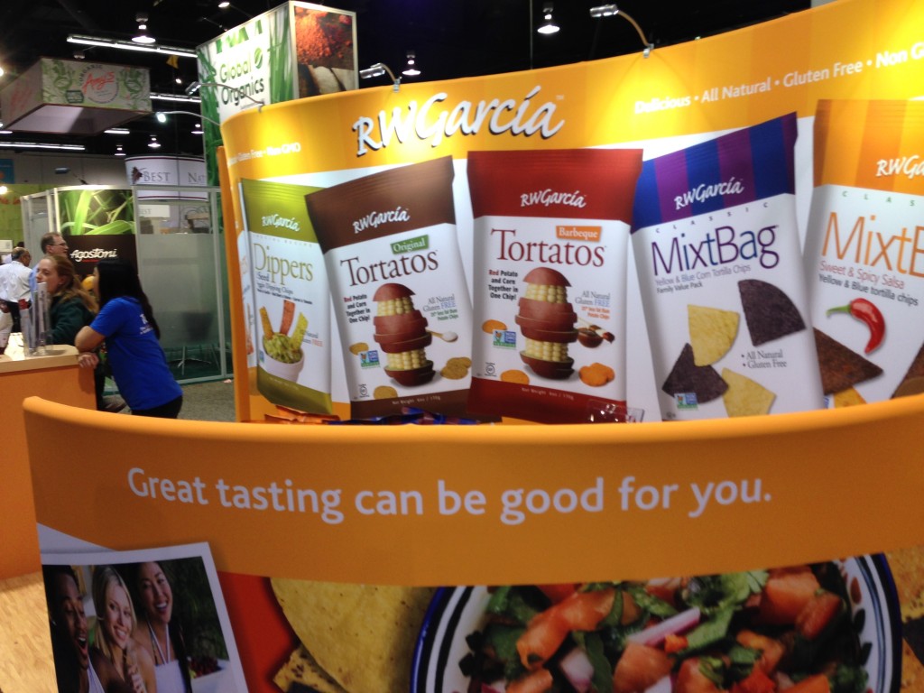
Secondly, your GRAPHICS MESSAGING should be planned so that a visitor’s eyeballs will follow it to its proper conclusion. Usually this means the hierarchy works like this:
- Company Name or Logo
- Positioning Statement or Bold Challenge
- Supporting Statement
However, if your company is not well know, this typical hierarchy might change a bit:
- Bold Statement or Challenging Question
- Company Name or Logo
- Supporting Statement
And on somewhat rare occasions, the company name might drop all the way to third place, if it’s an unknown company or if the company name is really insignificant:
- Bold Statement of Challenging Question
- Supporting Statement
- Company Name or Logo
If your company name is unimportant in the sense that a product or brand is important or more recognizable than the company name, that might go first:
- Brand
- Tagline or Positioning Statement
- Supporting Statement
There is no one-size-fits-all approach for graphics on tradeshow booths that covers all companies or situations. Instead, your goals, products and objectives should help determine how the graphic hierarchy is displayed. The main thing to keep in mind is that visitors pass by booths quickly and they all become a blur. Imagine your booth is a freeway billboard and you have 2 – 3 seconds to catch someone’s attention.
Next up: BOOTH FUNCTION.
From a 10×10 booth to the larger island booths, the function of a booth must be carefully thought out and discussed, and it will be determined largely by your show goals and objectives, the number of booth staff and how you want to interact with visitors. If you’re doing product demonstrations, for example, you’ll need to make sure the booth is big enough to accommodate the presenter or demonstrator and a small audience. If you’re sampling edibles, perhaps all you need is an easy-to-reach sampling table.
Every booth is different, every show is different and every company’s goals and objectives are different. Other questions to settle: Do you have enough storage? How many meeting areas do you need? Should the meeting areas be completely private or only semi-private? What products and/or services are you promoting at this show? Do you need video monitors, or an iPad kiosk to help visitors interact?
Take the time to address all of the functions that your booth needs. Those needs can be determined by the experience you’ve had at past shows as well as conversations with company staff that are involved.

And no matter what functions you detail and prepare for in your booth, chances are good that once you’ve lived in the booth for a few days, you’ll notice things that need to be changed for the next time. For example, one of our clients wanted a meeting space for their clients in a 20×30 booth, so one end of the booth – about a 10×20 space – was covered and mostly inaccessible to the casual visitor. However, after 2 – 3 times exhibiting in the booth, it became apparent that client meetings didn’t happen as often as they thought, and booth staffers found it to be a quick and easy place to hide out. So the covered meeting space was removed and the space was better utilized as product display and visitor interaction.
Of course BOOTH FUNCTION also includes things such as storage, meeting areas and traffic flow. While planning a booth you’ll want to take into account these three critical things. Not to say that they’re often – or ever – overlooked, but it’s not out of the ordinary for them to be miscalculated. For instance, traffic flow: do visitors have easy access to the booth? Or do you even want them to have easy access? Some companies design booths so that only desired visitors are allowed inside, limiting access to casual passers-by. Others want any and all visitors to step inside the line.
Storage needs to be considered: personal items (coats, purses, laptops, briefcases, etc.), products so samples can be replenished and more. Do you have enough space? Make sure you have enough, but try not to overdo it: space is at a premium at tradeshows and every cubic inch needs to be considered.
Finally: meeting areas. How many staffers will be meeting with clients or media types at the booth? How often? How many meetings are already scheduled ahead of time? How many do you anticipate to happen randomly?
Truthfully, it’s quite possible that the needs of each show will shift slightly from previous shows. The best approach seems to be to pay attention to how the booth is used at each show and make adjustments as budget and goals shift.
Finally, let’s touch on LOGISTICS, SET-UP AND DISMANTLE. In recent talks with a new client, they first mentioned the most important aspect of their new booth: it HAS to ship in a case small enough to go by UPS of FedEx. The large 4x4x8 wooden crates were a big NO-NO. So every possibility that came up from then on had to ultimately meet that objective.
To them, set up meant having a couple of booth staffers arrive a day or two early at the show, set it up with a minimum of fuss and tools, and avoid the double-whammy costs of pre-show staging and arrival at the advance warehouse, and having to hire show help to set up the booth.
Other companies don’t mind the extra cost – they try to minimize it, of course – but it’s more important to show their audience a great booth. Even if it means the booth is a 40×40 that requires a day to set up with hired help, and takes a dozen crates to ship.
Any good company will be aware of your desires in these areas, and determine what’s most important.
Best Case Scenario: having a booth that a) immediately conveys your company’s BRAND, 2) your GRAPHIC MESSAGING is clear and relates to this show’s goals and objectives, 3) is built to FUNCTION properly with room for meetings, storage, product/service display and 4) meets your company’s objectives when it comes to SET-UP and DISMANTLE.

