#IFT17 TradeshowGuy Exhibit Awards
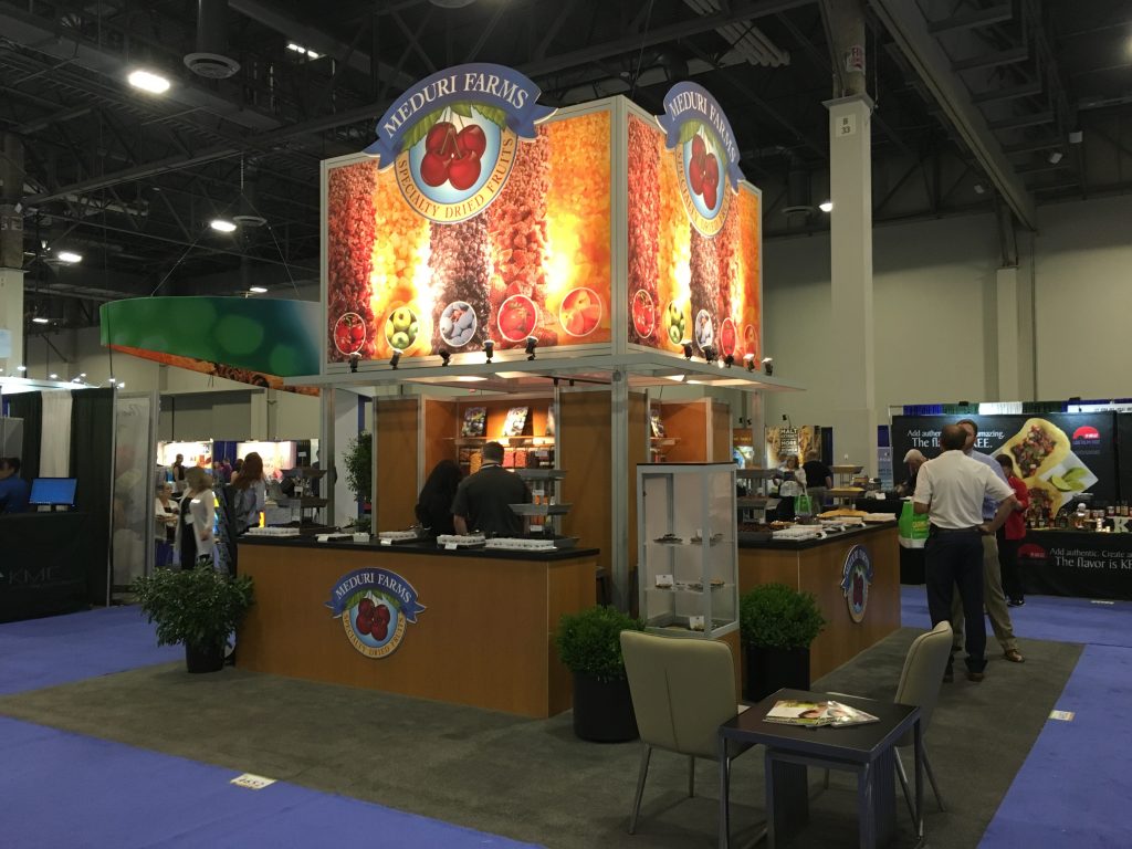
I had the pleasure to attend the International Food Technologists 2017 show in Las Vegas this week, thanks to our client Meduri Farms, who set up their 20×20 custom island booth for the second time. In walking the floor, I ran across a lot of fun exhibits that should be highlighted for one reason or another. So, let’s jump into another edition of TradeshowGuy Exhibit Awards – the #IFT17 Version! Let’s start with a look at the Meduri Farms booth, just because, well, to show off the exhibit:
Best Client Representation: Meduri Farms
It’s a custom 20×20 island designed by Greg Garrett Designs and fabricated by Classic Exhibits. Private meeting area, generous sampling and product display areas, and a nearly 16′ tall center tower that draws eyeballs from halfway across the floor:
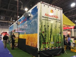
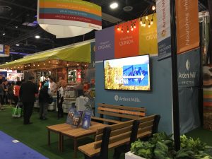
Best “Booth-In-A-Box:” Ardent Farms
There’s no easy way to view this exhibit in a single photo, so I’ll include a couple. Ardent Mills, of Denver, Colorado, simply drove in a trailer from an 18-wheeler, complete with kitchen and fold-down serving areas. Throw in some seating areas and signage and voila – you have a classy exhibit:
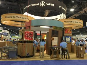
Best Exhibit Using Stuff We Build: International Paper
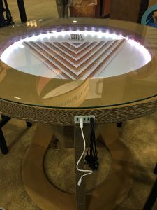
Nothing quite like showing off your stuff by having a booth built out of the stuff that you sell. In this case, International Paper bills themselves as one of the leading producers of fiber-based packaging, pulp and paper. So of course many of their booth elements were created using corrugated cardboard and related materials. Especially eye-catching: the custom charging table built from corrugated material:
Next up…
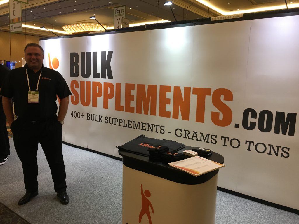
Simplest and Most Effective Backdrop: Bulk Supplements.com
Simple like being able to read and understand a billboard a 65 MPH. I spoke with Keven, the owner, and he said his purpose was to communicate what the company does loudly and simply. And that exactly what this 20′ wide back drop does, very effectively.
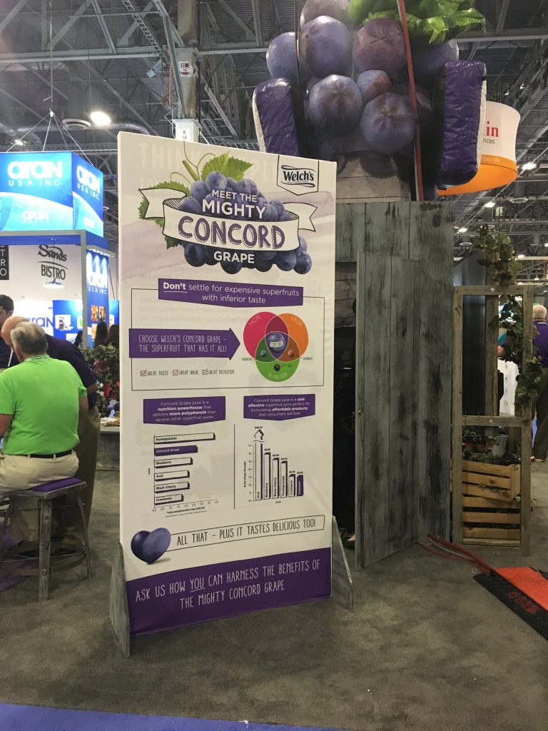
Best Use of Grape Balloons: Welch’s
Well, it may be the only use of grape balloons, but in this case, they caught my eye from a good three aisle over. A great way to stand out from the crowd, indeed:
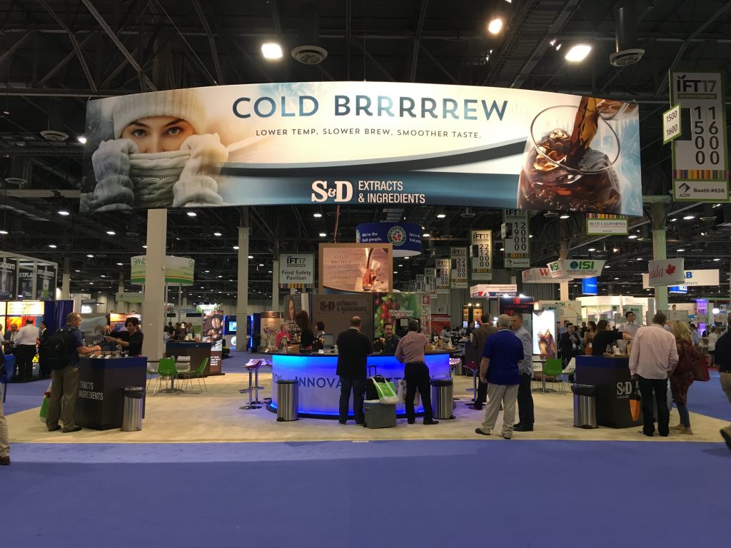
The “Let’s Get Their Attention NOW!” Exhibit: S&D Coffee and Tea
This large hanging sign close to one of the main entrances was designed to capture your eyeballs within a second or two – and it worked. The juxtaposition of the woman in a stocking cap with gloves, the “COLD BRRRRRRREW” statement and the experience of visitors walking in from the 105-degree Las Vegas heat drew a crowd.
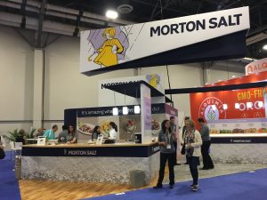
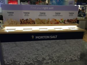
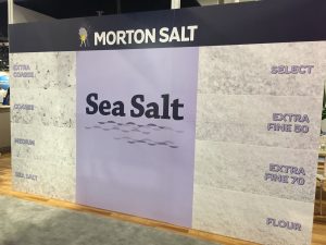
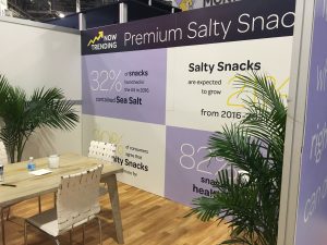
Best Branding from Top to Bottom: Morton Salt
You could quibble on this award as there were a lot of exhibits at IFT that were exceptionally executed from communicating a brand. But Morton’s booth was well-thought out from side-to-side and top-to-bottom, down to the display of the different types of salts that you could actually put your hands on and feel and touch. Even the conference room had great information to communicate.
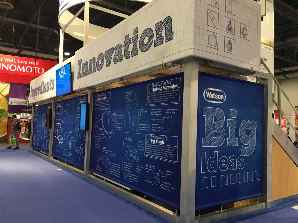
Best BluePrint for Ingredients and Innovation: Watson
From Connecticut, Watson Inc diagrams and displays more information than most people will bother to stop and read. But maybe that’s the point: the graphic design, displayed as if it were a blueprint, showcases information from infant formula to pet foods and leaves us impressed with the depth and breadth of their reach – all in a two-story exhibit that had plenty of room for meetings, storage and product display:
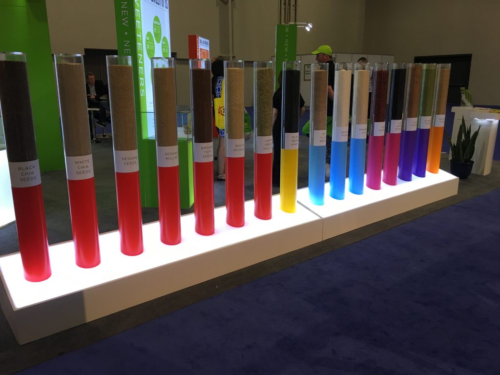
Best Use of Really Large Test-Tube Like Displays: Alquimia USA
More than eye-catching, this row of some 16 grains, beans, seeds and more also created a unique wall-off side of the booth.
And finally, a double/shared award to…
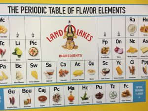
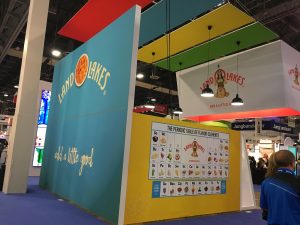
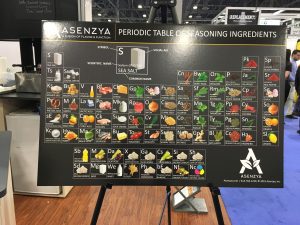
Best Use of the Periodoc Table: Asenzya and Land O’ Lakes
There may have been other uses of the periodic table of elements, but these two companies used the table to great effect, so show off the flavor elements and the seasons ingredients respectively. It’s a lot to digest (no pun intended), but great fun to take a look and see how they plotted out the display. Well done!
A couple of other observations from walking the floor…
There were a LOT of big monitors at the show, on the order of 60″ to 72″. Some exhibits had several of them. In speaking with on exhibitor, I suggested that in his next version of the video, that he added closed-captioning, since the ambient noise on the show floor made it nearly impossible to understand what was being said. “Good idea!”
I ran across a few exhibitors touting Virtual Reality: sit down, put a headset on and enjoy some virtual reality – mainly a quick interactive look at a company’s production process. Frankly, I’m still waiting to be impressed with VR at a tradsehow. Having said that, I’ve only tried it a few times, so no doubt someone is ready with a really good VR experience somewhere. I watched some people sit down, try the headset on while wearing glasses (didn’t work for them, didn’t work for me, either), and then go through the experience. If you wear glasses, taking them off to slip the headset on means that things are not clear and sharp, although it didn’t keep me from comprehending what was going on. The best ones are those that show off the company’s production process, or give a tour through a field or something related to the company. But with more and more VR coming to tradeshows, they’re going to have to step up with a great experience, or it’ll be hard to justify the use of VR headsets and the accompanying cost of creating the program.
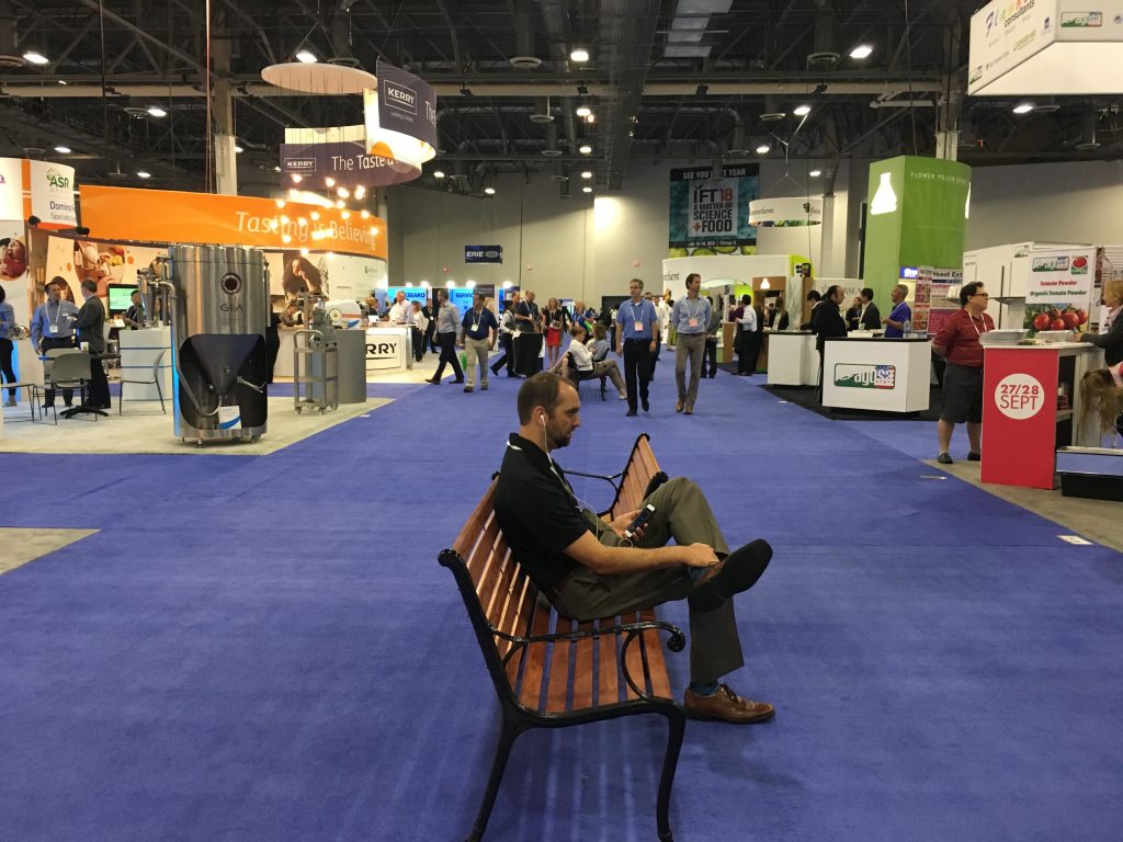
I really liked the larger 20′ wide center aisles that were spread in a few places on the floor, complete with park benches. A nice place to grab a quick respite from walking and talking without having to leave the hall:
