In the world of custom exhibit design, there are so many possibilities that any good exhibit designer will never run out of ways to put things together. Companies want a lot of the same things, such as product demo or display areas, meeting and storage areas and generous branding space.
We often have conference calls with prospects and clients with our designers, and from those discussions come mockup designs. Once a potential design is reviewed, changes are often made to accommodate functional needs and create more graphic branding opportunities. Or whatever. Designs, until they are built, are always a work in progress. Even after a custom exhibit design is built and used at a tradeshow, companies will often make changes between shows to flooring, graphics, and add storage, tables or chairs based on their experience with the exhibit at a show.
Given all of that, I have a ton of design mockups lurking on my hard drive. Many are from-scratch custom designs and others are modifications of kits that exist in Exhibit Design Search.
Let’s take a look at a handful of them and see what issues might have come up.
Starting with:
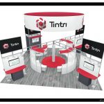
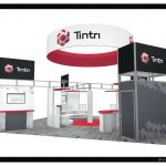
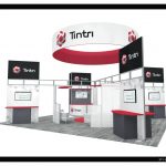
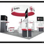
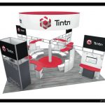
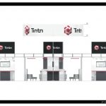
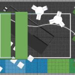
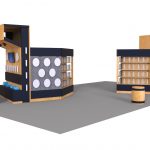
Tintri: Invited to submit a design for a 30×30 rental booth at a Las Vegas tradeshow this summer. Challenges: need 6 demo stations, a meeting area, and use an existing hanging sign.
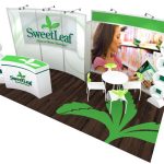
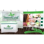
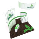
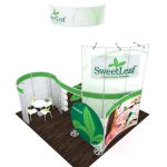
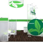
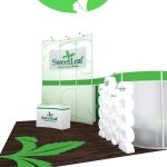
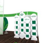
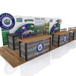
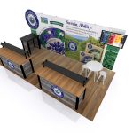
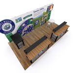
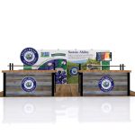
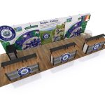
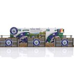
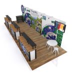
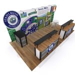
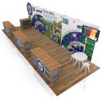
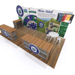
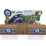
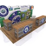
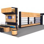
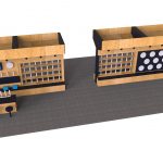
Sweetleaf: invited to respond to an RFP for a 20×20 design that would use elements of the larger design for a 10×20 to appear at smaller shows. Needs: some sample areas, but not too many, and modest product display. Partly private meeting areas desired.
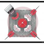
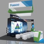
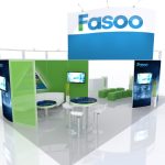
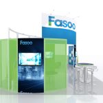
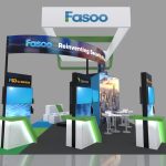
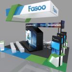
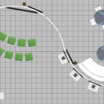
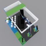
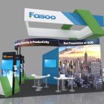
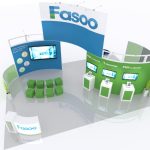
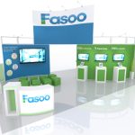
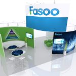
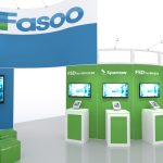
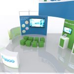
Fasoo: another RFP we were invited to respond to. Client was looking for a 20×30 design with a large A/V area, small staging area for in-booth presentations, and three double-sided demo stations, also a separate meeting area for clients and prospects. Hanging sign optional but desired if it fit the budget.
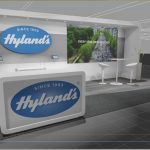
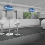
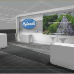
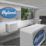
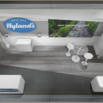
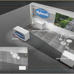
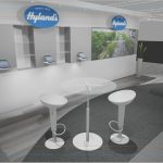
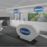
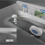
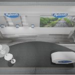
Hyland’s: a current client was interested in upgrading their current exhibit and was looking to streamline the older wood look with smaller product display area, a single meeting area, and a greeting counter with some storage.
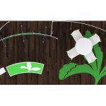
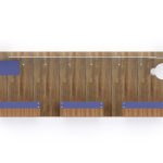
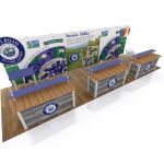
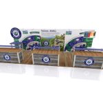
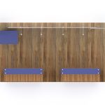
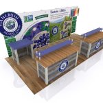
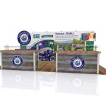
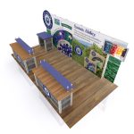
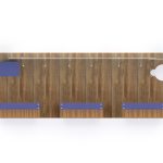
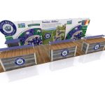
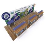
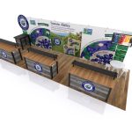
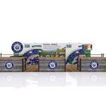
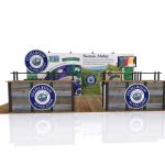
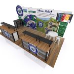
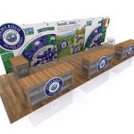
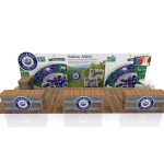
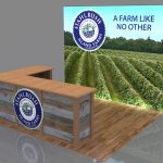
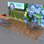
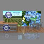
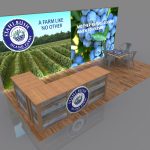
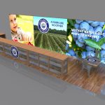
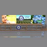
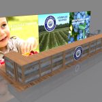
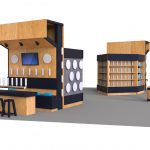
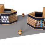
Stahbush Farms: wanted an exhibit that could have elements that would set up as a 10×10, 10×20 or 10×30 depending on the show. Needed sampling areas, storage and large branding graphic. Wanted a wooden, ‘farm-like’ image, but should be able to break down to smaller pieces for shipping.
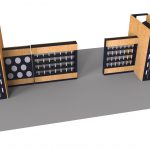
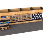
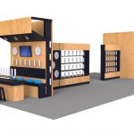
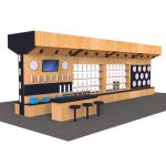
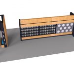
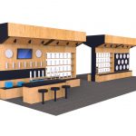
Unnamed company: we were invited to respond to an RFP for a company that made those little pull handles for beer taps. It was a larger island of 30×60 that would leave a lot of room for people to congregate and give ample space for showing off the pull handles. Also wanted a bar-like area, and if possible, a private storage closet or meeting area. This is an unbranded concept that the potential client chose to keep anonymous, but the unused design is certainly up for grabs if you want to stick your name on it!
These are all great designs and for one reason or another, remain unbuilt. But they’re up for grabs if they intrigue you and your marketing team and feel that they could be modified to fit your needs. What do you think?
Designs by Classic Exhibits and Greg Garrett Designs













Megan Bell ,
Loved reading this. The attractiveness and uniqueness of a display can give a company a great competitive advantage. The creativity exhibited by each of these companies is amazing.
Tim Patterson ,
Thanks, Megan! Really appreciate the comment. –Tim