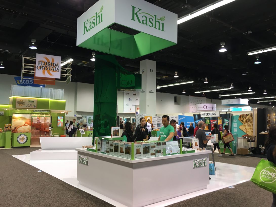
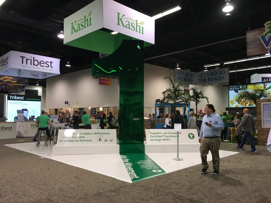
There are many reasons to explore bare-bones or low budget tradeshow design. Budget is probably a big motivator to many exhibitors to have a simple design, but it’s not the only reason. Having an extremely simplified exhibit can attract attention you might not otherwise get.
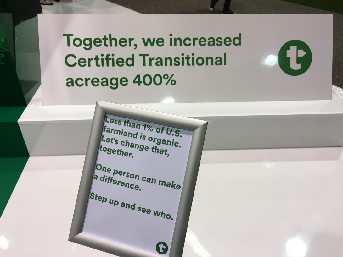
One recent example comes to mind: Kashi, at the Natural Products Expo West. For the past couple of years, Kashi has made a statement with a very simply exhibit. The large island exhibit consisted of a tall “1%” icon that engaged visitors, driving them to curiosity to stop and see what it meant. The explanation was shown on a small posted sign and was reinforced by a few staffers. The exhibit captured people by its very simplicity.
Of course, there are numerous ways to save bucks when exhibiting: instead of printing brochures, make them available only via PDF downloads. Rent an exhibit instead of owning. Promote through social media. Avoid promotional giveaways unless it really nails your brand. And so on.
But with a simple design, you can catch eyeballs and turn heads and keep to low budget tradeshow design. Large simple graphics with very little text can often to the trick. Using a pop-up internally lit graphic in a smaller booth is one good way to stand out. Having a creative design brief that directs your exhibit house to think in terms of stark simplicity. If your brand lends itself to simplicity, all the better. If not, a creative 3D exhibit designer and a creative graphic designer can work to simplify.
Another reason to simplify: if you have a simpler booth, you have fewer pieces to ship, which reduces shipping and drayage costs, and presumably, I&D costs. It also gives you more space to welcome visitors. A more open space is often more inviting.
What can you do with the design of your booth to simplify and reduce costs?


