Best tradeshow marketing tips and case studies. Call 800-654-6946.

Booth Design

Natural Products Expo West: Days Three and Four

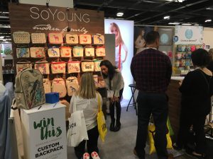
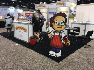
Babies – lots of babies – along with young kids, the occasional dog, lots of mascots/costumes, and a few weirdly dressed people. Typical Expo West!
natural products expo west

Saturday night – Day Three of Expo West – was spent hanging out with Oregon Business folks at their annual soiree at McCormick and Schmicks, and later, producing Monday Morning’s vlog/podcast. Now let me see if I can manage a recap of the final two days of Expo West.

Dozens of people I spoke with agreed that the show was somewhere between amazing and fantastic, or perhaps crazy-busy and overwhelming. Just saw the press release this morning from New Hope which showed that there were over 85,000 attendees, and 3,521 exhibiting companies, including more than 600 first-time exhibitors.

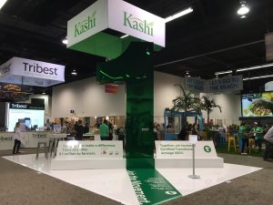
I mentioned in my vlog/podcast that I was impressed by the great detail that exhibit designers go to to capture a brand’s essence. I also got into a conversation with one booth staffer about the wild colors that are everywhere in the show. “Can you imagine what this show would be like without all of those colors?” he asked. Agreed. Bright and bold colors everywhere.

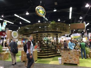
There were also a lot of BIG hanging signs, from 40’x40’ aluminum structures/fabric graphics to wooden panels and what looked like carved wooden signs. Does anybody look up these days at shows?
natural products expo west

There were a lot of clever interactive things going on at booths, offering people an opportunity to walk into the booth space and do something. It’s always a great way to capture attention. I counted at least a dozen “selfie” stations, with some including a circular light where you can take a selfie where you’re fully and evenly lit, and some stations where they’ll take a photo and then email it to you. One of the most fascinating and eye-catching interactives was a Rube Goldberg contraption in the KIND Snacks booth, showing how KIND snacks are made from start to finish.

There were many opportunities to tweet a hashtag with a photo for a chance to win something, so it was good to see the social media tie-in as well. Although, frankly, it almost seems run-of-the-mill, when six or seven years ago social media was all so new!

Another thing I noticed in booth fabrication was the use of see-through printed fabric. Everywhere I turned there was another example. See-through fabric is very useful in creating a barrier, but the see-through aspect gives you a view of what’s beyond it, without intruding on people that might be in a meeting room for example.

This was my sixteenth consecutive time I’ve attended Expo West in support of clients, for years, the halls have been set up in a specific configuration: foods, manufacturing, supplements, new products and more all have had their own areas. That didn’t change this year, but the layout changed – drastically – and it was interesting to see how the whole layout was essentially flopped from one end to the other. Lots of comments from people who weren’t sure how it worked, but from my view it worked just fine. Took a little getting used to.

Sunday – Day Four – started off much slower, in terms of visitors roaming the aisles. I was there at opening of ten o’clock, and the back reaches of the halls were lightly travelled. it didn’t take long for that to pick up. By late morning, it seemed almost as busy as previous days. It did give me a chance to speak to more people without feeling rushed. By 2:30 to 3 o’clock, exhibitors were offering all of their samples to attendees so they wouldn’t have to transport them back to HQ. And of course, some folks were pulling down banner stands and packing up suitcases by 3 o’clock. Ya ain’t s’posed to do that, but it happens anyway. Planes to catch.
natural products expo west

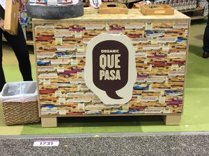
And finally, I know of no other show where, frankly, you never need to eat a meal offsite for ate least three days. Virtually every company is sampling the goods, from sausage, bagels, bread, toast and eggs to energy bars, drinks, coffee, teas, juices and other goodies. It’s easy to consume a couple of thousand calories without even batting an eye. Even if you try to avoid eating much, you’ll end up taking bite-sized samples here and there.

And don’t get me started on the varieties of chocolates.

Nine Things You Need to Know Before Buying a Custom Tradeshow Exhibit

It’s a big commitment, investing in a custom tradeshow exhibit. Maybe not as much as getting married or buying a new house, but it’s more than deciding who should accompany you to the prom. It’s a big deal – buying a new custom exhibit. If you haven’t been through the process before, or in a while, it’s not a bad idea to review the steps.

What are the pros and cons of the decision? What about budget, logistics, staff preparation and more? They’ll all be impacted by the purchase of a custom tradeshow exhibit.

Some of the pros and cons to weigh before choosing between purchasing a custom tradeshow exhibit or a more standard, modular or manufactured exhibit.

  1. Uniqueness: A custom tradeshow exhibit means that your company will have a unique, one-of-a-kind presentation. No one else will look like (if the designer does his job!). Your designer starts with a blank slate and before doing anything on the slate they should ask a lot of questions. They should ask so many that you may wish they’d stop! But it’s all good – it means they care about creating an exhibit that you really want; one that works well for your company from many aspects: the look and feel, the branding, and the functionality.
  2. Flexibility: A custom exhibit can be designed and fabricated form the outset to accommodate a variety of needs and intended uses. For instance, if you have an exhibit schedule that demands you exhibit in a 10×20 space in one show, a 10×20 space in another show, and a 20×20 in yet another show, your exhibit components can be designed to work in all three configurations.
    Custom Tradeshow Exhibit
  3. Pride of Ownership: A custom exhibit will give you those intangibles: pride of ownership, unique corporate identity and a feeling that can’t be beat, from the CEO to the front-line staffers!
  4. Other Options: Of course, you have options other than custom, especially when it comes to smaller exhibits, such as 10×10 or 10×20 inline exhibits. There is pop-up, modular, flat-panel, fabric panels, fabric back-lit walls, monitor inset options and more. There are custom hybrids that take elements of modular designs and add unique twists that help you stand out – maybe for less money than designing and fabricating a custom exhibit from scratch.
  5. Logistics: Drayage, Shipping and Installation & Dismantle: It seems that nothing can torpedo your tradeshow marketing budget faster than logistics. Shipping, show drayage and the costs to install and dismantle your exhibit are often seen as nothing short of highway robbery. But in the tradeshow world, it’s a cost of playing the game. So, what can you do from the design and fabrication standpoint to keep these costs as low as possible? Using lightweight materials such as fabric graphics and aluminum framing can help. Knowing how to set up your own small exhibit can help you avoid having to pay an I&D company, but there are tradeoffs. You’re either paying your own crew for their time, or you’re paying the pros.
  6. Custom Look, Function and Branding: The main reason to consider a custom exhibit is that, after all is said and done, you want a booth that looks like no other. If your company handcrafts potato chips, for example, uses biodiesel fuel, donates to charitable causes, mitigates wetlands on the site of a new factory, works a staying green by invoking heavy use of solar energy, you have a solid idea of how you want your exhibit to reflect those values as part of your brand.
  7. Design/Fabrication: One question that pops up on occasion: is it important to have the same company that designs your booth fabricate it? Not necessarily. But having the design and the fabrication shop right next door means communication is smoother and more efficient. Some independent designers will gladly create a custom design that is guaranteed to wow your audience. But many may not have as much experience designing using specific materials that an exhibit house typically uses. They may also not have as much experience at knowing how much things cost. Having an exhibit project manager in close communication with the designer can help keep the design within budget.
  8. Pricing: Budget is often the key element of a new exhibit project, and creating a custom exhibit will often drive the cost higher than picking something that’s more “off the shelf.” Those standard-issue exhibits will, in most cases, cost less than a similarly sized custom exhibit. But that doesn’t mean your custom exhibit has to cost an arm and a leg. Taking time to go through the process carefully helps rein in those costs. Know what your needs are, communicate those needs to your exhibit house, and make sure they are aware of your budget. Confirm all steps of the design and reviews, all the way through to fabrication.
  9. Learning Curve: Many companies that step up from a small modular booth to a custom booth will go through a few growing pains. It’s not uncommon. They’re spending more money, they’re having to deal with higher shipping costs, I&D, and their staff now has a larger space to deal with. But ultimately, every company I’ve worked with that has gone through the process unanimously report it was well worth it. Partners, clients, prospects, and even competitors see them as bigger players in the industry. Higher respect and recognition are your due.

There is a tremendous benefit to your company when your tradeshow marketing moves to a significantly higher level. Tradeshow marketing is by far one of the most cost-effective, highly targeted methods of reaching your potential customers and maintaining strong relations with your current clients.


When it Comes to Tradeshow Exhibit Design, Are You Stuck in a Checklist?

Recently I was speaking with tradeshow expert Marlys Arnold of Image Specialist, and she made a comment that struck me: Are you stuck in a checklist?

3D exhibit design is part art, part craft, and part skill. I don’t claim to be a design expert, but I’ve seen thousands of exhibit booths over the years, and only a very few have really stood out. Why did they stand out? Because – to me – if you are familiar with the company and the brand, and you’re standing in front of the booth for the first time, you say to yourself, “They freaking nailed it with that design!” The design of the exhibit adheres so close to the brand’s identity that you can’t help but notice.

Why doesn’t this happen more often? Let’s go back to the checklist. Brand managers and designers can get into a trap of making sure that all the items needed for proper booth function are included – and stop there:

Storage? Check. Product Display? Check. Big backlit graphic? Check. Nice-looking greeting counter? Check. You see how this goes.

Don’t get me wrong. Checklists are important, and they’re a good place to start. But when the challenge is to create an exhibit that screams your brand does using the checklist – and only the checklist – really get you there?

Let’s say the branding guidelines advise the designer to use branding standards and follow natural and sustainable practices. Perhaps it adds that it should be made from sustainable materials. And then there’s a call-out for innovative ways to showcase products to draw attention and traffic.

It isn’t long before you get lost in corporate gibberish and bland buzzwords that don’t really communicate well. It’s not really the brand manager’s fault: this is how they think and how they’ve been trained.

So, what’s the answer?

Frankly, I don’t think the answer is easy. And it’s not that hard, either.

tradeshow exhibit design

Some companies are better at communicating their needs than others. Some designers are better at sussing out what the company really wants than others. If you, as a tradeshow brand manager, can succinctly put into words what you’re looking for and avoid the corporate buzzwords and gibberish, you’re half the way there. If you pick a designer that has the skill to intuitively take those descriptions and create a 3D design that screams “your brand!” that’s the other half.

See: easy, right?

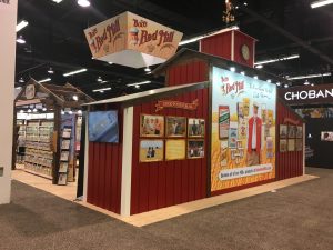
In projects I’ve been involved in that have fully succeeded in creating a 3D version of the brand, the power of description has been palpable. Usually, a sketch, even a napkin sketch, has been provided because the brand manager has taken time to visualize the exhibit. They don’t usually have the skill to bring it fully to life, but they can often effectively demonstrate what they’re looking for. Perhaps it’s taking the specific curves of a brand’s graphic look and incorporating that into the curves of a greeting counter. Or it might mean taking the iconic mill structure of a brand and making that the central piece of an exhibit.

Whatever your brand, I would tell you this – and this is coming from a non-designer: determine what visual elements of your brand are the most important, and work with your designer to recreate those elements in the design of the exhibit.

It’s not always easy, but if it’s done effectively, it’ll knock your audience’s socks off.

7 Simple Steps to Totally Rocking Your Tradeshow Graphics

Tradeshow graphics should be easy. But they’re not always as easy as you think. So let’s take a look at 7 simple steps that will totally rock your tradeshow graphics.

  1. Bigger is better. Yeah, even with a 10’ inline booth, the bigger the better. Face it, you’re competing for eyeballs. Make them jump out at visitors.
  2. Bright colors are eye-catching. It doesn’t mean that all of your graphics have to have reds and bright blues or greens. If it fits, use it. If bright colors don’t match your brand, not to worry. There’s more to look at.

  3. Simple is best: bold images and limited text. Think of a tradeshow graphic as a billboard that people can spend about three seconds on. If you can’t communicate a message in three seconds, you probably put too much on it.
  4. Back lit graphics are the rage these days, for a reason. LED-powered light boxes grab attention. Have you noticed? Even if most others are doing it is no reason to try and be different. These items do grab eyeballs.
  5. People notice quality. Or rather, they notice when its lacking. You may not think so, but if you notice that the printing is second-rate, others will. Graphics aren’t cheap any way you look at it, so spending an extra few bucks to use the printer that has the latest and greatest isn’t going to cost that much more. And people will notice.
  6. Professionally designed graphics are worth it. Yeah, Jimmy in accounting may be a good guy and is looking for a job as a graphic designer, and may have some chops. But designing graphics for large-size printing is more than just a good layout. It’s the highest resolution possible, and understanding how people perceive message at that scale and trying to absorb the message in just a few seconds.
  7. Change the graphics when necessary. A lot of the same people go to the same shows and see the same exhibitors. And they’ll notice when you haven’t refreshed your graphics in the past half-decade. So keep ‘em fresh.

Follow these seven steps and your tradeshow graphics will be rockin’!

10 Best Pinterest Boards about Tradeshow Marketing

Yes, I have a Pinterest account. No, I don’t spend a lot of time there. Something about not having enough bandwidth and so on. However, when I do get over there, I find a lot of things to like. Such as these boards on tradeshow marketing which are standouts!

Kimb T. Williams‘ board on Tradeshow Marketing Items features a variety of eye-catching items which make it a worthwhile stop.

best pinterest boards on tradeshow marketing

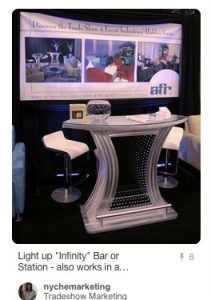
Nyche Marketing’s Tradeshow Marketing board has a bunch of infographics, exhibits and more.

Yes, it’s a corporate account, but Staples Promo board on Tradeshow Items has a lot of ideas.

From Danielle McDonald comes Tradeshows and Markets – tons of ideas-starters here.

Carl Phelps’ Exhibit Installation Ideas doesn’t have a lot of content, but what is there is inspiring.

Here’s Tradeshow Booth Design from April Holle. Banners, infographics, creations and more.

A lot of the images in Libby Hale’s Tradeshow Design board don’t strictly fall under the tradeshow design umbrella, but lots of great images to view here.

Teri Springer’s Tradeshow Design board is short on images, but long on inspiration. Wavy ceilings, tilted walls and hanging letters area ll eye-catching.

10×20 inline tradeshow exhibits are very popular, and Display Jay has gathered a collection of over a hundred images in 10×20′ Tradeshow Displays.

Let’s finish off our list of ten best Pinterest boards about tradeshow marketing with Anna Kammarman’s lively (and long-winded) Business – Tradeshow Tips and Tricks; For Exhibitors: Tips for Creating a Profitable #eventprofs #tradeshow.

14 Best Tradeshow Infographics on Pinterest

Infographics do a great job of quickly communicating information in a fun and effective way, especially if you’re like me (and 65% of the rest of the population) and are a visual learner. So let’s sift through some of the great tradeshow infographics floating around on Pinterest these days.Click through to the Pinterest posts, or browse the infographics below.

  1. Pipeliner Sales: 7 Keys to Getting Leads from Tradeshows
  2. Xibit Solutions: Anatomy of a Tradeshow Booth
  3. Inpex: Tradeshow Etiquette 101
  4. Media Mosaic: How to Boost Traffic at Your Tradeshow Booth
  5. Infographicality: Six Things to do Before Your Next Tradeshow
  6. Solutions Rendered: Creating a Successful Tradeshow Booth
  7. Skyline: Bad Booth Staffers
  8. Proj-X Design: How to Get the Most out of Tradeshows
  9. NWCI Displays: Tradeshow Booth Regulations
  10. Pardot: Marketing Automation for Tradeshows
  11. Bartizan Connects: Countdown to ROI: A Timeline to Plan for a Tradeshow
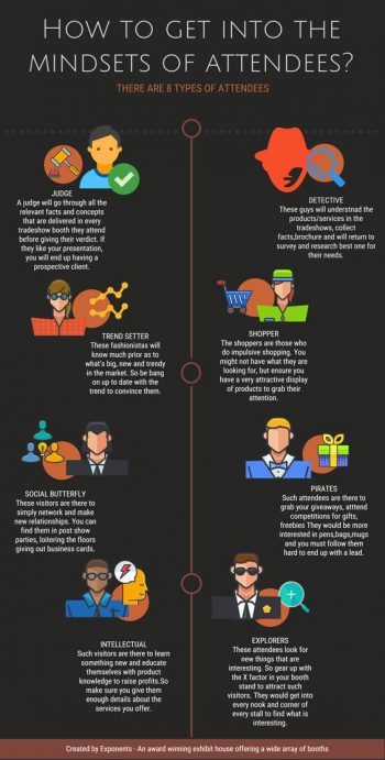
  12. Exponents: How to Get in to the Mindset of Attendees
  13. Skyline: 25 of the Most Common Tradeshow Mistakes
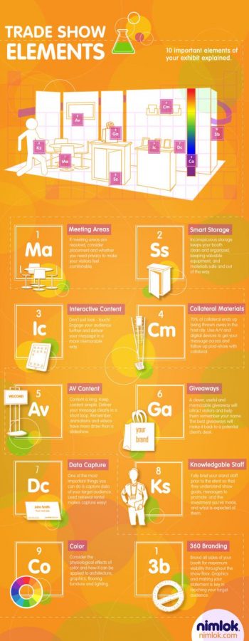
  14. Nimlok: Tradeshow Elements


Is Downsizing Your Exhibit the Right Move for You?

Many companies I work with are in the process of increasing the size of their booth, is that the right move for you? Perhaps downsizing is a better choice. So what comes into play when you consider the decision?

Often the choice is strategic. You may know that some of your major competitors are either not going to be exhibiting at a specific show where you want a presence, yet you don’t want to do the full exhibit that you’ve done in the past. Or it’s a show where the attendance is down, so having a smaller presence doesn’t hurt you.

Your brand is morphing into something different, and investing in a new exhibit doesn’t make sense. In this case, you can go for a smaller presence for less money. You might also consider renting an exhibit, which can give you significant savings in the short term.

You need to show a better ROI to the powers-that-be. Investing less in an exhibit is one way to cut up-front expenses and increase the overall ROI.

Downsize your tradeshow exhibit

You’re planning to invest more heavily in pre-show marketing. This is a simple re-focusing of your marketing tactics. Putting more emphasis on reaching visitors prior to the show with direct mail, for instance, can bring people directly to your booth with an appointment and plan in hand that is congruent with your goals.

The bigger shows get even more expensive, and yet you still need a presence there. One way to keep your presence at the show is to have a smaller exhibit. Smaller booth space may also mean you don’t have to send as many people to staff the booth, saving yet more money.

You’re reassessing your overall tradeshow marketing plan. I’ve seen some companies simply pull out of a show for a year or two. They’ve had a major presence for years, yet taking stock of the value of the show was important enough to them to not exhibit and to rather just send several members of management to meet with other exhibitors and partners offsite.

Having decided to downsize your exhibit, make sure that the smaller version of your brand is still impactful. This means that graphics have to be well-designed and of high quality, your exhibit structure should be of high quality, the booth space needs to be kept clean, your staff should be well-trained and well-prepared and your products and service offerings should be your latest and greatest.

Why the Gravitee Exhibit is a Game-Changer

Can a single exhibit called Gravitee really be a game-changer when it comes to exhibit design aimed at flexibility and being user-friendly?

Let’s take a look:

“If you’re tight on time or budget, try Gravitee!”

So exclaims Rey at Classic Exhibit, the exhibit house that is putting Gravitee out to the world. It’s a system of building blocks that uses no tools and has no loose parts. The aluminum extrusions are designed to accommodate doors, SEG fabric graphics and direct print graphics. The ability to use the various building blocks for an exhibit design are literally endless. Wire management is built in. You have fully assembled panels – always – single or double-sided. Corners are pre-notched for seamless SEG fabric graphic installation.

Seriously, this is limitless flexibility with elements that stack, connect and align perfectly every time.

And did we mention no tools or loose parts?

Take a look at Gravitee in action:

Take a closer look at the Gravitee selections on our Exhibit Design Search.

Does Your Tradeshow Exhibit Evoke Emotion?

“Does your tradeshow exhibit evoke emotion in the mind of a visitor?” might be a funny question. The better question might be: “HOW and WHAT emotion does your tradeshow exhibit bring out in your visitors’ hearts and minds?” But by asking it, you’re pulling on the string of branding, high-impact motivators such as confidence, sense of well-being, protecting the environment, being who you want to be and a litany of other emotions that pull in one direction or another.

tradeshow exhibit evokes emotion

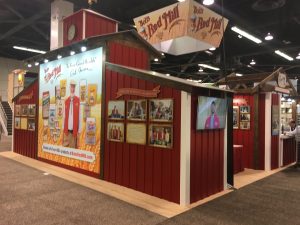
Let’s use one of our clients at TradeshowGuy Exhibits, Bob’s Red Mill, as an example. Their foods are mean to inspire good eating with high-quality grains, oats, cereals, mixes and more. Good eating equals longer life and better health. Better health equals a positive feeling. Hence, just seeing the Bob’s Red Mill exhibit can evoke an emotion that gives people familiar with the brand a sense of well-being and comfort. All without them even thinking about it. As long as the visitor has a familiarity with the brand and products, their brain will make a quick connection with a positive result.

Let’s try another brand, say, United Airlines. With the recent debacle of having a booked passenger dragged off the airplane with smartphone video cameras in action that spread quickly throughout social media and mainstream news outlets, many visitors to a tradeshow with a United Airlines exhibit might have a different feeling today than they did just a month prior.

According to Alan Zorfas and Daniel Leemon, writing in the Harvard Business Review, “On a lifetime value basis, emotionally connected customers are more than twice as valuable as highly satisfied customers.” Gaining that emotional connection pays off in numerous ways as they buy more, visit you online or in your store more, are less concerned about price in favor of quality, and listen more to what you’re saying, whether on a TV or radio ad, in a magazine, or in a weekly newsletter.

When it comes to evoking that positive emotion when visitors at a tradeshow come upon your booth, your branding and costumer experience already has to be in place, at least to a certain degree. A visitor that’s familiar with your brand and has a positive feeling upon seeing your exhibit has internalized that – but beyond that, she recognizes the key elements of the brand successfully executed in the design and fabrication, down to the small details.

A visitor that’s not familiar with your brand will still experience a gut feeling upon seeing your booth. The accuracy of that evocation has everything to do with how skillfully your 3D exhibit designer and your graphic designer have understood and communicated the elements of your brand. Once they inhale that look, as it were, they’ll make a decision on whether to more closely check out your products or services. If all is done right, your visitor will get an accurate emotion of the brand that you’re hoping to disseminate.

tradeshow exhibit evokes emotion

This is all not precise, of course. You can’t just plug in a color or texture or design or graphic and provoke a predictable reaction. Even ugly and unplanned exhibits can still have a successful tradeshow experience, which may be due to other factors, such as the competition, the specific product, the enthusiasm and charisma of a particular booth staffer or some other unknown element.

But the better your exhibit reflects your true brand, the more powerful it becomes in the heart and soul of your visitor. And they’ll take that home with them.

7 Easy Ways to Update Your Tradeshow Exhibit

The natural inclination for most exhibitors is to get the most money out of their booth, so it’s important to consider ways to update that tradeshow exhibit. What options do you have?

  1. The first and most obvious is to change the graphics. Products and services change, and you can show that change with new graphics, and still keep the old frame of the booth.

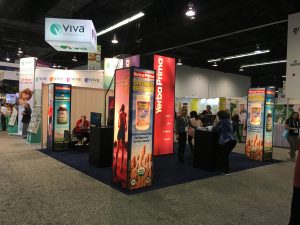
    Yerba Prima updated their booth by replacing about half the graphics.
  2. Add to your exhibit by including things such as iPad kiosks, banner stands or interactive elements that previously were not there. The challenge, especially in smaller booths, is to keep from adding items that clutter up the booth but don’t really add to your overall effectiveness.
  3. Rent something, such as a charging table and furniture. Your original exhibit may not have come with a budget big enough to do all that you wanted, so after using it a few times, instead of purchasing new items, you can rent them.
  4. Add space. If you’ve been exhibiting with a 10×20, you could upgrade to a 10×30, which would give you 50% more booth space. Then, add something like a meeting area, a theater viewing space or something similar.
  5. Hang a sign. If you’re in an island booth, or some other space that allows you to hang a sign from the ceiling, but you’ve never done it, this is one way to draw more eyeballs from a longer distance. And with the idea that perception is important, having a hanging sign gives you a big upgrade in people’s minds.
  6. Custom flooring. One way to set your exhibit apart from neighbors is to add custom flooring. We recently did a custom booth for Schmidt’s Naturals of Portland, and as part of their exhibit, the flooring was custom. Several people in the company, as well as visitors, commented that the flooring really went a long way to set them apart from other exhibitors.
  7. Hire a pro. Even in a 10×10, the presence of a professional presenter can draw a crowd, and really set you apart from competitors. In a larger space, having regular professional presentations is often a good investment that more than pays for the investment – without a single change to your booth other than making sure you have the space for the crowd.

© Copyright 2016 | Oregon Blue Rock, LLC
Tradeshow Guy Blog by Tim Patterson

Call 800-654-6946 for Prompt Service
Copyrighted.com Registered & Protected <br />
QA4E-AZFW-VWIR-5NYJ