Best tradeshow marketing tips and case studies. Call 800-654-6946.

Case Study

SIA Snow Show From an Exhibitor’s Viewpoint

I’ve never attended the SIA Snow Show but I think I should someday, for two reasons. Number One: I’m a ski bum. Number Two: uh, see reason number one. Oh, and that’s right – I’m TradeshowGuy – I do tradeshows.
SIA SNOW SHOW

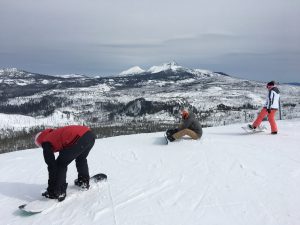
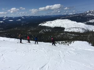
SIA – Snowsports Industries America – holds the annual SIA Snow Show in January in Denver, Colorado, home of some of the greatest skiing in America. Of course. With close to 20,000 attendees, it’s the industry’s largest global annual B2B gathering. It’s a smaller and more narrowly focused show than Outdoor Retailer, but in speaking to SIA Snow Show exhibitors, I gathered that many of them also exhibit or attend Outdoor Retailer.

Having not attended the snow show, I thought it might be illuminating to ring up some of the exhibitors at the show and debrief them on how the show went for them. Here’s what I came up with over the past several weeks.

Overall, how did the show rate? Most gave it very high marks.

“If it wasn’t a ten, it was a high nine,” said Ashley McGarvey of Meier Skis, who praised the show as bringing in lots of industry people. In spite of the challenges of being a smaller company, she felt the show was a very worthwhile marketing effort. According to SIA Snow Show information, over 96% of the supplier market share for ski, snowboard, AT, backcountry, cross country, snowshoe and winter apparel is there.

A big challenge that most small exhibitors faced, which is common throughout the industry and not just for the SIA Snow Show, is the high cost of transporting big booths and setting up the exhibits. This also resonated with the small core of Meier Skis team.

But all of the exhibitors I spoke with said they made great connections with retailers and distributors that made the show a ‘must.’

Whit Boucher of Strafe Outerwear agreed with Ashley, saying “It was a nine and a half, definitely,” saying that their 20×40 booth had a lot of traffic for the first three days, and saw a typical drop-off on day four. He speculated that it might be nice to drop the last day so they can show up then and break down the booth.
SIA SNOW SHOW

All exhibitors I spoke with felt the show opened doors to markets that they might not have normally had access to.

What challenges did they face? Besides the cost of exhibiting, smaller companies felt understaffed at times. Others felt that their exhibit wasn’t large enough to hold the people and products all at once.

One exhibitor, who preferred to remain nameless, felt the show was slipping in the past few years and felt that attendance had dropped “20 – 25%” in the past several years, and that the organizers had let in companies that had little to nothing to do with the core audience of snow sports: make-up companies, food companies and more. As a result, he said their company would be down-sizing next year. But still, he ranked the show as an “8 on a scale of 1-10 for what we need it to do.” He did express fear that the show would be sold or would merge into another show.

Erik Leines, CEO of Celtek has a personal mantra regarding tradeshows is “I’ve never met a tradeshow I didn’t like.” Why? “I’ve literally never done a tradeshow where I walked out and thought it wasn’t worth the money. For anyone doing a show, that’s the way to treat it. We have our own secret sauce on how to do it,” he added, as they always look at ways to attract attention and promote their products. Erik rated the show as “very high” as a marketing tool for their company.

Anything you’d change in your approach to exhibiting, or anything that is a challenge? Answers to this question ranged from “we need a bigger booth next year” to “we need more people in our booth” to “frustration and the cost of dealing with show services – how can it cost $1200 for three guys and a forklift to hang a sign in just four minutes?”

Bottom Line: a mixed bag. Even though most exhibitors I spoke with gave the show high marks, there was some comments that indicated that the show could be better and in fact might be slipping in some cases. Being such a narrowly focused show doesn’t necessarily give it strength, although it tends to draw the core audience that is needed for success. From all appearances, it is still a successful show, and yes, I’d like to get there and try out some new skis!


Thanks to Celtek, Meier Skis, Strafe Outerwear, POW Gloves, SKEA, 4F, Icelantic Skis, Red Feather and a few others that chimed in with comments on and off the record.

Meduri Farms Exhibit Project

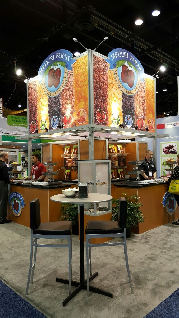
Meduri Farms 20x20 custom exhibit, seen at IFT, Chicago, July 2016
Meduri Farms 20×20 custom exhibit, seen at IFT, Chicago, July 2016

You never know exactly how new clients will find you. It could be from an introduction at a tradeshow. It might be from someone hearing a webinar that impressed them enough to make a call. It might be from an internet search or a referral. The Meduri Farms exhibit project came about thanks to an online search.

One of our most recent clients, Meduri Farms of Dallas, Oregon, found TradeshowGuy Exhibits through a Google search. Through a few months of back and forth to answer questions, the issuing of a Request for Proposals including a design from scratch, we ended up getting the project. It was awarded in March after a competition of four or five exhibit firms, and kicked off in April, finally making it’s debut in July at the Institute of Food Technologists show in Chicago at McCormick Place.

Design was by Greg Garrett Designs. Fabrication by Classic Exhibits. The 20×20 structure was a combination of original design (the tower/alcove unit and product display unit) and rental (counters). The top section of the tower features SEG fabric images up to about a 15′ height which grabs eyeballs from a distance.

The 15′ tower is 9′ x 9′ with a meeting space in the bottom. Two sides are taken up by alcoves that display products and offer plenty of storage room. The roughly 10′ counters give more product display area and more storage for the oodles of samples handed out during the show.

According to Sara Lotten, Sales & Customer Service for Meduri Farms, management loved the booth and the results it brought (“that’s beautiful!” was the comment passed along as the president first laid eyes on the booth at the show). Meduri Farms got a great number of positive comments about the booth. Comments are great, but results are more impressive.

“We got as many leads the first day with the new booth as we did all of last year’s show. We ended up with three times as many leads for the show as last year,” said Lotten.

Meduri Farms, Inc., founded in 1984 is a premier supplier of specialty dried fruits to food manufacturers around the world.

Check out our Meduri Farms photo gallery here.

Find out more about how you can get a new tradeshow booth here.


SoYoung wins ExhibitorLIVE’s Best 10×10 Portable Modular Exhibit Award

20150918-0802

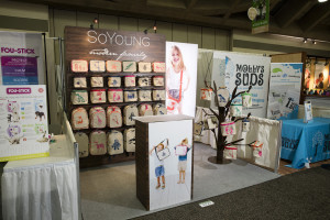
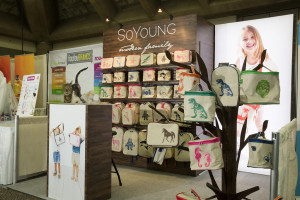
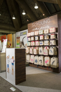
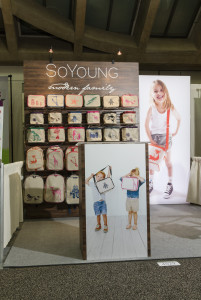
At this year’s ExhibitorLIVE conference and tradeshow in Las Vegas, the annual Portable/Modular Design award were handed out. Here at TradeshowGuy Exhibits (formerly) Communication One Exhibits, we snared a design award for last summer’s SoYoung 10×10 portable booth.

Keep in mind, this was not the popularity contest where everyone got to vote on their favorite design. No, this was the juried design award.

The goal of the competition was to “recognize the vendors and designers responsible for these remarkable exhibits, while also spotlight what’s possible in this realm.” It was the third annual version of this competition. While it appears that all of the awards have yet to be posted online, you’re welcome to review winners of the first and second years.

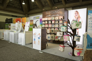
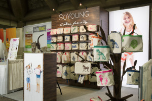
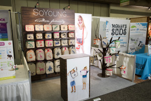
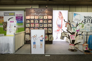
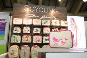
When we were contacted by SoYoung last summer, owner Catherine Choi indicated that they were looking to upgrade their current booth, which was a bit of a mishmash of hanging shelves and display units which didn’t work as well as they liked. Working with Classic Exhibits and designer Katina Rigall, we created an attractive and functional booth with a large backlit graphic, product display shelves and a unique aluminum CNC-cut display tree (which is what we think knocked it out of the park and got the judges’ attention).

The booth made its debut at Expo East last fall in Baltimore and will continue its work at Expo West in Anaheim this winter and beyond.

Exhibitor Magazine made the announcement of all of the award winners on March 1st, starting with the SoYoung booth. Many thanks to Classic Exhibits and Katina for creating a beautiful, creative and functional design, and of course to SoYoung for reaching out to us for the project.

Check out our gallery of the SoYoung booth here.


People’s Choice Awards: Vote Today and Again Tomorrow!

20150918-0804

One of our recent booth projects over the summer was a custom portable modular booth for the Toronto-based company SoYoung. The project turned out so great and people loved the look, that the design and fabrication team at Classic Exhibits thought it should be entered in the Exhibitor Portable/Modular, which recognizes design excellence. So it was. And it made the finals round where you, the public, get to vote!

Classic Exhibits also had two other projects make it to the finals round: Philadelphia Commercial and Nationwide.

The rules for the voting are simple: you can vote only once a day, but you can vote every day.

To vote, simply go here. To learn more about the awards, check this page.

Thanks to SoYoung for letting us design and fabricate their exhibit, and for letting us enter it in the design excellence contest.

And to see a full gallery of photos of the SoYoung booth, check it out here.

“Tradeshow Success” Book Released

This week is the launch of my new book “Tradeshow Success: 14 Proven Steps to Take Your Tradeshow Marketing to the Next Level.” I’m doing a lot of the normal launch things an author would do: sending copies to industry media and bloggers, along with industry colleagues. Creating a list of clients and potential clients that I’d like to get the book into. And much more!

Beyond that, I’ve created a series of 14 videos, with each one relating to one of the chapters in the book. Those videos are appearing, about one a day, at my YouTube Tradeshow Marketing channel. Check ’em out!

So what can you do? If you want to purchase the paperback, here’s the Amazon.com page. You can also buy the Kindle version for about half the list price of the paperback.

You can also read the book for free here at TradeshowSuccessBook.com. You’ll be asked to opt-in to a mailing list (which, if you gotta, you can always unsubscribe from).

Book cover 3DV3 325 pix

What do you get in the book? As mentioned in the subtitle, I’ve detailed 14 steps that are critical to tradeshow success. Not every successful tradeshow marketer uses all of these steps with utmost efficiency, but most of them make very good use of many of the steps.
So what are the steps?

Let’s take a look at the 14 Steps:

  • Step One: Going with or without a Map? Are you doing enough planning and organizing around your tradeshows?
  • Step Two: Dollars, Pounds, Euros: How Much Do You Really Need to Make This Work? A breakdown of the budgeting process for tradeshows and what it takes to budget for a new exhibit.
  • Step Three: Getting Ready for the Big Dance: Pre-show planning and marketing.
  • Step Four: Did You Come to the Right Dance? Just make sure that your target market is at the show you’re going to dump all of that money into.
  • Step Five: Home is Where the Booth Is: Booth design essentials, including function, traffic flow, graphics and more.
  • Step Six: Is Your Frontline Team Up to Snuff? Booth staff training!
  • Step Seven: What Do I Do With All of These People in the Booth? Now that you’ve drawn a crowd, what do you do with them?
  • Step Eight: Tweeting, Posting and Instagramming Like a King or Queen: Putting social media to work for you in a creative way.
  • Step Nine: Who’s Keeping Track of Those Damn Tweets? Someone needs to create videos, blog posts, tweets, etc. Here’s a great look at some online content ideas.
  • Step Ten: Got a Stack of Leads: Now What? Lead generation and follow up.
  • Step Eleven: Becoming the Zen Master of Stats and Records: Record-keeping is the secret sauce to tracking your success.
  • Step Twelve: Stirring the Public Relations and Media Pot: Working with industry media.
  • Step Thirteen: Do QR Codes Still Kill Kittens? And Other Tech Questions: A quick examination of technology in tradeshows.
  • Step Fourteen: Out Of Your Nest: Time to Fly! Your call to action!

Want to grab your own copy? Use the links above to own your own. Or if you want the digital version (PDF download), try this:

Click Here to Get Your Digital Copy of My New Book

SoYoung Custom Booth Makes Debut at Expo East

One of our newest clients, SoYoung from Toronto, Ontario, Canada, unveiled their new custom 10×10 booth to the public earlier this month at Natural Products Expo East in Baltimore, MD to great reviews.

“The show has been hopping and the booth is fantastic!” was the text I got from company owner Catherine Choi on day two of the show. She had a photographer come by to document the booth and products. Check out the gallery. And thanks to SoYoung – glad to have you as a new client!

GetFreeExhibitQuotes1

Essentials of Tradeshow Booth Design: Slide Deck

If you got a chance to see the webinar I did recently with Handshake, thanks! I hope you got something useful out of it. I’ve had a handful of requests for the slide deck so people can review it closer. Here’s the deck:

If you’d like to see the replay, click here.

Top 8 Ways to Justify The Cost of a New Exhibit

What are the indicators that tell you when it’s time to invest in a new tradeshow exhibit? What does it take to justify the expense, which can often be very large?

Naturally, there’s no single answer that applies across the board. However, if you, as a tradeshow marketing manager, feel it’s time to make a major upgrade, you’re put in a position of having to sell the investment to management. Here are a few things that you might consider in the process.

1. Can you point to tradeshow marketing as a consistent method of bringing in leads? And are you turning those leads into clients? If that’s true, the question may be: why do you need to fix it? Isn’t it already working?

It may indeed be working. But if you’re consistently running into issues such as growth, lack of space, too many visitors in such a small space, it may be that you are in need of a bigger space and hence, a bigger booth. One way to determine this is to track visitors by counting, or by anecdotal evidence from your booth staff.

If tradeshow marketing is a solid and consistent business driver, it’s likely that the people with the purse strings may be sympathetic to the request.

2. Consider the prospect of NOT doing anything. What would happen if you did NOT invest in a new booth? Are you satisfied with holding firm with the current booth property? The questions that come up around this question include how old the current assets are, and how is being perceived by your staff and clients at the show.

Another part of this conundrum is this: what are your most direct competitors doing? If the top three competitors in your market have upgraded and upsized their booth properties in the last two or three years, the perception will be that you’re losing ground to them. And in a competitive market, perception is critical.

VK-3006a

3. Do your research. What are your competitors doing? What are the strengths, weaknesses, opportunities and threats from within and without? A simple SWOT analysis can tell you a lot about where you are and where you might go from here.

4. Ask yourself if a new booth is really the answer. What about investing in your booth staff instead or in pre-show marketing and post-show follow up? Support your staff with training and education that allows them to more properly interact on the show floor with attendees by asking the right questions. Maybe a booth isn’t really right yet, but a smaller investment in the staff may yield good results without the larger booth investment, which can then be put off a year or two or three.

5. If a new booth is the answer, spend some time assessing how to understand the investment of capital, what’s involved and when it will be delivered and how it will happen. This will likely mean talking with booth designers and fabricators to get an idea of how much time and money it would cost to develop a design and construct the booth.

6. Once these items are assembled, they should be presented in the context of the life of the booth. Do you plan to use the booth for three, five, or seven years before considering major upgrades? In the case of one client who had committed to a 30×30 island booth in 2012, they had an opportunity to upgrade the space and the booth in 2015 to a 30×40, and decided the investment was worth it.

7. Determine how the new booth will change those who are tasked with the logistics of setting up and dismantling the booth, staffing it for the shows and inviting more clients for one-on-one meetings. In my experience, upgrading to a larger booth will modestly impact the marketing staff, giving them more opportunities to meet more clients and spread the word about the booth. Costs for set-up and dismantle will rise. Shipping costs will rise. Stepping up to a new booth is a major commitment, but it can often be well worth it in the return on that investment.

8. Now it’s time to present the final proposed cost. You’ve assembled a design and fabrication team that is capable. You have a reasonable price range for the project. While the bean-counters will want to justify the case in a hard dollars won vs. dollars spent, in addition to showing how the cost will be justified by the return with new business, detail the ‘soft’ return. These soft reasons to spend the money may include increased business opportunities due to a larger booth, more visibility at the shows, easier and quicker set-up times, perception of being bigger and better than your competitors, better branding opportunities in your booth, and so on. Be as specific as possible. For instance: “our new booth will give us a 300% increase in visible graphic display area to show off our brand and products compared with our current display.”

Use whatever combination of these methods you deem appropriate for your situation. Need help? Give me a call or drop a note and I’ll be glad to chat!

TSEBK download intivation2-rounded corners

Expo West 2015: Blisters, Wacky Booth Awards and Show Reflections

After 62,219 steps, a couple of achy legs and a few foot blisters in four days of Expo West, it came to me: “Tradeshows ain’t for wimps!” Certainly not if you’re walking the floor, nor if you’re an exhibitor who’s shepherding a booth (and staff) from the home office location to the show floor, through day(s) of set-up, three days of visitors, then dismantling and shipping it back. Thanks to Fitbit’s tracking device that’s 28.96 miles, give or take…

Tradeshows ain’t for wimps. I know it, and every year I say the same thing: I should have gone into training for this about six weeks ago.

Depending on whom you listen to and believe and what rumors are flying, this year’s Expo West, held at the Anaheim Convention Center, drew around 80,000 visitors, a one-third boost from last year. Or, as one exhibitor confided, a New Hope rep told her that the total attendance (attendees and exhibitors) was north of 110,000 and growth was so substantial that they were looking to demand some more space and concessions from the convention center, or within a few years it could be ‘Sayonara, Anaheim, hello Las Vegas!’

Like I said, rumors.

Flash Drives: @Tradeshowguy Exhibitor Toolkit

The @tradeshowguy Exhibitor Toolkit

My calling card this year wasn’t a card; it was a flashdrive that contained a lotta stuff to help exhibitors.  I took six dozen and they all found a home, except for the one that stayed in the bottom of my backpack. I loved that they were quite well-received by those I offered them to: “You’re showing me how to bring home more leads, get more PR and have a better-trained booth staff? I’ve been waiting for this!” Did you get one? Would you like one? It’s available now online: download your toolkit here.

Social Media

As always, I keep abreast of happenings on the show floor via Twitter, and, increasingly, via Instagram. It’s easy to post photos to either, but from the Instagram platform, you can also post directly to Facebook and Twitter, so that makes it an easy choice to start there. Loads of exhibitors and attendees are hanging out on both platforms, and it’s easy to follow them by tracking the hashtags #expowest and #expowest2015. Hey, I got some freebies this way, and also entered a few contests that I previously would not have run across. (Hey NutraSumma, call me when I win that mountain bike, okay?)

Booth Awards

This year’s show was, as usual, quite the extravaganza. And the booths (and attendees) ranged from ghastly to elegant to stunning. Let’s hand out a few awards, shall we?

Coolest Interactive

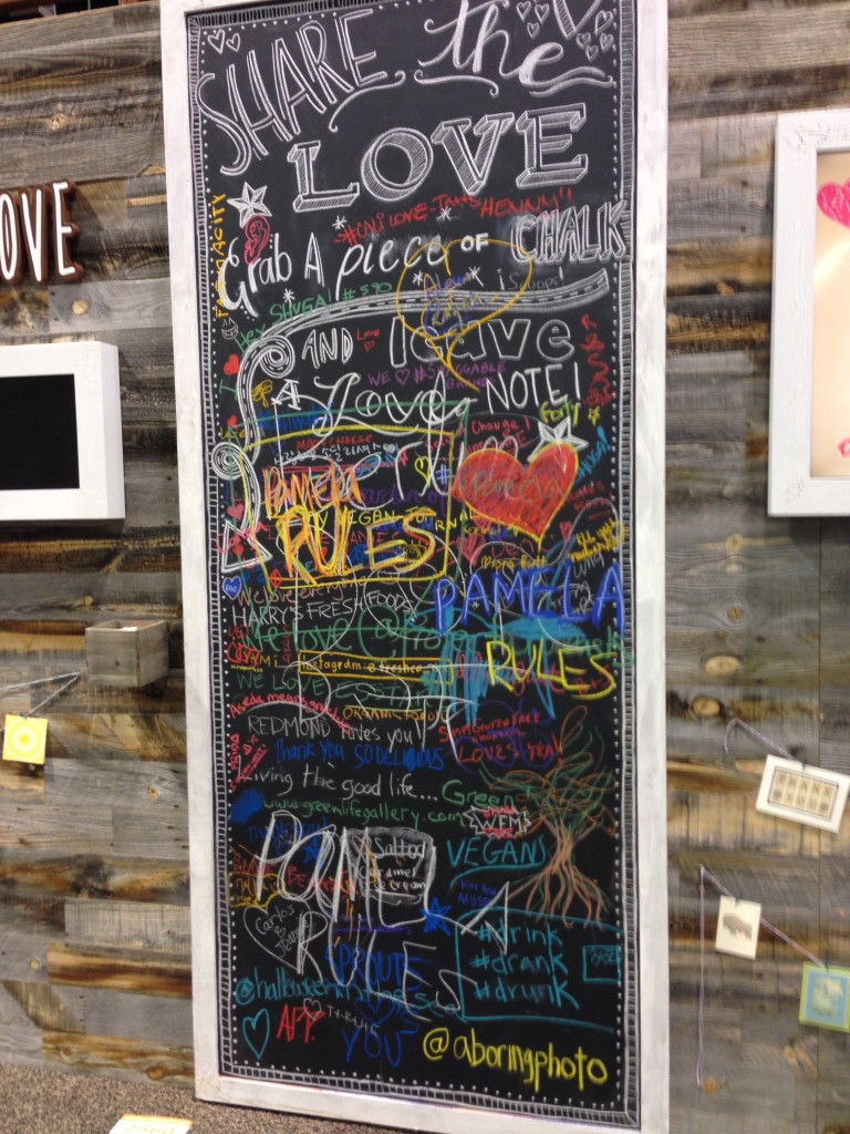
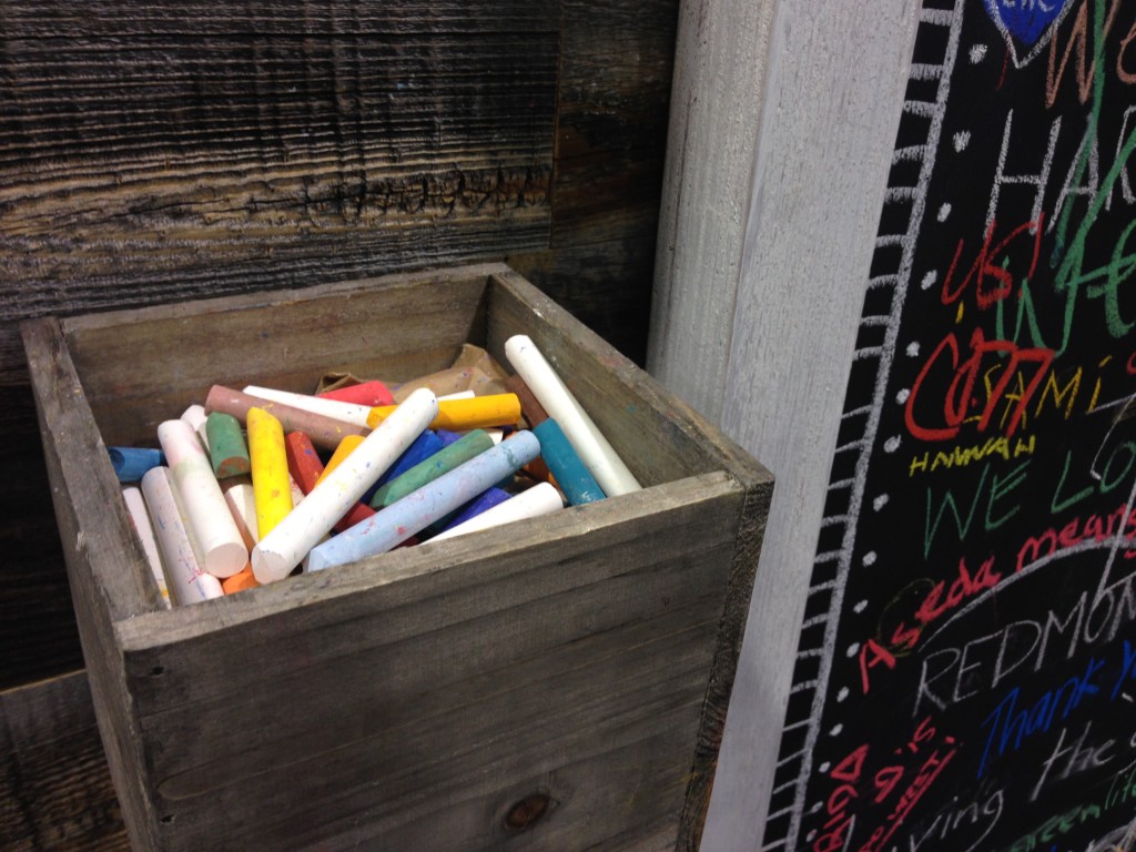
While there were certainly a lot of companies looking to find ways to get visitors to interact with their booth, the So Delicious booth found a nice way to get people involved by ‘sharing the love’ with chalk on a large chalkboard at the back of their booth.


IMG_9611
IMG_9614

Most Unsubtle Header

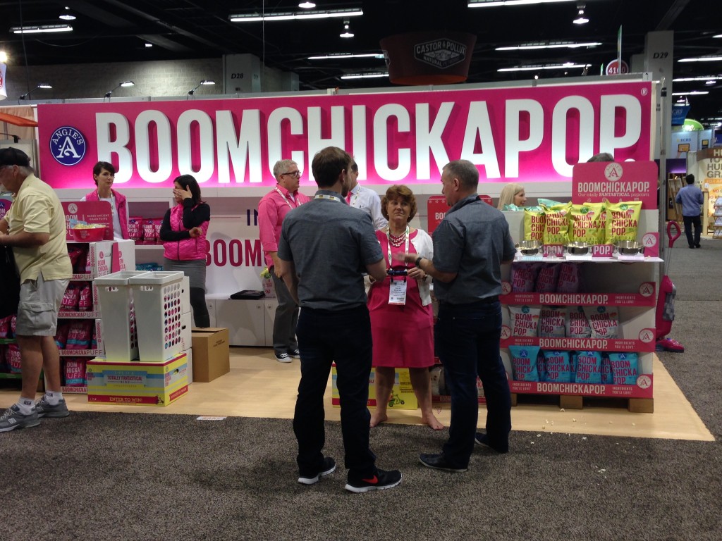
Boomchickapop decided to go all in. I can hear the discussion now: “Hey, let’s take the name of the product, make it as big as possible and add a lot of PINK! Whaddaya say, gang?” Well, it works. It gets you to stop, take a look and see what they’re all about.

IMG_9477

Most Iconic Cut-Outs

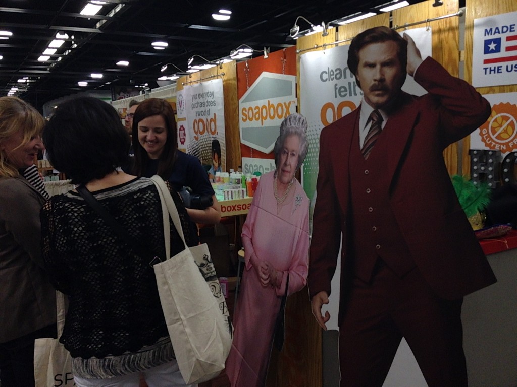
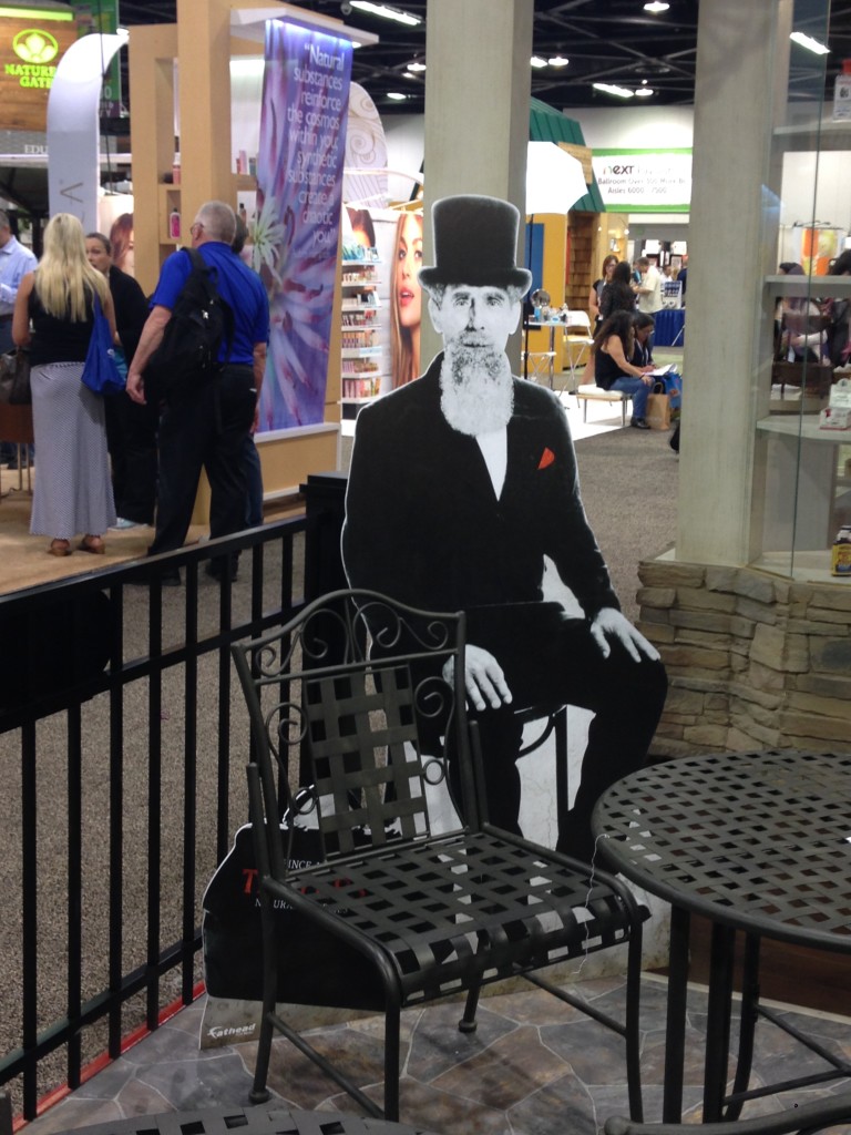
A year or two ago, the new Pope was featured in a cut-out. I didn’t see him this year, but I did see Will Ferrell, The Queen of England and Dr. Thayer. I probably missed some others.

IMG_9451
IMG_9631

Big Ass Colorful Graphic

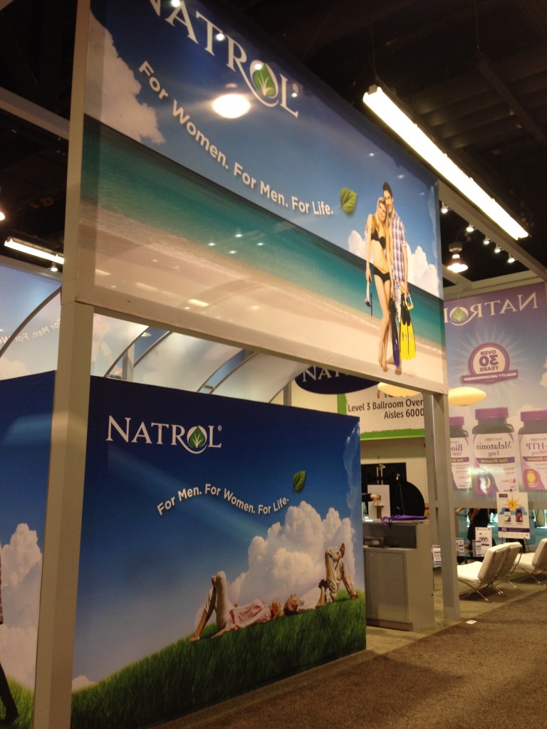
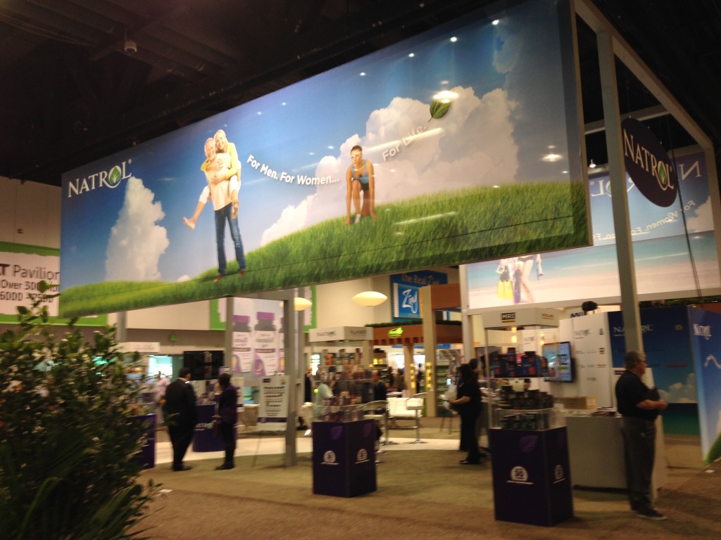
Natrol’s booth sat up front at the entrance to the hall, and to grab people’s attention, they installed a graphic that must have measured about 8’ x 30’. Big. Colorful. And not the only one. The booth had big ass graphics on all sides, so you couldn’t miss ‘em.

IMG_9634
IMG_9632

Biggest Coconuts

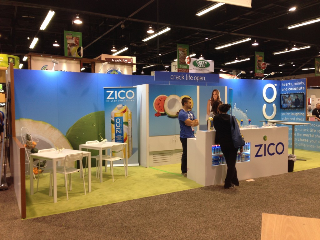
A large pair of coconuts on the back wall of Zico’s booth caught my eye and drew me in for a taste of chilled juice blend.

IMG_9638

Biggest Boobs

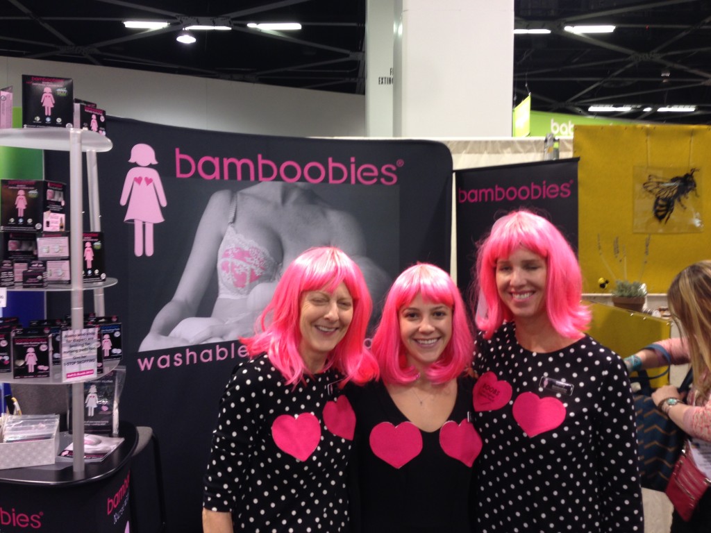
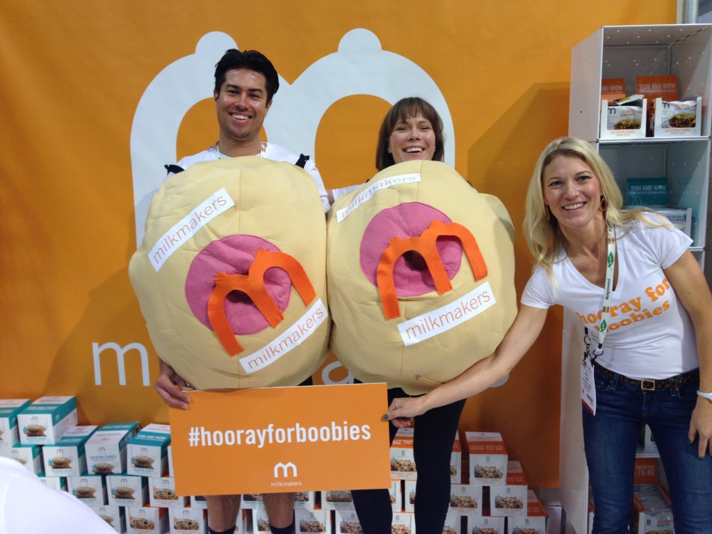
A tough battle between Bamboobies (the girls with the pink hair) and the giant walking boobs of milkmakers, who were promoting their product with the hashtag #hoorayforboobies, and I think the boobs from milkmakers won out.

IMG_9443
IMG_9538

Best Stairway to Heaven (or at least the second floor)

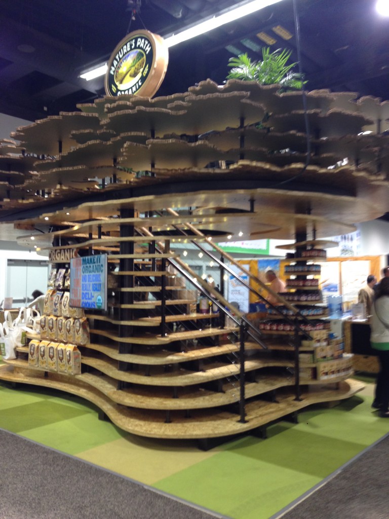
Nature’s Path showed up with a clever booth that showed a layered look from the floor to the 16 foot level, including a stairway up the middle to a private meeting area.

IMG_9352

Busiest Graphic Backwall

Not always a good award to win because people don’t often stop to read the whole damn thing; nonetheless, this one from Powercrunch was arresting.

IMG_9639

Best Iconic Brand Knockoff

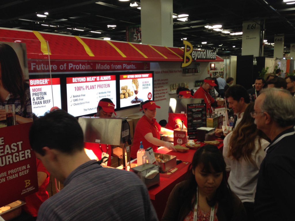
While Beyond Meat will never be mistaken for McDonald’s, they did work hard to pull the look and feel of Mickey D’s into their booth to show how their meatless product compares. Nicely done!

IMG_9653

Most Elegant Look

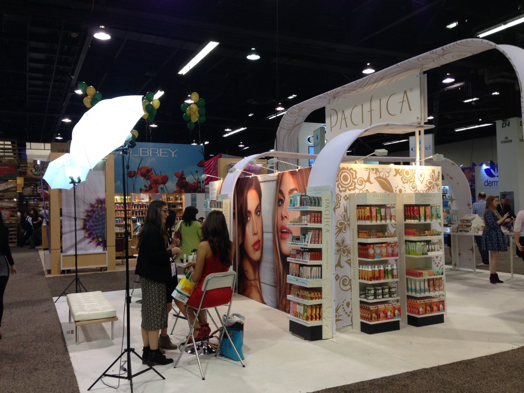
Simplicity and function are their own reward. This was accomplished by the designers of the new booth for Portland’s Pacifica.

IMG_9486

I look forward to Expo West every year; this was my 13th consecutive year at the Anaheim gathering. It’s had astonishing growth in that time (and it was big back then!), and it appears to be anticipating even more growth in the next half-decade. The Natural Products Industry has done well of late with healthy and intriguing products, dramatic competition and an increasing market for those products.

Our company, Communication One Exhibits, has about a dozen current and former clients at Expo West this year, and we’d love to add more. Want a booth for your next show? Click here. We love making you look good, whether it’s at Expo West or any other show.

Tradeshow Marketing Analysis, Part 5: The Booth

This is number 5 in a series. Check the previous articles here:

  1. Where to Start
  2. Budgeting
  3. Pre-Show Preparation
  4. Which Shows to Attend

Let’s tackle the BIGGEST part of your tradeshow strategy – at least in terms of potential cost.

The BOOTH.

IMG_5636

We can agree that booths come in all shapes and sizes. We can also agree that they usually cost a LOT MORE than you anticipated, right?

Let’s leave the cost and size up to your particular company’s available budget, goals and marketing presence. For some companies, a 20×30 booth would be a huge investment, more than they could possibly justify. For others, a 70×100 might be smaller than they’re used to. So for now we’ll dispense with the actual size and cost and focus on other important elements.

Let’s start with the BRAND. Your booth should convey, at a glance, the look and feel of your brand. For some, that’s a natural wood look. For others, it means a high-tech look straight out of Star Trek. That doesn’t mean that a rootsy, earth-mama brand couldn’t get away with an aluminum structure with fabric graphics. Those decisions are typically made through long and detailed conversations with a 3D booth designer, the company’s marketing team and a booth fabricator. But still, the goal should be that when a visitor sees the booth and the company’s name, it evokes a FEELING that is in congruence with what the company wants the visitor to feel. If not, somebody messed up.

Secondly, your GRAPHICS MESSAGING should be planned so that a visitor’s eyeballs will follow it to its proper conclusion. Usually this means the hierarchy works like this:

  1. Company Name or Logo
  2. Positioning Statement or Bold Challenge
  3. Supporting Statement

However, if your company is not well know, this typical hierarchy might change a bit:

  1. Bold Statement or Challenging Question
  2. Company Name or Logo
  3. Supporting Statement

And on somewhat rare occasions, the company name might drop all the way to third place, if it’s an unknown company or if the company name is really insignificant:

  1. Bold Statement of Challenging Question
  2. Supporting Statement
  3. Company Name or Logo

If your company name is unimportant in the sense that a product or brand is important or more recognizable than the company name, that might go first:

  1. Brand
  2. Tagline or Positioning Statement
  3. Supporting Statement

There is no one-size-fits-all approach for graphics on tradeshow booths that covers all companies or situations. Instead, your goals, products and objectives should help determine how the graphic hierarchy is displayed. The main thing to keep in mind is that visitors pass by booths quickly and they all become a blur. Imagine your booth is a freeway billboard and you have 2 – 3 seconds to catch someone’s attention.

Next up: BOOTH FUNCTION.

From a 10×10 booth to the larger island booths, the function of a booth must be carefully thought out and discussed, and it will be determined largely by your show goals and objectives, the number of booth staff and how you want to interact with visitors. If you’re doing product demonstrations, for example, you’ll need to make sure the booth is big enough to accommodate the presenter or demonstrator and a small audience. If you’re sampling edibles, perhaps all you need is an easy-to-reach sampling table.

Every booth is different, every show is different and every company’s goals and objectives are different. Other questions to settle: Do you have enough storage? How many meeting areas do you need? Should the meeting areas be completely private or only semi-private? What products and/or services are you promoting at this show? Do you need video monitors, or an iPad kiosk to help visitors interact?

Take the time to address all of the functions that your booth needs. Those needs can be determined by the experience you’ve had at past shows as well as conversations with company staff that are involved.

IMG_5442

And no matter what functions you detail and prepare for in your booth, chances are good that once you’ve lived in the booth for a few days, you’ll notice things that need to be changed for the next time. For example, one of our clients wanted a meeting space for their clients in a 20×30 booth, so one end of the booth – about a 10×20 space – was covered and mostly inaccessible to the casual visitor. However, after 2 – 3 times exhibiting in the booth, it became apparent that client meetings didn’t happen as often as they thought, and booth staffers found it to be a quick and easy place to hide out. So the covered meeting space was removed and the space was better utilized as product display and visitor interaction.

Of course BOOTH FUNCTION also includes things such as storage, meeting areas and traffic flow. While planning a booth you’ll want to take into account these three critical things. Not to say that they’re often – or ever – overlooked, but it’s not out of the ordinary for them to be miscalculated. For instance, traffic flow: do visitors have easy access to the booth? Or do you even want them to have easy access? Some companies design booths so that only desired visitors are allowed inside, limiting access to casual passers-by. Others want any and all visitors to step inside the line.

Storage needs to be considered: personal items (coats, purses, laptops, briefcases, etc.), products so samples can be replenished and more. Do you have enough space? Make sure you have enough, but try not to overdo it: space is at a premium at tradeshows and every cubic inch needs to be considered.

Finally: meeting areas. How many staffers will be meeting with clients or media types at the booth? How often? How many meetings are already scheduled ahead of time? How many do you anticipate to happen randomly?

Truthfully, it’s quite possible that the needs of each show will shift slightly from previous shows. The best approach seems to be to pay attention to how the booth is used at each show and make adjustments as budget and goals shift.

Finally, let’s touch on LOGISTICS, SET-UP AND DISMANTLE. In recent talks with a new client, they first mentioned the most important aspect of their new booth: it HAS to ship in a case small enough to go by UPS of FedEx. The large 4x4x8 wooden crates were a big NO-NO. So every possibility that came up from then on had to ultimately meet that objective.

To them, set up meant having a couple of booth staffers arrive a day or two early at the show, set it up with a minimum of fuss and tools, and avoid the double-whammy costs of pre-show staging and arrival at the advance warehouse, and having to hire show help to set up the booth.

Other companies don’t mind the extra cost – they try to minimize it, of course – but it’s more important to show their audience a great booth. Even if it means the booth is a 40×40 that requires a day to set up with hired help, and takes a dozen crates to ship.

Any good company will be aware of your desires in these areas, and determine what’s most important.

Best Case Scenario: having a booth that a) immediately conveys your company’s BRAND, 2) your GRAPHIC MESSAGING is clear and relates to this show’s goals and objectives, 3) is built to FUNCTION properly with room for meetings, storage, product/service display and 4) meets your company’s objectives when it comes to SET-UP and DISMANTLE.

© Copyright 2016 | Oregon Blue Rock, LLC
Tradeshow Guy Blog by Tim Patterson

Call 800-654-6946 for Prompt Service
Copyrighted.com Registered & Protected <br />
QA4E-AZFW-VWIR-5NYJ