Best tradeshow marketing tips and case studies. Call 800-654-6946.

Custom tradeshow booth

Is Downsizing Your Exhibit the Right Move for You?

Many companies I work with are in the process of increasing the size of their booth, is that the right move for you? Perhaps downsizing is a better choice. So what comes into play when you consider the decision?

Often the choice is strategic. You may know that some of your major competitors are either not going to be exhibiting at a specific show where you want a presence, yet you don’t want to do the full exhibit that you’ve done in the past. Or it’s a show where the attendance is down, so having a smaller presence doesn’t hurt you.

Your brand is morphing into something different, and investing in a new exhibit doesn’t make sense. In this case, you can go for a smaller presence for less money. You might also consider renting an exhibit, which can give you significant savings in the short term.

You need to show a better ROI to the powers-that-be. Investing less in an exhibit is one way to cut up-front expenses and increase the overall ROI.
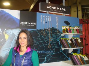
Downsize your tradeshow exhibit

You’re planning to invest more heavily in pre-show marketing. This is a simple re-focusing of your marketing tactics. Putting more emphasis on reaching visitors prior to the show with direct mail, for instance, can bring people directly to your booth with an appointment and plan in hand that is congruent with your goals.

The bigger shows get even more expensive, and yet you still need a presence there. One way to keep your presence at the show is to have a smaller exhibit. Smaller booth space may also mean you don’t have to send as many people to staff the booth, saving yet more money.

You’re reassessing your overall tradeshow marketing plan. I’ve seen some companies simply pull out of a show for a year or two. They’ve had a major presence for years, yet taking stock of the value of the show was important enough to them to not exhibit and to rather just send several members of management to meet with other exhibitors and partners offsite.

Having decided to downsize your exhibit, make sure that the smaller version of your brand is still impactful. This means that graphics have to be well-designed and of high quality, your exhibit structure should be of high quality, the booth space needs to be kept clean, your staff should be well-trained and well-prepared and your products and service offerings should be your latest and greatest.

Why the Gravitee Exhibit is a Game-Changer

Can a single exhibit called Gravitee really be a game-changer when it comes to exhibit design aimed at flexibility and being user-friendly?

Let’s take a look:

“If you’re tight on time or budget, try Gravitee!”

So exclaims Rey at Classic Exhibit, the exhibit house that is putting Gravitee out to the world. It’s a system of building blocks that uses no tools and has no loose parts. The aluminum extrusions are designed to accommodate doors, SEG fabric graphics and direct print graphics. The ability to use the various building blocks for an exhibit design are literally endless. Wire management is built in. You have fully assembled panels – always – single or double-sided. Corners are pre-notched for seamless SEG fabric graphic installation.

Seriously, this is limitless flexibility with elements that stack, connect and align perfectly every time.

And did we mention no tools or loose parts?

Take a look at Gravitee in action:

Take a closer look at the Gravitee selections on our Exhibit Design Search.

Does Your Tradeshow Exhibit Evoke Emotion?

“Does your tradeshow exhibit evoke emotion in the mind of a visitor?” might be a funny question. The better question might be: “HOW and WHAT emotion does your tradeshow exhibit bring out in your visitors’ hearts and minds?” But by asking it, you’re pulling on the string of branding, high-impact motivators such as confidence, sense of well-being, protecting the environment, being who you want to be and a litany of other emotions that pull in one direction or another.

tradeshow exhibit evokes emotion

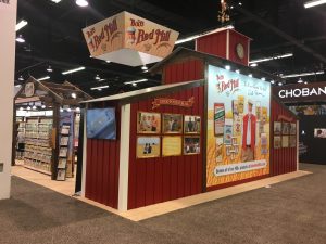
Let’s use one of our clients at TradeshowGuy Exhibits, Bob’s Red Mill, as an example. Their foods are mean to inspire good eating with high-quality grains, oats, cereals, mixes and more. Good eating equals longer life and better health. Better health equals a positive feeling. Hence, just seeing the Bob’s Red Mill exhibit can evoke an emotion that gives people familiar with the brand a sense of well-being and comfort. All without them even thinking about it. As long as the visitor has a familiarity with the brand and products, their brain will make a quick connection with a positive result.

Let’s try another brand, say, United Airlines. With the recent debacle of having a booked passenger dragged off the airplane with smartphone video cameras in action that spread quickly throughout social media and mainstream news outlets, many visitors to a tradeshow with a United Airlines exhibit might have a different feeling today than they did just a month prior.

According to Alan Zorfas and Daniel Leemon, writing in the Harvard Business Review, “On a lifetime value basis, emotionally connected customers are more than twice as valuable as highly satisfied customers.” Gaining that emotional connection pays off in numerous ways as they buy more, visit you online or in your store more, are less concerned about price in favor of quality, and listen more to what you’re saying, whether on a TV or radio ad, in a magazine, or in a weekly newsletter.

When it comes to evoking that positive emotion when visitors at a tradeshow come upon your booth, your branding and costumer experience already has to be in place, at least to a certain degree. A visitor that’s familiar with your brand and has a positive feeling upon seeing your exhibit has internalized that – but beyond that, she recognizes the key elements of the brand successfully executed in the design and fabrication, down to the small details.

A visitor that’s not familiar with your brand will still experience a gut feeling upon seeing your booth. The accuracy of that evocation has everything to do with how skillfully your 3D exhibit designer and your graphic designer have understood and communicated the elements of your brand. Once they inhale that look, as it were, they’ll make a decision on whether to more closely check out your products or services. If all is done right, your visitor will get an accurate emotion of the brand that you’re hoping to disseminate.

tradeshow exhibit evokes emotion

This is all not precise, of course. You can’t just plug in a color or texture or design or graphic and provoke a predictable reaction. Even ugly and unplanned exhibits can still have a successful tradeshow experience, which may be due to other factors, such as the competition, the specific product, the enthusiasm and charisma of a particular booth staffer or some other unknown element.

But the better your exhibit reflects your true brand, the more powerful it becomes in the heart and soul of your visitor. And they’ll take that home with them.

In Tradeshows, Perception is Everything (Almost!)

When you are going out on a date, my guess is you dress up. If you’re a guy, you’ll put on some nice clothes, fuss with your hair a bit, brush your teeth and maybe put on a dab of cologne. If you’re a girl, you’ll do much the same, only probably spend longer (is that a sexist remark or just an observation of reality?). In either case, the intent is to put your best “YOU” forward. You want to give a good impression.

tradeshow perception is everything

It’s the same at a tradeshow. You want to put your best look forward. And in probably almost more than any other marketing medium, tradeshows are critical to putting out a good impression.

The perception visitors have of you is what they’ll take away. And while there are many elements, from the exhibit to the booth staff and how they interact, to the products or services you offer, the bottom line is: what the visitors thinks they see is the impression they’ll take home.

And while this often means bigger is better and more impressive, that’s not always the case. And in fact, smaller exhibitors can often make a big impression by doing thing differently with booth activities, a ‘must-see’ product, a special guest in the booth, an unusual exhibit or giveaway or more.

If your visitors leave with the perception that your company is sharp, the product is great/cutting edge/marketing leading or whatever, and your exhibit is top-notch regardless of the size, you’ve accomplished your mission.

If those visitors see an old and tired exhibit, lazy or uninterested booth staffers, products and services that don’t inspire, that’s what they’ll remember.

Regardless of what your company or employees or products are really like, the perception is the reality. So put out the best impression you can. And if for some reason the perception is more impressive than the reality, you know you’ve got some work to do behind the scenes. But on stage – out where everyone can see you and make up their own minds based on what they see – that’s where you’ll leave a lasting impression.

Natural Products Expo West TradeshowGuy Exhibit Awards

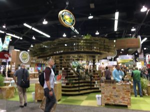
Walking the floor of the Natural Products Expo West show in Anaheim, one is overwhelmed by the sheer number of tradeshow exhibitors and visitors. According to New Hope, the organization that puts on the show, there were over 80,000 visitors this year, and over 3,100 exhibitors.

That’s a lot of bone broth, honey, yogurt, Paleo diets and chocolate. Oh, the chocolate!

But there are literally tons of tradeshow exhibits, many of which stand out in unique ways. Let’s capture a few of these and call them out for service and recognition above and beyond.

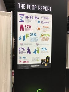
Best Use of Bodily Function Statistics: GoodBelly

I watched as visitor after visitor stopped at the side of the GoodBelly exhibit and snapped a photo of The Poop Report, an infographic compiled from a survey of over 3000 people who visited the GoodBelly website.

The Poop Report: Good Belly

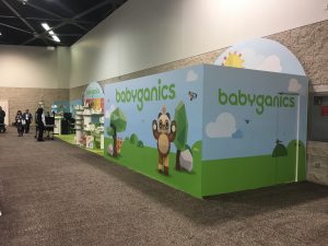
Best Long Form Screenplay, er, uh, Exhibit: BabyGanics

BabyGanics have traditionally occupied an odd-shaped island space for years in the convention center, so I was a bit surprised to see that space occupied by another exhibit. It took a moment of spinning on my heels, but I did eventually find the 60′ (70′? 80′?) long exhibit. Just an inline exhibit, but they jammed a lot of longevity and functionality into the space.

BabyGanics Goes Looong!

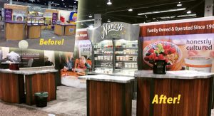
Best Makeover: Nancy’s Yogurt

This booth is near and dear to my heart: it’s the second exhibit project I ever sold when I got into the business 15 years ago. So this is nearly 15 years old. For years, the booth has had the same look and feel. But a laminate makeover gave it an entirely new look and feel. In fact, I admit at first glance I thought it was an entirely new exhibit! But not the case – just a quick re-skin for a whole new look:

Nancy's Yogurt Before and After
Nancy’s Yogurt Before and After

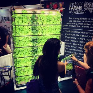
Best Lettuce on a Wall: Indoor Farms of America

Inside Farms of America had a simple concept: show people what they do, and as a result it’s an eye-catching and ‘stop-in-your-tracks’ effect:

Best Lettuce Wall
Best Lettuce Wall

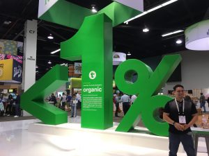
Best Minimalist Exhibit: Kashi

Kashi’s <1% display got people talking and snapping photos. It’s nothing but a large space with a hanging sign, the <1% display and, when you read the fine print, you discover their message about organic farmlands. Effectively done:

Best Minimalist Exhibit: Kashi

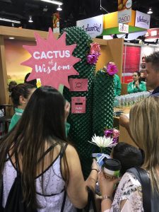
Best Use of Cactus Wisdom for Interactivity: Steaz Tea

There’s nothing like handing out cards with pre-printed fortunes to get people to line up. I know I did. Clever, interactive, and engaging in a fun way – a perfect fit for Expo West:

Steaz Teas Interactive Fortune-Telling Cactus

Seriously, I could go on forever with fun and silly awards for exhibits at Expo West: it’s a place with a lot of creativity. Yes, you’ll find uncreative low-budget exhibits that should (and probably did) embarrass the exhibitors, but what’s the fun in pointing those out? They know who they are, and they know when it’s time to upgrade. So let’s go with just one more that caught my eye:

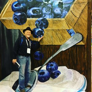
Best Photo-Op Exhibit: StonyField Yogurt

A large painting on a wall and floor made it look like you’re standing in a bowl of yogurt, if photographed at the right angle. So I joined in. Lots of people waiting for their turn here throughout the show:

Best Interactive Photo-Op: Stonyfield Yogurt

TradshowGuy Exhibits Shows Off Three New Client Booths at Expo West

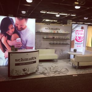
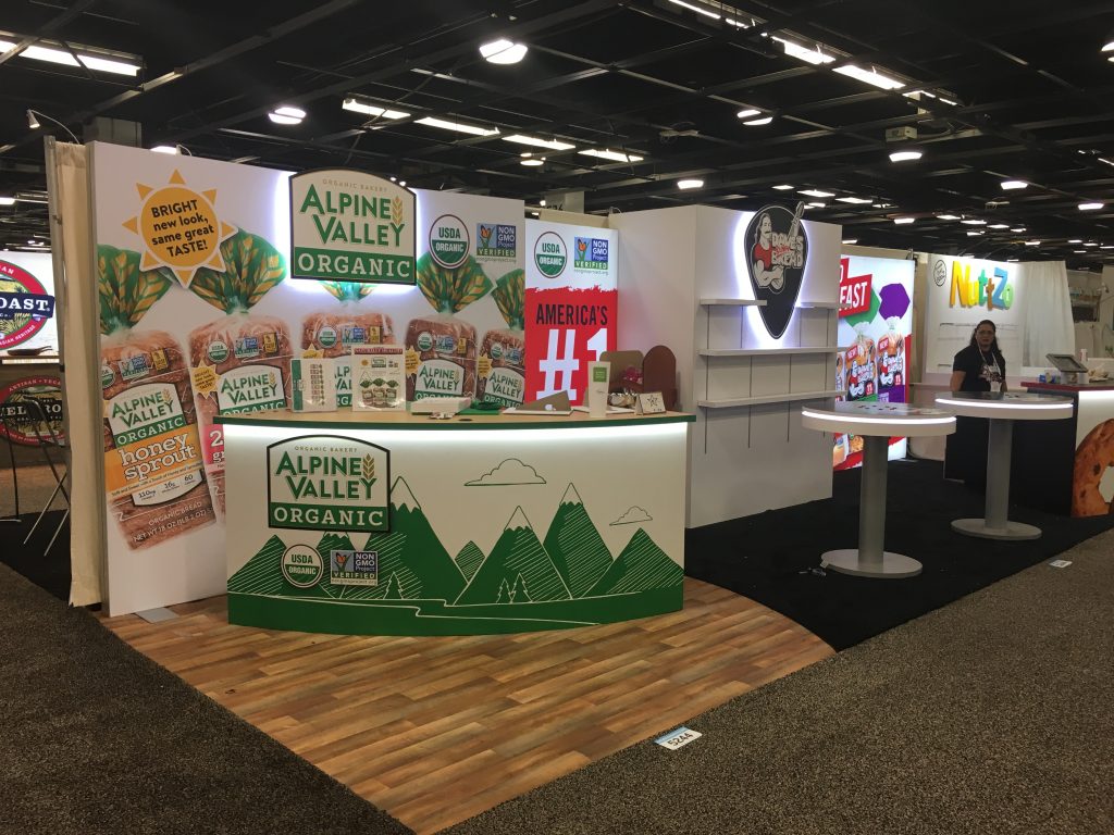
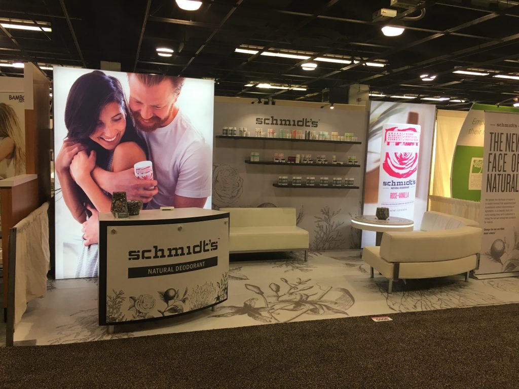
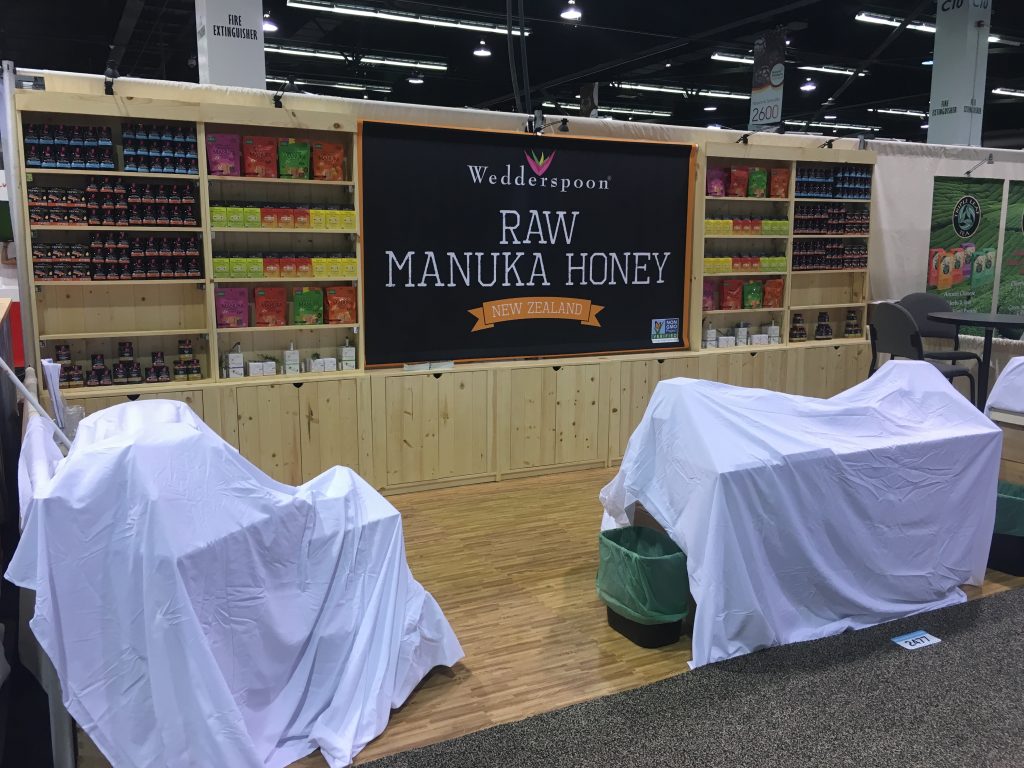
it was a good Natural Products Expo West 2017 for all of us here at TradeshowGuy Exhibits! We welcomed three new clients at the show: Dave’s Killer Bread/Alpine Valley Bread, Schmidt’s Natural Deodorant and Wedderspoon Manuka and Organic Gourmet Honey.

Expo West Tradeshow Exhibits

Dave’s Killer Bread/Alpine Valley Bread got it started with a 10×30 booth; 10′ is dedicated to the Alpine Valley brand, 20′ to the Dave’s Killer Bread brand. The booth featured three fabric graphics, two of which were backlit by LED lights, creating a bright and attractive light box. Both brands showed off their logos with stand-off direct print sintra with LED highlights. A small storage closet gave them plenty of room for product, along with two custom curved counters equipped with USB chargers and LED trim. One had a tablet kiosk affixed to the top.


Schmidt’s Natural Deodorant is a relatively young company that has seen its products make a big impression in the marketplace. This year they introduced a new soap product to go with the deodorant, and showed it all of with a custom 20′ inline booth featuring two large fabric light boxes.

Both of these booths had custom flooring, which we’re seeing a lot more of these days.

Last, but not least, we worked with Wedderspoon from Philadelphia to create a wood-shelf oriented booth to show off their line of New Zealand honeys. This was a simple, elegant wooden booth that gave them a large hanging graphic in the middle, several display shelves and ample storage space.

All of the companies reported glowing comments from visitors on their new exhibits. But more importantly, the great folks from Dave’s Killer Bread, Schmidt’s Naturals and Wedderspoon loved the exhibits and were a joy to work with. It’s another good reminder of why we’re in this industry: to make you look good!

Repeal and Replace: The Tradeshow World’s Version

All this talk and angst about ‘repeal and replace!’ Yet it happens all the time in the tradeshow world. Yesterday I walked the floor of the Natural Products Expo West show in Anaheim as exhibitors assembled exhibits for business later in the week. Many of the exhibitors there have performed a version of ‘repeal and replace’ on their exhibits. Others have done a partial makeover, hoping to satisfy the budget-minded constituents in the company. And yet others have stuck to their guns, not making any changes from last year.

repeal and replace

That’s the way of the tradeshow world. Every year there are new competitors in the marketplace. Every year there are new potential customers that are going to view your exhibit with new eyes. Every year there will be the same visitors who have seen your exhibit before.

So what prompts a company to throw out the old – repeal – and bring in a new exhibit – replace? It could be any number of things, but a recent client described it perfectly: their old exhibit was a ‘train wreck’ and the new one fixed all those issues with something that was well-planned and well-executed.

Certainly budget comes into it. So does function. So does the competition, company growth (or contraction), change of direction or any number of things.

When you’ve come to the decision to repeal and replace your exhibit, take the time to get it right. You’re going to want to live with it for several years.

TradeshowGuy Monday Morning Coffee: February 20, 2017 [video replay]

List-making! In this episode of the TradeshowGuy Monday Morning Coffee, I take a look at the top 7 things I like about being a tradeshow exhibit project manager and owner of TradeshowGuy Exhibits. And I explain why making a checklist for your exhibit project is a very good thing.

As for today’s One Good Thing, I shared a night sky app called SkyView. Check it out.

The Importance of Knowing Your Tradeshow Marketing Goals

What are your tradeshow marketing goals? It may seem an obvious question. But it bears some attention before schlepping off to the show, setting up and accosting attendees.

Each show is different with a unique audience and a unique set of competitors. How you determine your goals depends on those combinations. Some shows may be better at connecting you with retailers, some better at interacting with buyers, others better at connecting with bigwigs who can make big things happen.

In general, the tradeshow marketing goals can fall under three main areas:

the importance of knowing your tradeshow marketing goals

Brand Awareness and Perception

In this area, you can build on your company’s marketplace awareness with an effectively branded booth that shows off your credentials or capabilities. You can promote specific products, launch new products, position your company effectively against competitors, or even reach new markets.

Floor Activity Goals

This is where you can work to increase traffic, have one of your managers speak at a conference or panel, speak with industry media outlets, compile information about your competitors, interact with attendees, promote your message, give demos or hand out samples, work to build traffic through promotions and social media engagement and more.

Things to Measure

I’ve always advocated that exhibitors count visitors. It’s not always easy on the crazy chaos of a tradeshow floor, but if you can keep count you’ll know the number of visitors you had. Use that as a baseline and count the visitors at each show and compare year-to-year. You’ll also count leads and sales that result from those leads. Do a little market research by taking a survey or visitors and compile the results. Keep count of any new distributors, suppliers, retail buyers and more.

Knowing your tradeshow marketing goals gives you focus, especially since those goals change from show to show, from audience to audience.


Free Report: “7 Questions You’ll Never Ask Your Exhibit House”

7 Kinds of Exhibits to Look for at the Tradeshow

There are hundreds of styles and types of exhibits at tradeshows, but in my estimation you can reduce them to just a handful of ‘kinds’ of exhibits. Do you recognize these?

  1. Super-Duper Over-the-Top Big Tent Exhibit. You know these kind. This exhibit has a hanging sign, a dozen or more people working the booth who are wearing matching tees or tops, are handing out samples and generally trying to be the ‘big dog’ in their niche. And with this kind or exhibit, they usually succeed.
  2. 7 Kinds of Exhibits to Look for at the Tradeshow

    Large Format Well-Branded Exhibit. Most likely an island, but you can tell in an instant who the exhibitor is. Highly professional. The staff is smiling, greeting everyone appropriately. Kicking ass and taking names.

  3. Something New. Often an inline exhibit from a company that changes it up frequently. Some companies take the same exhibit year after year after year. There are some exhibitors, however, that bring a brand new look almost every year. These are companies that are challenging their competitors and the status quo.
  4. Same Old Exhibit. Just referenced in last paragraph. The company that doesn’t even bother to change their sign from year to year even though a casual observer can tell they should probably do some updating.
  5. The Kluge Exhibit. Creativity run amok, where a (usually) small company has a couple of creative folks who take bicycle parts, discarded barn wood or whatever and somehow manage to come up with an exhibit that knocks your socks off. What are they selling again?
  6. Basic. Lots of companies start here. There’s not a lot of creativity, but simplicity is important and the message is clear.
  7. The WTF exhibit. Poorly executed graphics with unclear messaging, bored-looking staffers. It makes you wonder WTF are they doing at the show?!

Next time you walk the show floor, see how many of each kind of exhibits you can identify! And if you can add to our list, feel free to drop a comment!

© Copyright 2016 | Oregon Blue Rock, LLC
Tradeshow Guy Blog by Tim Patterson

Call 800-654-6946 for Prompt Service
Copyrighted.com Registered & Protected <br />
QA4E-AZFW-VWIR-5NYJ