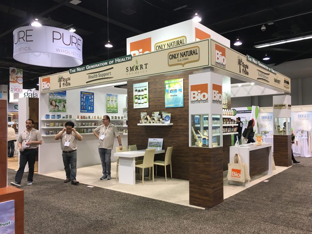
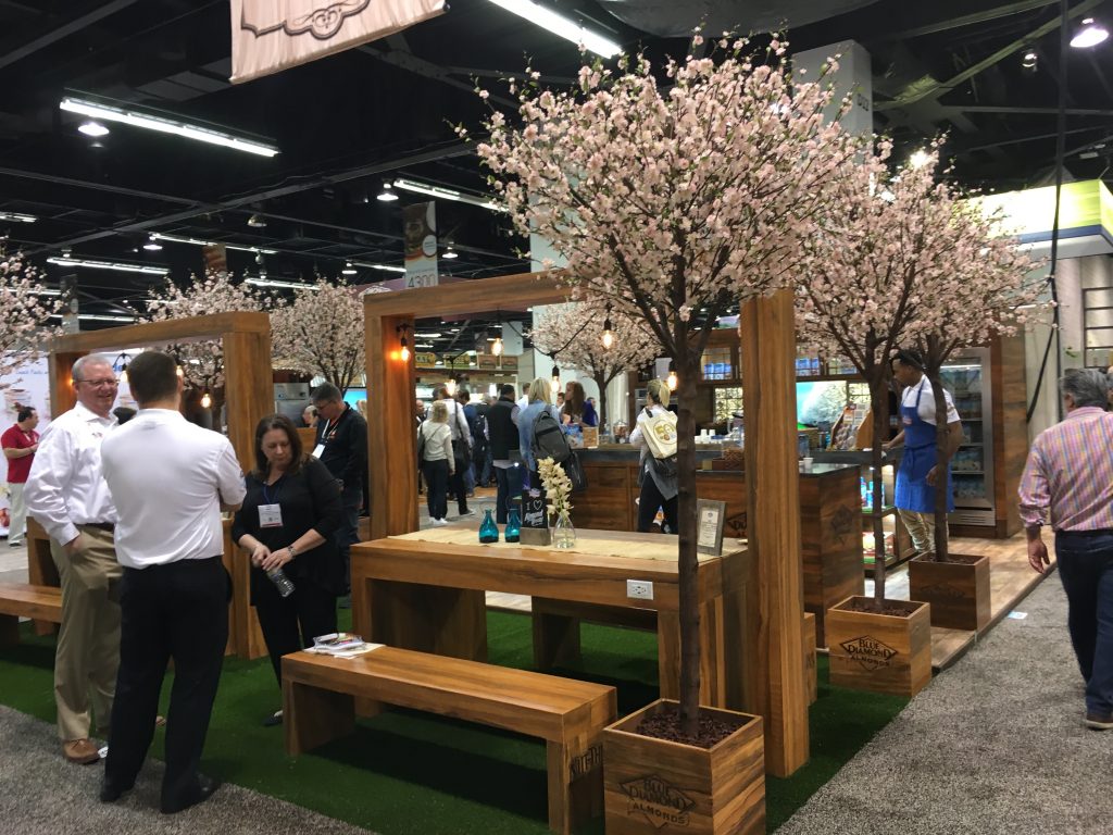
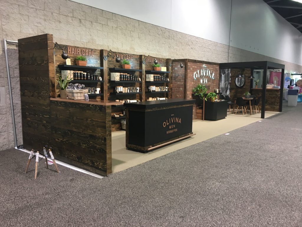
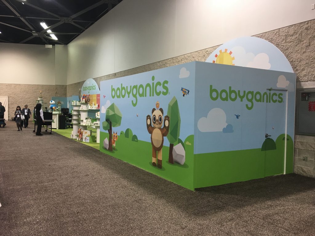
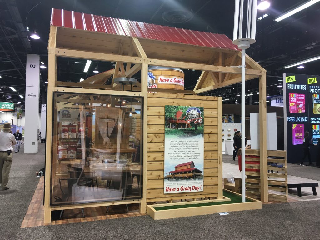
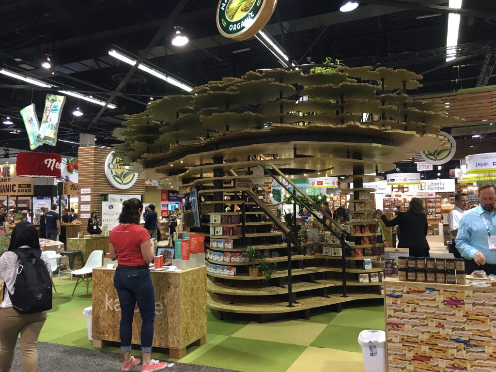
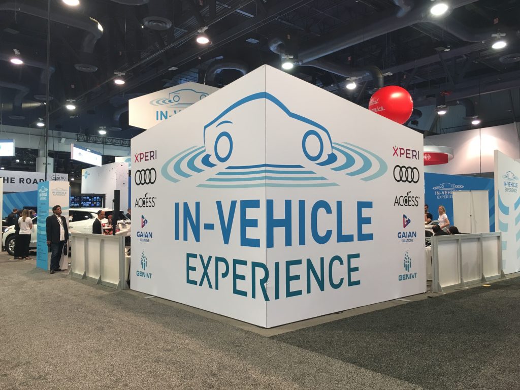
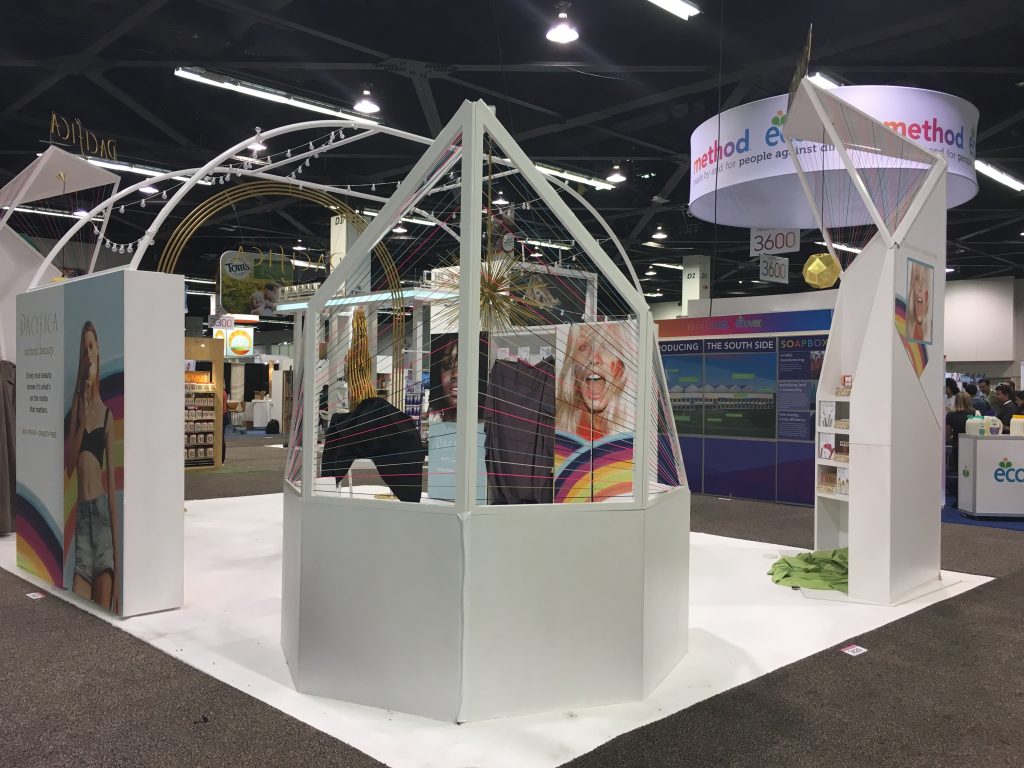
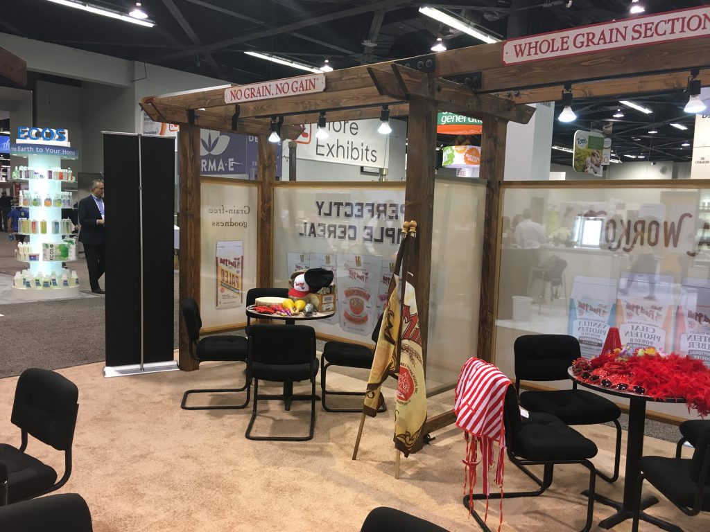
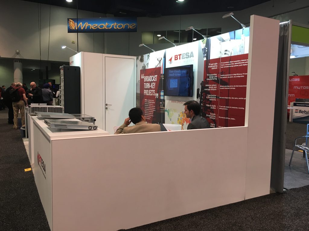
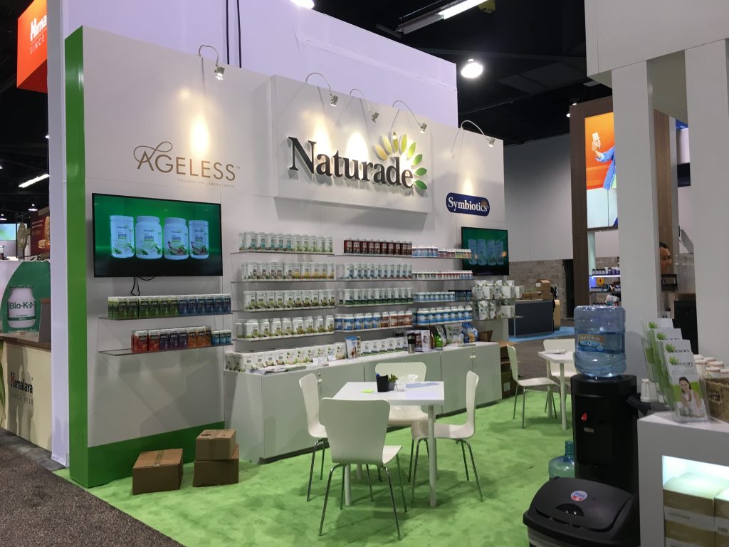
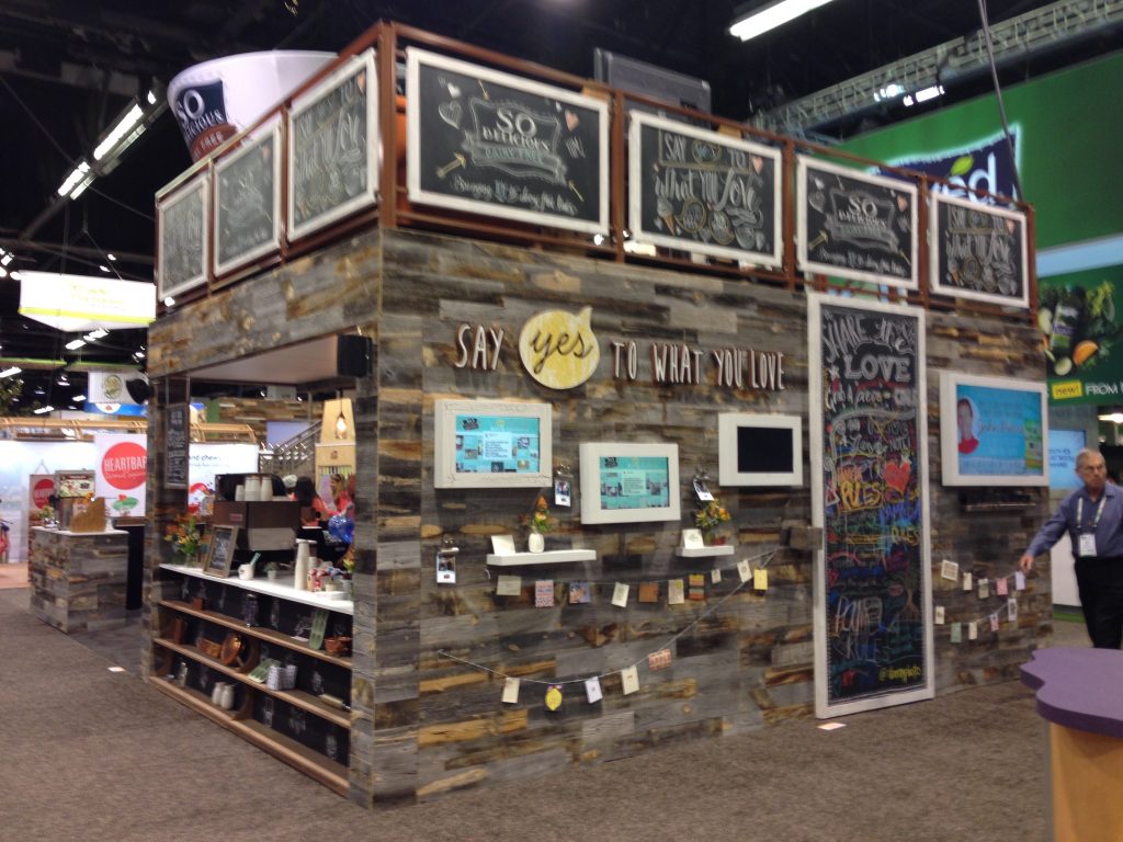
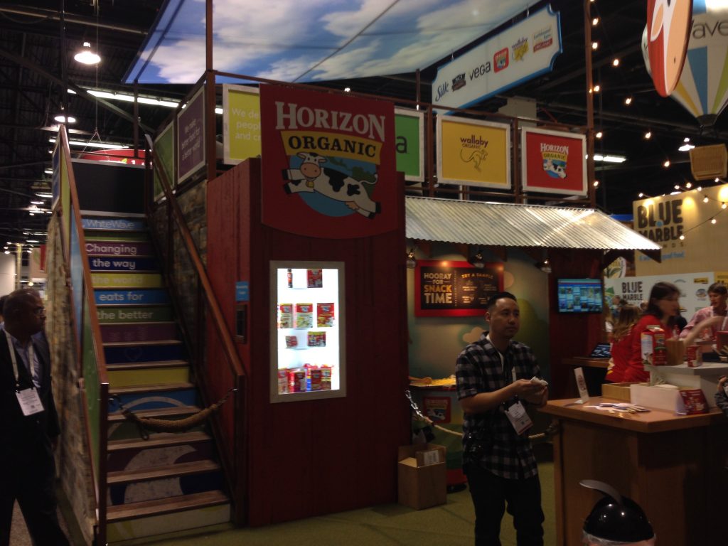
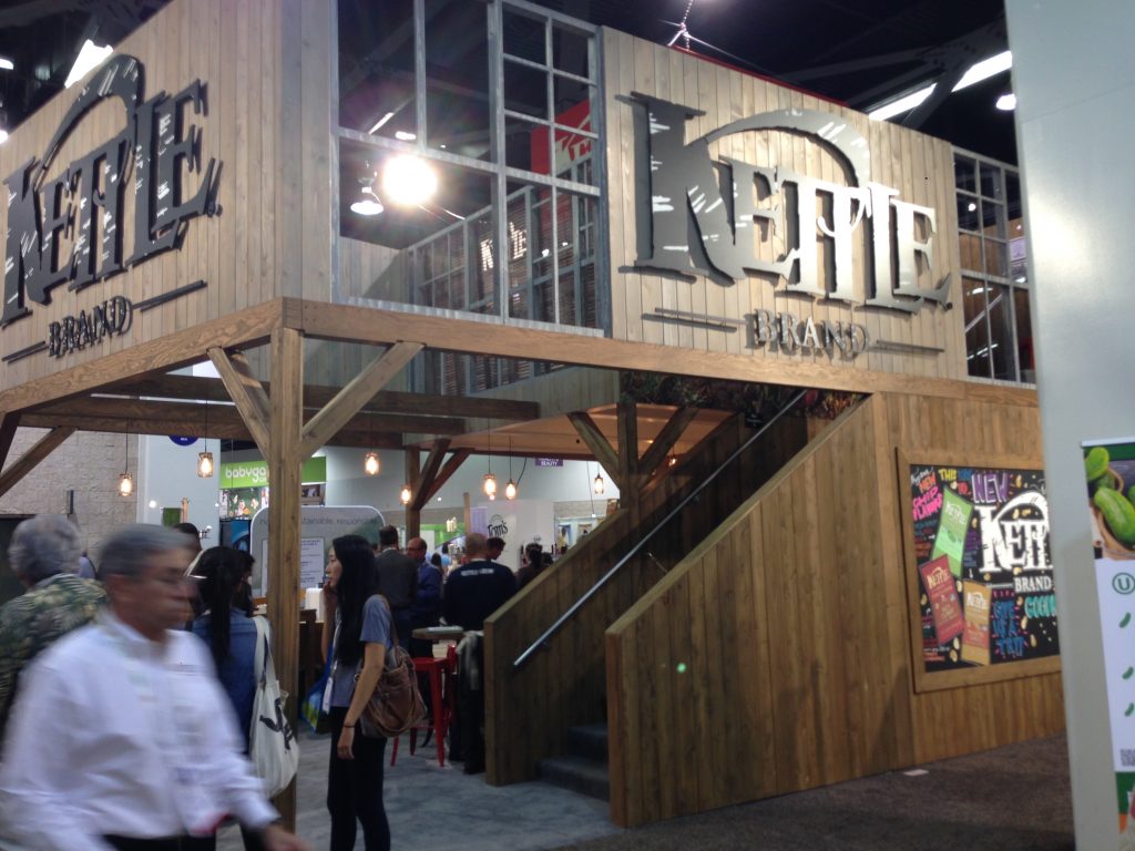
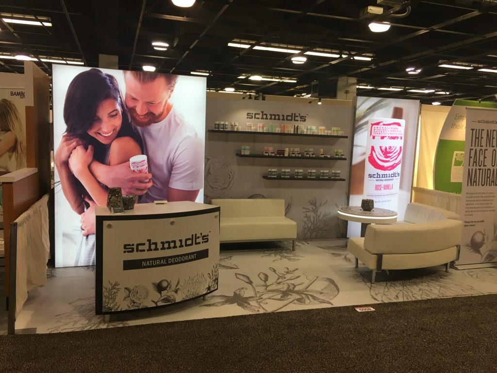
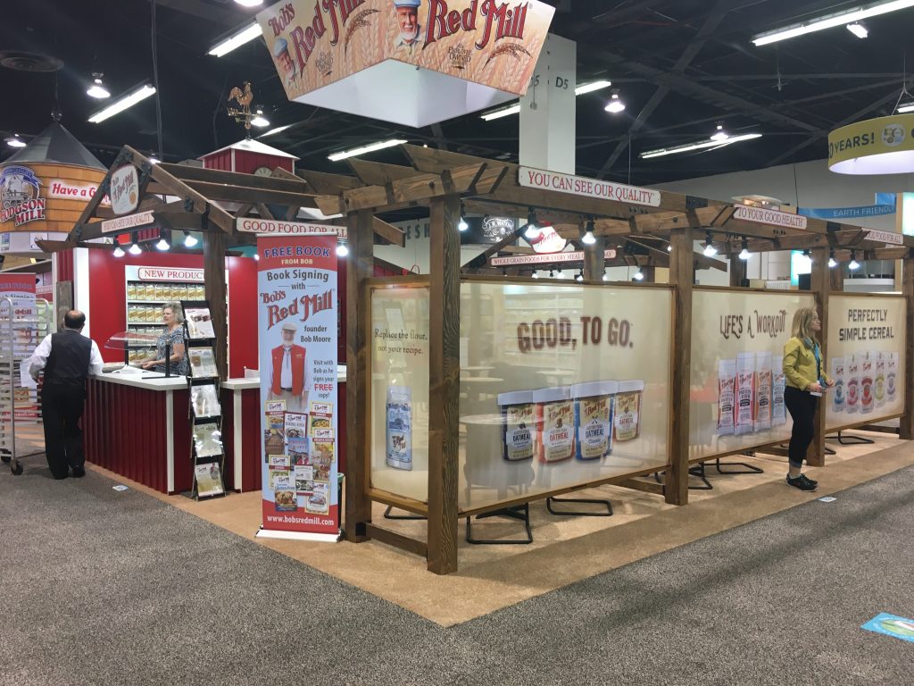
When you step up to a larger island booth and get away from the shorter inline configurations, your options for a private or semi-secluded conference or meeting area increase dramatically. You can go all the way from a private, enclosed space with opaque walls to more open meeting areas that, while open to the aisle, have a barrier of some sort, whether it’s a see-through wall such as a milk-plex or some arrangement of foliage or barrier that tells people “this is private.”
This topic came up recently during an initial conversation with a client who stated they wanted a private meeting area in the booth. That led to a discussion about what exactly they meant by “private.” Opaque walls? An area that is clearly delineated as a meeting area by invitation only? A second floor that would also clearly mean “invitation only”?
There are many approaches to creating a private or semi-private meeting area for you and your clients or prospects in a tradeshow exhibit, limited only by your imagination and budget. Here are a smattering of exhibits I’ve seen over the years that have various iterations of what a meeting area can look like.
Do you set up the exact same booth every year with no changes? Or do you find that you have to make minor or even significant changes from year to year because your needs change or some piece of your exhibit doesn’t function the way you thought it would?
Many exhibitors stay the same, but many change. Frequently.
Let’s say at one show – a big one that you set up an exhibit at every single year – you have had nearly the same configuration for five or six years. That’s not unusual. Although, in my experience, most clients we work with at TradeshowGuy Exhibits do at least modest changes nearly every year. Sometimes they do rather wholesale changes, like increasing their footprint by 50% or more. Or realizing at this year’s show they don’t have enough meeting space. Or product display space. Or that some element of the exhibit just didn’t work as anticipated.
There are always reasons for making changes. But if you purchased the exhibit, you’re kind of stuck with it.
Rental furniture adds a nice touch without a big commitment
Except. Not always. There are always a lot of ways to skin the cat, as it were. Let’s say – like a client of ours recently – you have a custom booth. You spent a lot of dough on it, so the idea of building another piece just to satisfy your functional needs is going to challenge your budget. When this happened to the client, who was looking for more counter space, we suggested that instead of having some custom counters built, why not rent some counters? That way, you’re only committed to one show with the revised configuration, and the cost will be lower than if you had them custom-built and bought them. And if for some reason you really like the configuration, you can either purchase them or choose to rent them again the following year. I see it happen frequently.
Same thing with furniture. It used to be that clients would ship furniture to shows in their crates. Chairs, small loveseats, tables. In some cases, that’s a good thing, especially if the table is branded or is custom in some other way like LED highlights.
But the furniture is unused the rest of the year. It can get scuffed and damaged during setup and dismantle. Renting the right pieces, such as a nice brand-new comfortable couch might make more sense. Do the math, take a look at the options, and make the decision.
It’s all fluid. Especially when it comes to the various smaller elements of your tradeshow exhibit: counters, furniture, product display units and more. Talk with your exhibit house rep or coordinator and see what options you might have that can both save you money and give you an upgrade on looks and function. It’s doable. Because it’s fluid.
Not every custom tradeshow exhibit project needs an RFP (Request For Proposal). But there are times when it’s an appropriate way to communicate what you need to a handful of carefully selected exhibit design and fabrication firms. Here’s a brief look at a number of things you should consider including in the RFP:
When putting a budget together for a new tradeshow exhibit, there are more things to consider than just the cost of the exhibit itself. Here are a handful of things that will likely come into the mix:
Everything you do, everything you say, how you say it, what you wear, what you drive…they all send signals to other people. A Rolex sends a different signal than a Swatch watch. A Tesla sends a different signal than a Ford 150 pickup. A pair of shorts sends a different signal than a tuxedo.
We all choose the signals we send out, whether consciously or unconsciously. What kind of car we buy, clothes we wear, people we hang out with, how we speak, what we read?
When someone visits your place of business, what signals do you send? How clean is the floor, what kind of bathrooms do you have (and how clean are they)?
Every interaction a prospect or client has with you or your company is an opportunity for them to form an impression.
It’s the same thing at tradeshows. Do you ever think about the signals you send with your tradeshow presence? No doubt a lot of thought goes into how you’ll present your image and brand down to the right colors, the type of packaging, the types of products you design, create and market.
Everything in your booth sends a signal
But I wonder if that consideration goes all the way to the people in your booth. Do you decide if Jesse is a better choice than Aaron to represent the company in the booth? Do you choose branded clothing, such as t-shirts, for all of your booth staffers to wear from day to day? Do you train them on how talk to visitors, how to ask questions, how to stand, how to understand and control their body language?
What about the state of your booth and exhibit? Is the carpet clean? Is the garbage can overflowing? Does your exhibit have cracks and signs of wear and tear or is it in tip-top shape with new graphics and clean countertops?
Everything you do, wear, and speak sends a signal.
No, things don’t always go wrong when exhibiting at a tradeshow, but when they do, it can throw you and your team for a loop. The best way to deal with what happens when things go wrong is plan for them to go wrong.
Obviously, you can’t game out every scenario. But you can at least anticipate a few things, right?
One way to see what things might possibly go wrong is to read Exhibitor Magazine’s Plan B column, a monthly ‘you-are-there’ description of actual events where things went wrong. Sometimes terribly. But you get to see the creative ways in which people dealt with an unexpected circumstance.
What are some of the things that can go wrong? How about a missing shipment, where only part of your exhibit shows up? Or new graphics are printed but you haven’t had a chance to review them or test them on the exhibit frame because, you know, timing? Or finding out that your booth space wasn’t where it was supposed to be and wasn’t as big as planned.
Frankly, a million things can go wrong and the hardest part of dealing with something unexpected is that you’re in an unfamiliar place. And you may be setting up on a weekend, or in a different time zone and you can’t reach the people you normally would rely on.
And of course, the time crunch of making things happen in short order because the show will open on time whether you’re ready or not.
A few things that I believe can make a difference: knowing who to call. Knowing your vendors or shippers on a first name basis. Having cell phone numbers of critical people who can make things happen quickly, like printers, exhibit makers and more.
Things often go wrong at a tradeshow…how do you handle it?
Another common denominator is that most of the problems take place early on during setup, which means making sure all of your vendors are on alert for anything from late night phone calls to early morning emails to deal with situations that arise.
One way to head off potential problems is to get ahead of the game as much as possible. Get graphics designed sooner than you might normally plan. Get them produced and fitted ahead of time. Set up the exhibit prior to packing it for shipping to make sure all pieces are there and still fit; we all know that exhibits are packed away quickly and that some things get broken or bent or torn and no one will notice until it’s too late. Which means that one of the best things you can do is go through your exhibit crates on a slow day shortly after they return from the show. It’ll give you a chance to take the time to confirm that all is as it should be or uncover potential issues way before you’re under a time crunch.
Bottom line: be as prepared as possible before things ship and have contact info for all of the players at your disposal (and have a full-charged phone or a portable power pack!). And if all of those plans don’t head off a problem, work with the creative people in your setup crew and booth staff. Putting heads together instead of trying to solve everything on your own is probably the best way to work your way through a difficult and stressful unexpected problem.
Building software to host a virtual event poses a million questions, many of them hoping to address the user experience. And the exhibitor experience. How to keep people engaged, how to keep them from being bored, how to have conversations, how to connect, how to give keynotes. And so on. I recently caught up with Sandy Hammer, co-founder of AllSeated, which has recently launched virtual event software that looks, well, impressive. She and I sat down to talk about it, and to give her a chance to show us a little bit about how it works:
Check out AllSeated.com. And I just noticed that David Adler will be giving a keynote on Thursday, January 7th with AllSeated and the virtual event software exVo. More info here.
When I first speak with a new client about what they want in a new tradeshow exhibit, it usually comes down to one of two approaches. Either they want to start from scratch, in a sense, and have a good idea of the potential layout and scope of the exhibit, and they have a budget number in mind. Or, and this is the other extreme, they want to pick out a kit from our catalog and make do, mainly to save budget dollars.
There’s nothing wrong with either approach. Every company has a different agenda when it comes to a new exhibit.
The former approach means everything is custom from the git-go. A designer is brought in, conversations are had about brand attributes and guidelines, and the designer is basically turned loose. These are typically the bigger budget projects where, from the start, the designer is encouraged to cut loose, to try several approaches and show a number of structures with different traffic flow patterns, demo areas, meeting areas and so on. From that, the client decides on one (or two) that work best for them, and the design is refined until it’s ready.
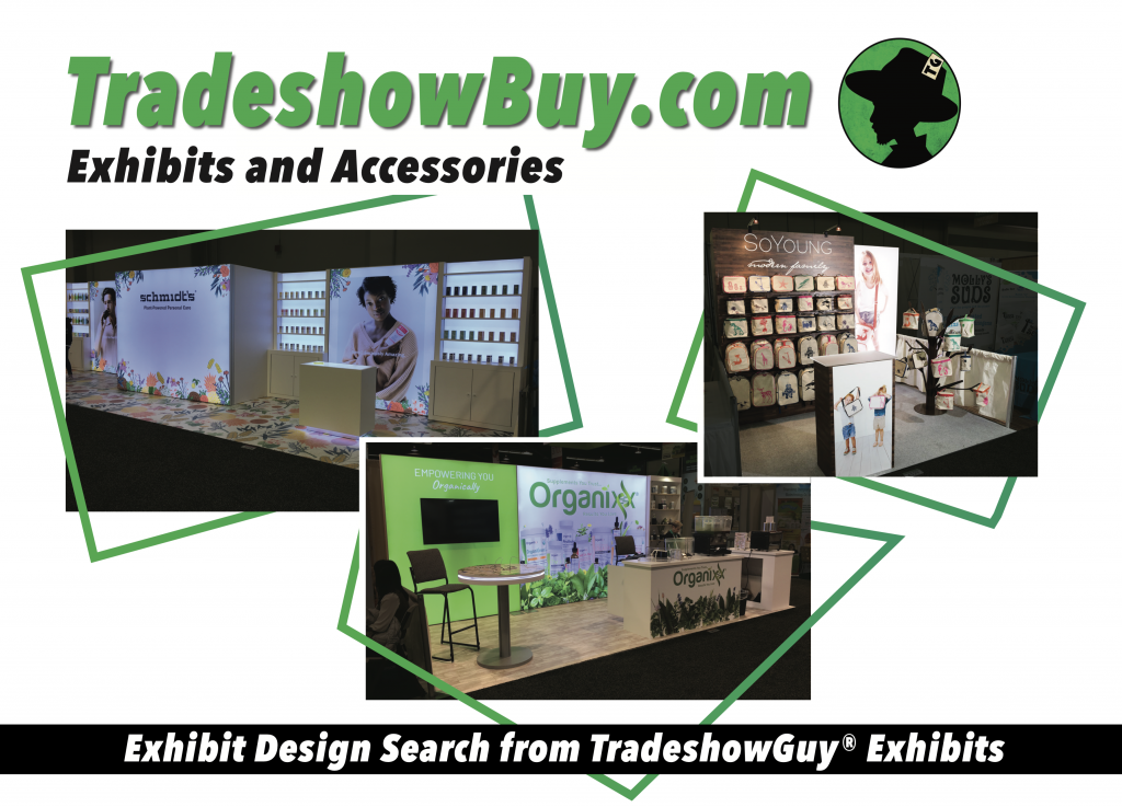
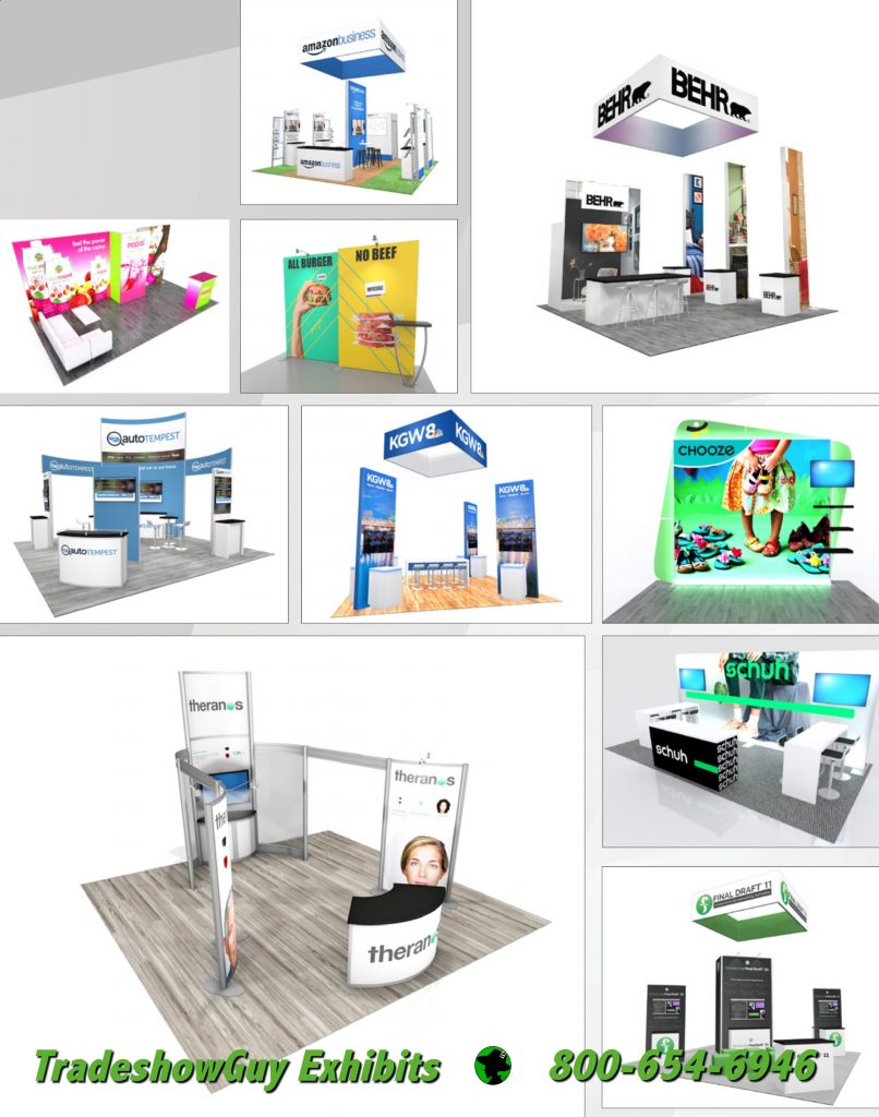
The other approach, where the client is typically working with a more limited budget, starts with a kit from our Exhibit Design Search at TradeshowBuy.com. More often than not, the client believes that the kit as shown in the renderings is the final design.
That rarely happens. Once the conversation starts, the questions begin. Can we add a counter? What about shelves? We need shelves. And something to sit at. And that panel isn’t big enough, what if we made it bigger.
The answers are yes, yes, and yes. Kits get customized, almost all the time. With new clients, there is a bit of a learning curve, but once they realize that even if they start with a kit, that doesn’t mean they’re stuck with everything that’s show. Kits are good starting points to get what clients really want, which is most often a customized version.
A good thing to keep in mind when starting from scratch, especially if your budget is pointing you in the direction of a kit. That kit can be revised, reduced or enlarged in size, configured to fit in more than one final setup (10×10, 10×20, 10×30 for example). Accessories can be added, freestanding graphics or tables can become a part. And those additions don’t have to be out of the catalog, either. Often a client will have custom-built tables that include their logo and additional lighting effects to make them stand out.
If you’re shopping for a new exhibit in 2021 and your budget is pointing you towards something out of a catalog, starting with a kit makes sense. But you don’t have to (and probably won’t) stay there.
The tradeshow and event industry has been gasping for air for months and months. Exhibitors are putting off investing in new exhibits while wondering if they’re even going to appear at any shows in 2021.
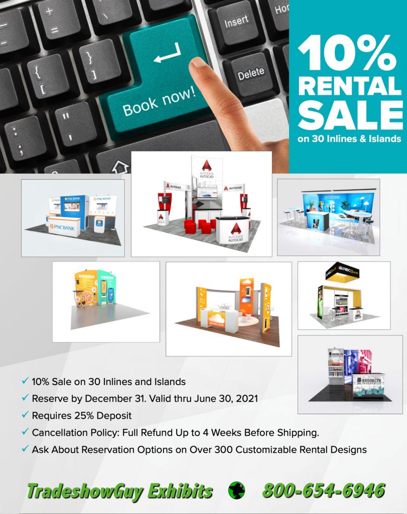
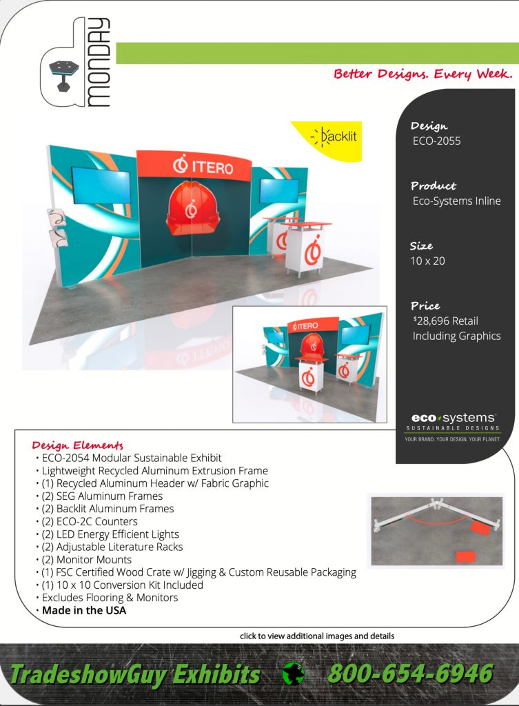
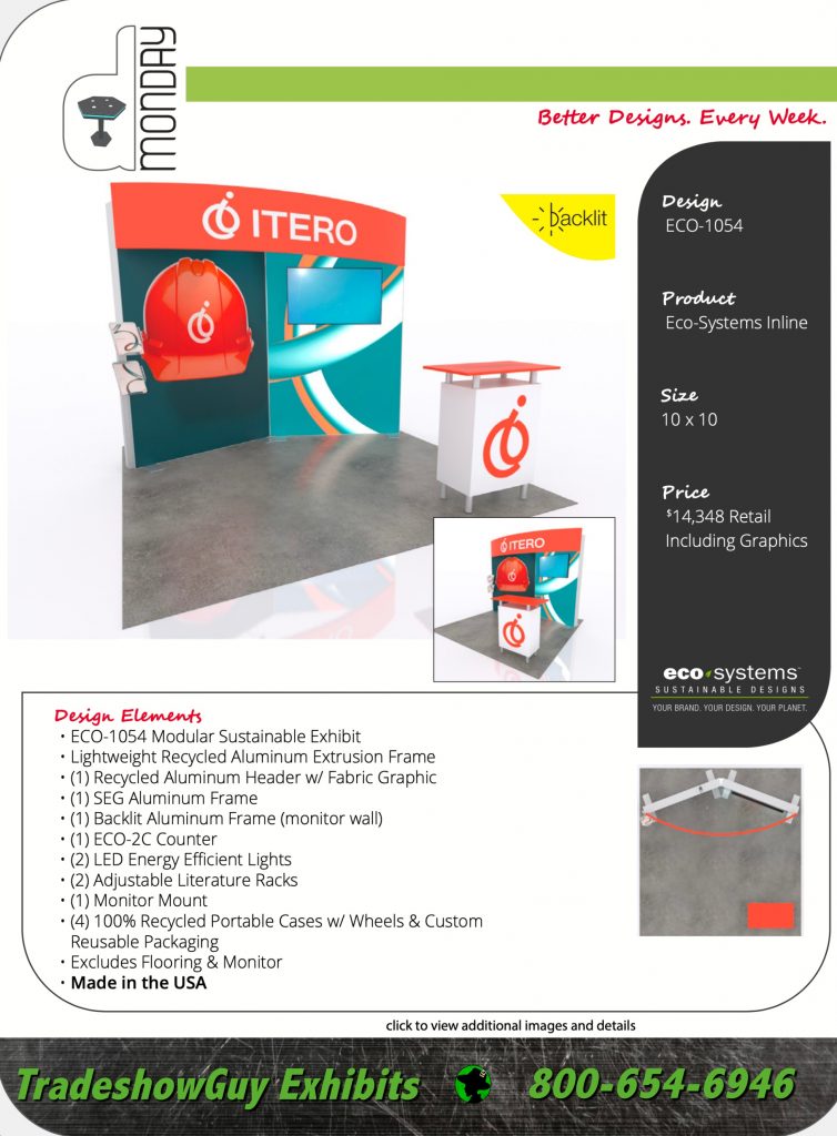
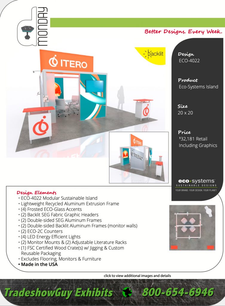
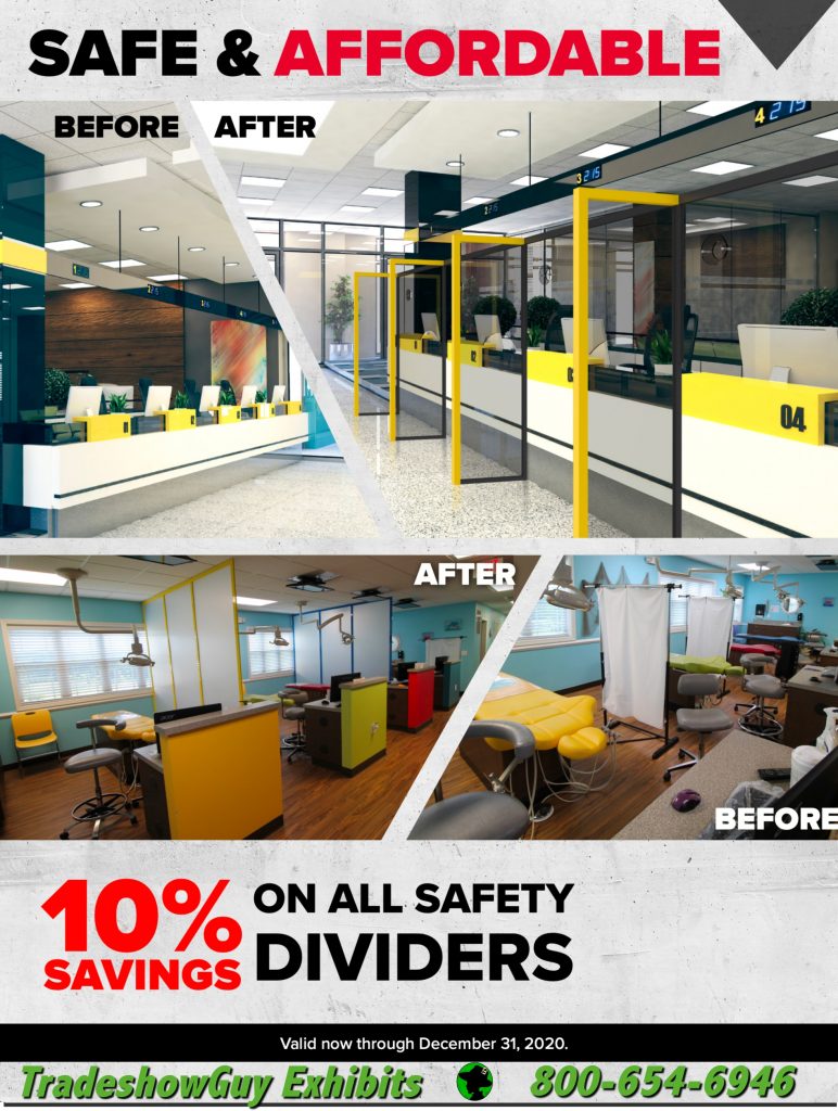
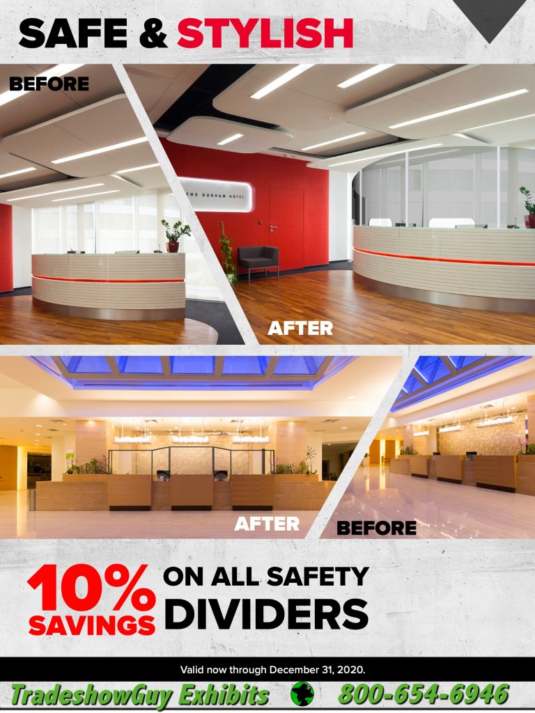
In steps Classic Exhibits, our main exhibit manufacturer, with a little help: a price drop on safety dividers and rental! Not to mention, a trio of eco-friendly sustainable exhibits: a 10×10, a 10×20 and a 2020 island. Let’s take a look. Click to enlarge. Find the links below to download the PDFs.